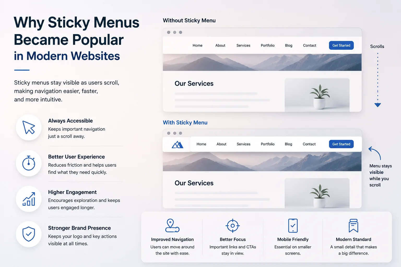
Website design has changed significantly in recent years, especially with the rise of mobile browsing. One feature that has become common across modern websites is the sticky menu. A sticky menu, also called a fixed or persistent navigation bar, stays visible on the screen as users scroll through a page.
This simple design choice has had a strong impact on how users interact with websites. It improves navigation, reduces effort, and helps users find what they need quickly. In a time where attention spans are short and competition is high, even small usability improvements can make a big difference.
This article explains why sticky menus became popular, how they affect user behavior, and how they contribute to better website performance. The content follows practical insights and user-focused design principles to align with EEAT standards.
What Is a Sticky Menu?
A sticky menu is a navigation bar that remains fixed in position while the rest of the page scrolls. It is usually placed at the top of the screen but can also appear on the side or bottom.
Key Characteristics
- Always visible during scrolling
- Contains important navigation links
- Often includes call-to-action buttons
- Designed to be compact and non-intrusive
Unlike traditional menus that disappear when users scroll down, sticky menus stay accessible at all times.
The Shift Toward Mobile-First Design
The popularity of sticky menus is closely linked to mobile-first design. As mobile traffic surpassed desktop usage, designers had to rethink how users interact with websites.
Why Mobile Changed Everything
- Smaller screens limit visible content
- Touch navigation requires simplicity
- Users scroll more than they click
- Quick access to menus becomes essential
Sticky menus solve a key problem in mobile design: keeping navigation accessible without forcing users to scroll back to the top.
How Sticky Menus Improve User Experience
User experience is one of the main reasons sticky menus became widely adopted. They reduce friction and make browsing smoother.
Faster Navigation
Users can move between pages without scrolling up. This saves time and effort, especially on long pages.
Better Accessibility
Important links like “Contact,” “Services,” or “Shop” are always within reach. This is helpful for both new and returning users.
Reduced Cognitive Load
When navigation is always visible, users don’t need to remember where to find it. This creates a more comfortable browsing experience.
Improved Engagement
Users are more likely to continue browsing when navigation is easy. This increases session duration and page views.
The Role of Scrolling Behavior
Modern users are comfortable with scrolling. Social media platforms have trained users to scroll continuously, and websites now follow similar patterns.
Scrolling Trends
- Long-form content is more common
- Infinite scrolling is widely used
- Users prefer vertical navigation over multiple clicks
Sticky menus support these habits by keeping navigation available without interrupting the scrolling flow.
SEO Benefits of Sticky Menus
Sticky menus are not just about design; they also support SEO performance indirectly.
Lower Bounce Rate
When users can easily navigate, they are less likely to leave the site quickly.
Increased Page Views
Quick access to other pages encourages users to visit more sections of the website.
Better Internal Linking
Sticky menus often highlight key pages, improving their visibility and traffic.
Improved Mobile Usability
Search engines prioritize mobile-friendly websites. Sticky menus contribute to better usability scores.
Design Principles Behind Effective Sticky Menus
Not all sticky menus are effective. Poor implementation can harm user experience instead of improving it.
Keep It Simple
Avoid adding too many links. Focus on essential navigation items.
Maintain Proper Size
The menu should not take up too much screen space, especially on mobile devices.
Use Clear Labels
Navigation items should be easy to understand. Avoid confusing or technical terms.
Ensure Smooth Behavior
The menu should not flicker or lag while scrolling. Performance matters.
Highlight Important Actions
Buttons like “Get a Quote” or “Contact” should stand out without being aggressive.
Common Mistakes to Avoid
Even though sticky menus are useful, they can create problems if not designed carefully.
Overcrowding the Menu
Too many links make the menu difficult to use and visually cluttered.
Blocking Content
A large sticky menu can cover important content, especially on small screens.
Poor Mobile Optimization
Menus that work on desktop may not function well on mobile devices.
Ignoring User Intent
Menus should reflect what users are looking for, not just what the business wants to show.
Sticky Menus and Conversion Rates
One of the biggest advantages of sticky menus is their impact on conversions.
Easy Access to CTAs
Call-to-action buttons remain visible, increasing the chances of user interaction.
Faster Decision-Making
Users can quickly navigate to pricing, contact, or product pages.
Reduced Friction
The fewer steps required to take action, the higher the conversion rate.
When Sticky Menus Work Best
Sticky menus are not suitable for every type of website, but they are highly effective in certain cases.
Ideal Use Cases
- E-commerce websites
- Service-based business websites
- Blogs with long content
- Landing pages with multiple sections
In these cases, users benefit from constant navigation access.
When to Avoid Sticky Menus
There are situations where sticky menus may not be necessary.
Minimal Content Pages
Short pages do not require persistent navigation.
Distraction-Free Designs
Some websites focus on a single message and avoid navigation elements.
Performance-Sensitive Sites
If not optimized properly, sticky menus can affect loading speed.
Technical Considerations
Developers must ensure that sticky menus function smoothly across devices and browsers.
Performance Optimization
- Use lightweight code
- Avoid heavy animations
- Minimize scripts
Responsive Design
Menus should adapt to different screen sizes without breaking layout.
Accessibility
Ensure that menus are usable with screen readers and keyboard navigation.
Real-World Implementation Insight
Many businesses have adopted sticky menus after noticing improvements in user engagement. Even a simple change in navigation structure can lead to measurable results.
For example, a web design company in dubai may implement a sticky menu to ensure users can easily access service pages, case studies, and contact forms without interruption. This aligns with user expectations and improves overall usability.
In practice, companies like Inter Smart have emphasized user-friendly navigation in modern website structures, focusing on clarity and accessibility rather than complexity.
The Psychological Impact of Sticky Navigation
Sticky menus also influence user behavior on a psychological level.
Sense of Control
Users feel more in control when navigation is always available.
Reduced Frustration
Not having to scroll back up prevents irritation.
Increased Trust
A well-structured website appears more professional and reliable.
Future of Sticky Menus in Web Design
Sticky menus will continue to evolve as design trends change.
Emerging Trends
- Minimalist sticky headers
- Transparent menus that blend with design
- Smart menus that hide and reappear based on scroll direction
- Integration with voice and gesture navigation
The focus will remain on improving usability while maintaining clean design.
A Practical Closing Perspective
Sticky menus became popular because they solve a real user problem. They make navigation easier, reduce effort, and improve overall website performance. In a digital environment where users expect fast and smooth experiences, small design decisions like this can have a strong impact.
However, success depends on proper implementation. A well-designed sticky menu feels natural and helpful, while a poorly designed one can create frustration.
The key is balance—keeping navigation accessible without overwhelming the user. When done correctly, sticky menus contribute to better engagement, improved SEO performance, and higher conversions.
Websites that prioritize user behavior and practical design choices will continue to perform better in search rankings and user satisfaction.