
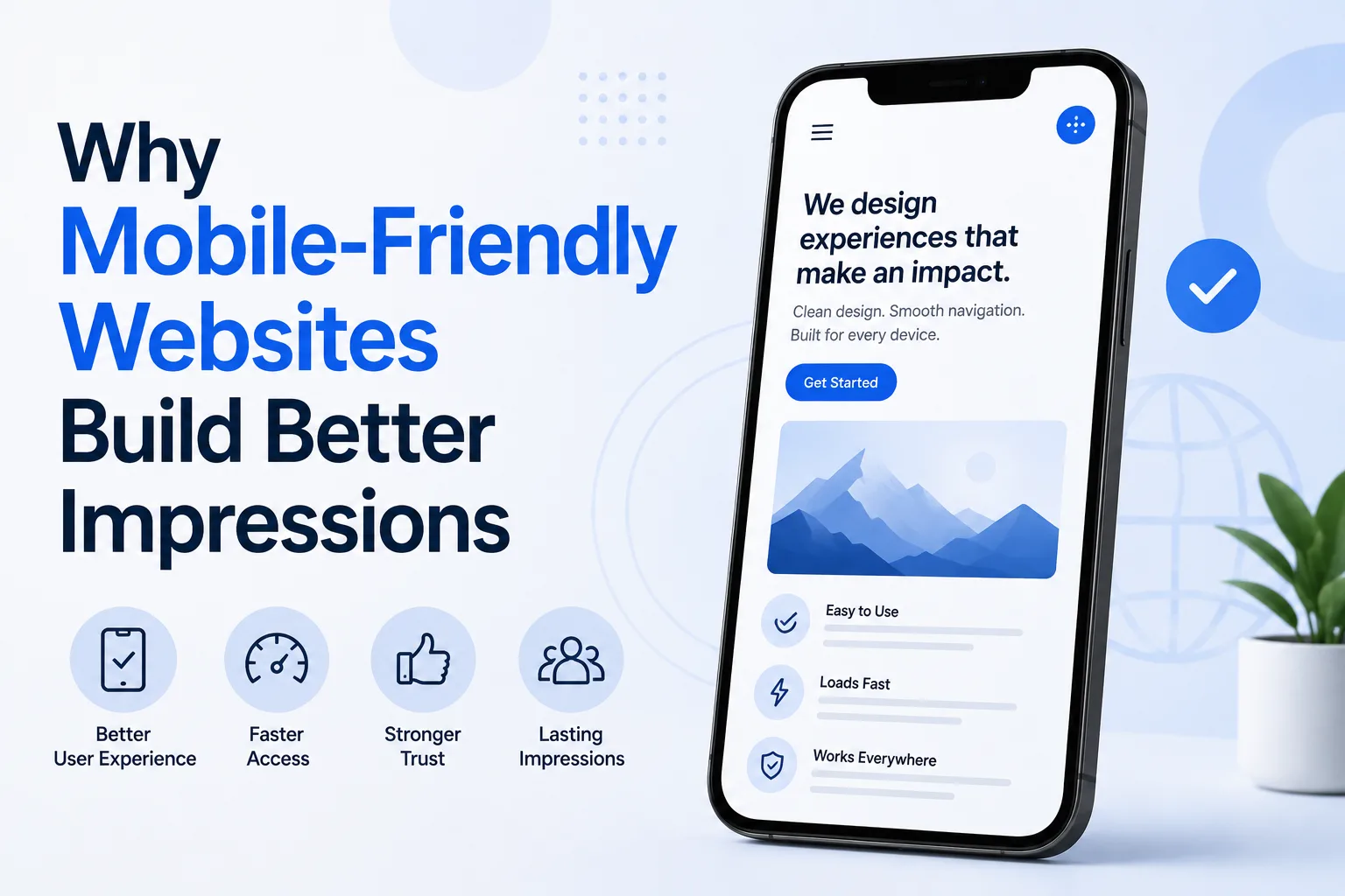
In today’s digital world, most people visit websites using their smartphones. Whether they are searching for a service, reading information, or making a purchase, their first interaction often happens on a mobile device. Because of this, a mobile-friendly website plays a major role in shaping how users perceive a business.
A website that works well on mobile creates a smooth and comfortable experience. It helps users find what they need quickly without confusion. On the other hand, a website that is difficult to use on a phone can leave a negative impression within seconds.
This article explains why mobile-friendly websites build better impressions and how they influence user trust, engagement, and business growth.
What Is a Mobile-Friendly Website?
A mobile-friendly website is designed to work properly on smartphones and tablets. It adjusts its layout, content, and features to fit smaller screens while maintaining usability.
Key Features of Mobile-Friendly Websites
Responsive LayoutThe design adapts to different screen sizes automatically.
Easy NavigationMenus and links are simple to use with touch.
Readable ContentText is clear without the need to zoom in.
Fast Loading SpeedPages load quickly even on slower networks.
First Impressions Are Often Mobile
For many users, a mobile visit is the first interaction with a website.
Why First Impressions Matter
- Users form opinions within seconds
- A smooth experience builds trust
- A poor experience creates doubt
If a website looks clean and works well on mobile, users are more likely to stay and continue browsing.
How Mobile-Friendly Design Builds Trust
Professional Appearance
A well-optimized mobile website looks modern and organized. It shows that the business pays attention to quality.
Consistent Experience
When users get the same smooth experience across devices, it builds confidence in the brand.
Reduced Errors
Mobile-friendly websites minimize issues like broken layouts or hard-to-click buttons, which improves reliability.
Improved User Experience Leads to Better Impressions
User experience is one of the most important factors in building a positive impression.
Easy Navigation
Users should be able to move through the website without confusion.
- Clear menus
- Simple structure
- Logical flow
Comfortable Interaction
Touch-friendly buttons and proper spacing make it easy to interact with the website.
Quick Access to Information
Important details should be easy to find without excessive scrolling.
Role of Speed in Mobile Impressions
Speed is a critical part of mobile experience.
Faster Load Times
Users expect pages to load quickly. Delays can lead to frustration.
Smooth Performance
A fast website feels responsive and reliable.
Lower Bounce Rates
Users are less likely to leave a website that loads quickly.
Content Readability on Mobile Devices
Content should be easy to read on smaller screens.
Clear Typography
- Proper font size
- Good spacing
- Simple font styles
Short Paragraphs
Breaking content into smaller sections improves readability.
Use of Headings
Headings help users scan content and find relevant information quickly.
Impact on User Engagement
A mobile-friendly website encourages users to interact more.
Longer Visit Duration
Users stay longer when the experience is smooth.
More Page Views
Easy navigation leads users to explore more pages.
Higher Interaction
Users are more likely to click, scroll, and take action.
SEO Benefits of Mobile-Friendly Websites
Search engines prioritize mobile-friendly websites in rankings.
Mobile-First Indexing
Search engines mainly use the mobile version of a website for indexing.
Better Search Visibility
Mobile-optimized websites have a higher chance of ranking well.
Improved User Signals
Lower bounce rates and higher engagement positively impact SEO.
Business Advantages of Mobile Optimization
Increased Conversions
When users can easily complete actions, conversion rates improve.
Wider Reach
Mobile-friendly websites reach a larger audience.
Stronger Brand Image
A smooth mobile experience creates a positive impression of the business.
Common Mistakes to Avoid
Non-Responsive Design
Websites that do not adjust to screen sizes create a poor experience.
Small Clickable Elements
Buttons that are too small can lead to errors.
Slow Loading Pages
Heavy content and unoptimized media affect speed.
Cluttered Layout
Too many elements can overwhelm users.
Importance of Consistency Across Devices
Users may switch between devices while browsing.
Seamless Experience
The website should provide a consistent experience on mobile, tablet, and desktop.
Familiar Layout
Consistent design elements help users navigate easily.
Accessibility and Inclusivity
Mobile-friendly design should work for all users.
Readable Text
Text should be clear for users with different vision levels.
Simple Navigation
Easy navigation benefits all users, including those with limited technical skills.
Clear Contrast
Good color contrast improves visibility.
Real-World Impact of Mobile-Friendly Design
Businesses that focus on mobile optimization often see:
- Improved customer satisfaction
- Better engagement
- Higher conversions
- Stronger online presence
These results show how important mobile-friendly design is in shaping user perception.
Practical Tips for Creating Mobile-Friendly Websites
Use Responsive Design
Ensure the layout adapts to all screen sizes.
Optimize Images
Reduce file size without affecting quality.
Keep Navigation Simple
Make it easy for users to find what they need.
Test on Multiple Devices
Check performance across different smartphones.
Role of Professional Web Design
Building a mobile-friendly website requires proper planning and expertise. A web design company in kochi can help businesses create websites that are optimized for mobile users while maintaining usability and performance.
Experienced teams like Inter Smart understand how to design websites that focus on user needs, speed, and clarity. Their approach ensures that websites are easy to use without unnecessary complexity.
Future of Mobile-Friendly Design
Mobile usage will continue to grow, making mobile-friendly design even more important.
Emerging Trends
- Faster mobile experiences
- Better responsive designs
- Improved accessibility features
- More user-focused layouts
Businesses that adapt to these changes will be better prepared for future user expectations.
Building Strong Impressions Through Mobile Experience
A mobile-friendly website is not just a technical requirement. It is a key factor in how users perceive a business. When a website is easy to use, fast, and visually clear, it creates a positive impression that lasts.
Users are more likely to trust, engage, and take action on a website that meets their expectations. By focusing on mobile-friendly design, businesses can improve user experience, strengthen their brand image, and achieve better results.
In a world where mobile browsing dominates, creating a smooth and reliable mobile experience is essential for long-term success.