Business intelligence (BI) and reporting rely on data visualization because it streamlines translating and sharing business data insights. Since enterprises have increased their data processing scope, data visualization is more crucial than ever. It now eliminates delays in reporting, aiding corporate teams in making rapid yet accurate decisions.
Simultaneously, inaccurate data visualization is among the key challenges. Flawed data views can create confusion, slow down how firms respond to crises, and result in harmful business decisions for an organization. Therefore, tapping into multiple visualization approaches based on suitability is desirable. This post will describe the top approaches in data visualization that ensure business intelligence and reporting stay relevant and reliable.
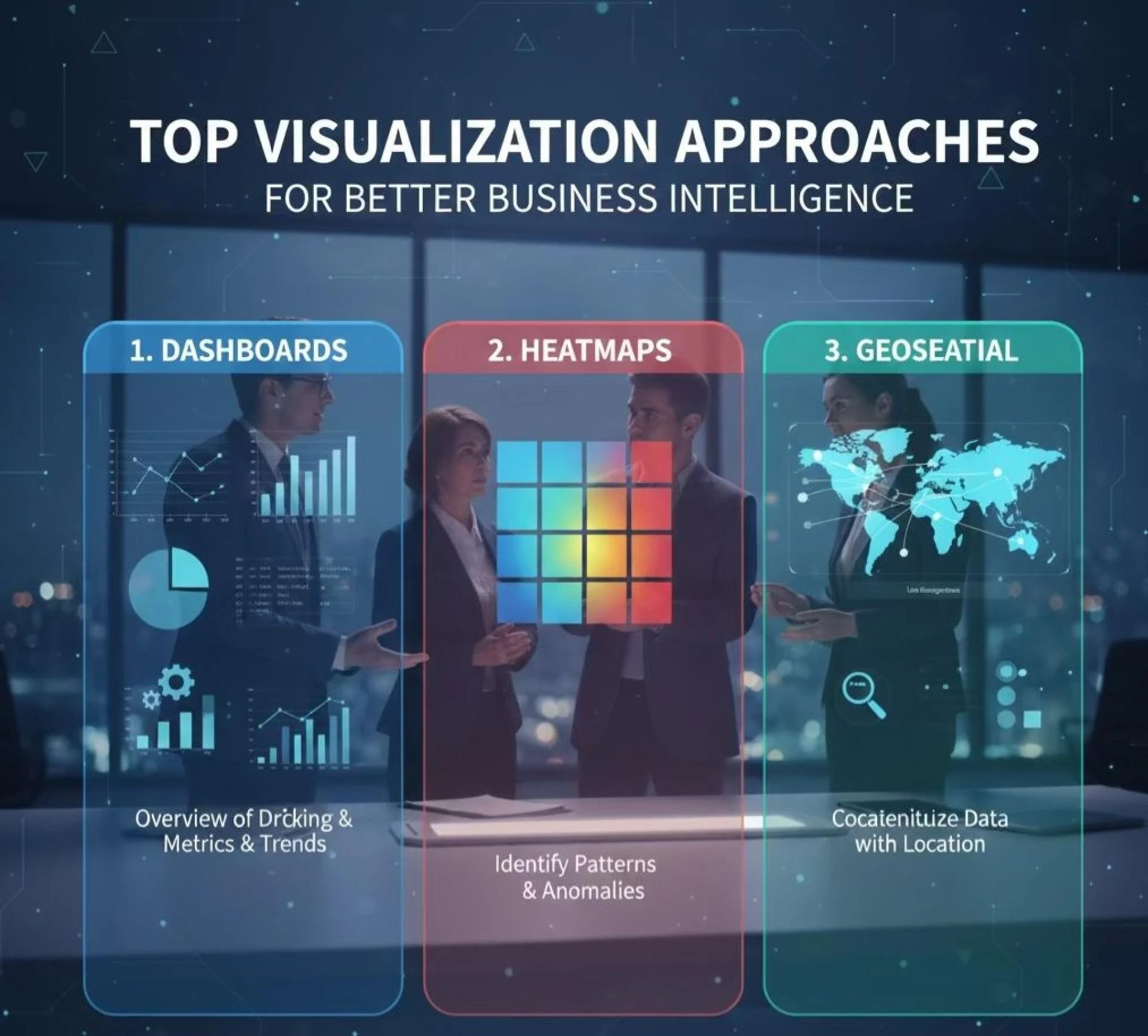
Best Visualization Methods to Enhance Business Intelligence
1. Dashboard-Based Data Visualization
Dashboards are the standard components of most well-known business intelligence tools like Tableau, Microsoft Power BI, and Qlik Sense. They help to demonstrate key performance indicators, metrics, and trends in an intuitive way. Therefore, dashboard visualization allows for easy understanding and familiar functionality.
Dashboards help the management professionals track key metrics like revenue, cost of sales, and growth. Likewise, the operations teams use the dashboards for monitoring the daily activities and performances. Customizing each reporting view is also possible in data visualization services. Furthermore, options like filters, drill-down analytics, and role-based privileges help the users analyze the data at different levels of granularity.
Such visualization methods ensure proper alignment between the reports for different teams. As a result, professionals can plan better actions and respond to different business scenarios.
2. Heatmaps for Pattern Discovery
Heatmaps, or heat maps, are helpful in the identification of patterns and differences based on large datasets. They involve the application of color-coded intensity variation. So, stakeholders can use them to depict performance changes or the severity of distinct issues. Depending on the department, a custom heatmap can be available.
It will describe customer flow dynamics. Other areas where heatmaps dominate include product durability and quality management checks. In the context of marketing and customer experience, heatmaps can help study how audiences or website visitors interact with graphical user interfaces (GUIs), especially in web apps. Besides, engineers and designers can leverage such visualization to examine product functions under simulated usage conditions.
3. Geospatial Method
Geospatial visualization binds data with geographical locations, providing a great technique for location-based decision-making through business intelligence and analytics services. Some of the industries that leverage customizable maps prefer geospatial visualization to a large extent. Think of logistics, transport, property, and telecommunication businesses.
Today, Esri ArcGIS, Google Maps Platform, and Mapbox are some tools that enable companies to visualize their delivery routes. From coverage areas to resource distribution analytics, many firms can benefit from this visualization approach. Logistics companies use geospatial methods to plan routes in a way that will decrease fuel expenses and also cut down on delivery time.
Conclusion
Great visualization aids in discovering and sharing insights faster. However, distinct methods are suitable based on the type of information and goal. At global organizations that form multidisciplinary teams, dashboards and heat maps assist in interpreting data into meaningful patterns. Including the key findings with a visual perspective facilitates seamless discussion of complex problems and solutions.
Data visualization lets businesses enable faster transfer of ideas, suggestions, and doubts. As a result, coordination, brainstorming, and decision-making among stakeholders become better. In a way, it is a much-needed catalyst that unlocks business intelligence through improved data views and reporting.