
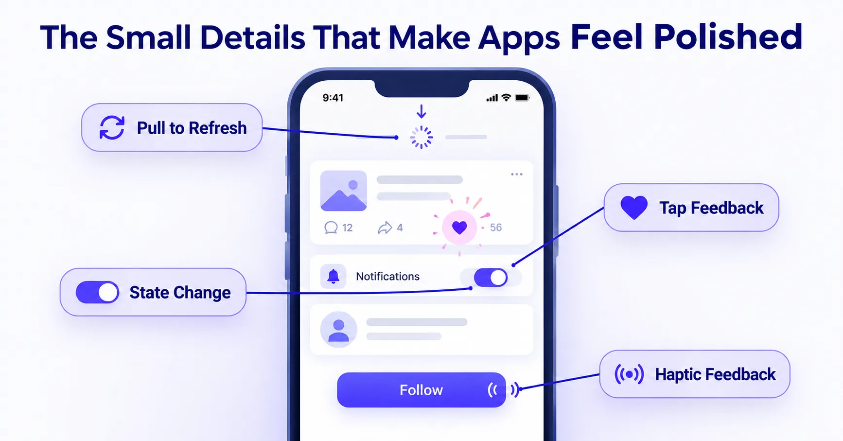
Open any app that feels genuinely well-made, and it's rarely one single feature that creates that impression. It's usually a collection of small moments a button that responds instantly to a tap, a pull-to-refresh animation that feels satisfying, a subtle vibration confirming an action went through. These are micro-interactions, and while individually tiny, they add up to the difference between an app that feels responsive and alive versus one that feels flat and mechanical, even when both have identical functionality.
What a Micro-Interaction Actually Is
A micro-interaction is a small, contained moment of feedback triggered by a single user action: tapping a like button, pulling down to refresh a feed, toggling a switch, swiping to delete an item. Each one typically has four parts a trigger (the user's action), rules (what happens as a result), feedback (how the app communicates that something happened), and a loop or mode (whether and how it repeats).
The scale is intentionally small. A micro-interaction isn't a full onboarding flow or a major feature it's the button press, not the screen. But because users encounter dozens of these moments in a single session, their cumulative quality shapes the overall feel of an app far more than any single screen's layout does.
Why They Matter More Than They Seem
They confirm actions happened. Without feedback, users are often left uncertain whether a tap actually registered did the like count, did the item get added to the cart, did the message send? A brief animation, color change, or haptic pulse closes that uncertainty loop immediately, without requiring the user to check or wait.
They communicate system status. A skeleton loading animation tells a user content is on its way, rather than leaving them staring at a blank screen wondering if the app has frozen. This is a small design decision with an outsized effect on perceived performance, independent of actual load time.
They add a sense of responsiveness. Instant visual feedback on a tap even before an action fully completes makes an interface feel fast, because the user's brain registers the immediate response rather than waiting for the full result. This is why button press states (a slight scale-down or color shift on tap) matter even when the underlying action takes a moment to process.
They guide attention without interrupting flow. A subtle animation drawing the eye to a newly updated element does the job a modal or alert would do, but without forcing the user to stop and dismiss something. This keeps momentum intact in a way that overt notifications can't.
Where Teams Get Micro-Interactions Wrong
Overdoing it. Every tap doesn't need an elaborate animation. Excessive motion slows perceived performance and becomes actively annoying on repeat use a delightful animation the first time can become an obstacle the hundredth time a frequent user performs the same action. Motion should scale with how often an interaction happens: frequent actions need fast, minimal feedback; rare, significant actions (completing a purchase, finishing onboarding) can support more elaborate celebration.
Inconsistent feedback patterns. If tapping a like button produces one style of animation and tapping a save button produces a completely different one, users have to relearn feedback patterns across the app instead of building intuition that transfers. A small, consistent set of feedback patterns reused across similar actions teaches users faster than novel animations for every interaction.
Ignoring accessibility. Motion-based feedback needs a reduced-motion fallback for users who've enabled that system setting, and feedback that relies purely on color needs an accompanying visual or haptic cue for users who can't perceive the color change. Skipping this isn't just an accessibility gap it means a portion of users get a genuinely broken feedback loop.
Treating them as decoration rather than function. The best micro-interactions are functional first, delightful second. An animation that looks impressive but doesn't clearly communicate what happened has failed at the actual job, regardless of how polished it looks in a portfolio reel.
Designing Micro-Interactions Deliberately
Rather than treating these as a final layer of polish added at the end of a project, effective micro-interaction design starts by mapping the key moments in a user's flow that need feedback every tap, toggle, submission, and state change and deciding deliberately what each one should communicate and how. This keeps feedback purposeful and consistent, rather than an inconsistent patchwork of whatever felt fun to build for each individual feature.
The Cumulative Effect
No single micro-interaction makes or breaks an app, but their consistency and quality compound across a session. An app where every tap feels acknowledged, every load state feels intentional, and every action is confirmed clearly ends up feeling meaningfully more polished than a functionally identical app where these details were left as an afterthought even though a user often can't articulate exactly why one app "feels better" than the other.
Getting these details right, alongside the larger structural decisions like navigation and onboarding, is part of what separates a functional app from one people genuinely enjoy using. It's a detail worth building into the custom mobile app design process from the start rather than retrofitting once the core flows are already built.