
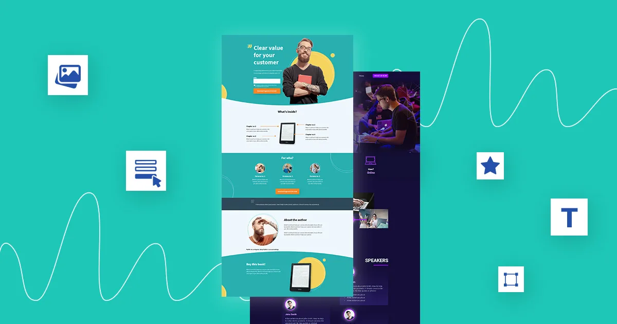
A landing page has one job: move a visitor toward a clear action. That action might be booking a consultation, requesting a quote, downloading a resource, starting a trial, or making a purchase.
Yet many landing pages lose potential customers long before the CTA gets clicked. The headline feels vague. The page asks for too much information. The design creates friction. Or the visitor cannot tell what makes the offer worth their time.
Strong Landing Page Best Practices solve these problems by aligning the message, design, offer, and user journey around one conversion goal.
Start With One Clear Conversion Goal
Every landing page should have a primary objective. A page built to generate leads should not compete with a page built to sell a product.
Define the desired action before writing the copy or designing the layout.
For example:
- Request a free consultation
- Schedule a product demonstration
- Download an industry report
- Start a free trial
- Purchase a specific product
Multiple competing CTAs can scatter attention. Give visitors one obvious next step and support that action throughout the page.
Think of the landing page as a sales conversation. Each section should answer the question that naturally follows the previous one.
Write a Headline That Carries Real Weight
Your headline is often the first piece of copy visitors process. It needs to communicate value quickly.
Weak headlines tend to describe the company rather than the visitor's desired outcome.
Instead of:
Digital Marketing Services for Growing Businesses
Try:
Generate More Qualified Leads With a Smarter SEO Strategy
The second version connects the service with a tangible business outcome.
A useful headline formula is:
Desired outcome + primary benefit + relevant context
Keep the supporting subheadline focused. Use it to explain how the offer works, who it serves, or what the visitor receives.
Match the Landing Page to Search Intent
A landing page should feel like the natural continuation of the user's journey.
If someone searches for "local SEO service for dentists," sending them to a generic homepage creates unnecessary friction. A focused page addressing dental practices, local visibility, patient acquisition, and relevant SEO challenges has stronger message alignment.
This principle matters for paid campaigns too. The ad promise, keyword, headline, offer, and landing page should tell the same story.
Search intent gives the page its direction. Conversion psychology gives it momentum.
Make the Value Proposition Obvious
Visitors should understand three things within seconds:
What do you offer?
Who is it for?
Why should they care?
Your value proposition should answer these questions without forcing visitors to hunt through paragraphs of copy.
Use concrete benefits instead of vague claims.
"Improve website performance" is broad.
"Reduce checkout friction and turn more product visitors into customers" gives the reader a clearer picture of the outcome.
Specificity creates credibility. Strong landing page copy does not need grand promises. It needs relevance.
Design for Scanning, Not Reading Every Word
Most visitors scan before they read. Your visual hierarchy should support that behavior.
Use:
- Short paragraphs
- Descriptive subheadings
- Concise bullet points
- Strategic whitespace
- Clear CTA buttons
- Relevant visuals
- Strong contrast between sections
Keep important information close to the action it supports. A testimonial should appear near the claim it validates. Product benefits should sit near the relevant CTA. Pricing information should not be buried beneath unnecessary content.
Think of the page as a guided path. Every visual element should help visitors move forward.
Build Trust Before Asking for the Conversion
People rarely submit personal information on a page they do not trust.
Trust signals can reduce hesitation and answer silent objections. Depending on the offer, useful elements include:
- Customer testimonials
- Case studies
- Recognizable client logos
- Ratings and reviews
- Security indicators
- Guarantees or clear policies
- Industry credentials
- Results supported by evidence
Specific testimonials carry more weight than generic praise. "Great service" says little. A testimonial describing a measurable improvement, a solved problem, or a smoother experience gives visitors something concrete to evaluate.
Create a CTA That Feels Worth Clicking
"Submit" is functional, but it gives visitors little reason to act.
Your CTA should describe the next step or reinforce the benefit.
Examples include:
Get My Free SEO Audit
Book a Strategy Call
See Pricing Options
Start My Free Trial
The CTA should stand out visually without becoming aggressive. Repeat it at logical points on a long page, yet keep the requested action consistent.
Reduce Form Friction
Lead forms create a tradeoff between information quality and conversion volume.
A form requesting ten fields can discourage casual prospects. A form asking only for an email may generate more submissions but provide less qualification data.
Ask for information your sales process genuinely needs.
For many campaigns, a useful starting point includes:
- Name
- Company
- Website
- One qualifying question
Test the form length rather than relying on assumptions. The right balance varies by offer, audience, and purchase complexity.
Use Mobile First Thinking
A landing page that works on desktop but struggles on mobile is leaking conversions.
Check the mobile experience for:
- Readable text
- Fast loading
- Comfortable button sizes
- Simple navigation
- Proper image scaling
- Minimal intrusive elements
- Easy form completion
Test the page on real devices, not only through a browser preview. A thumb is less precise than a mouse. Mobile visitors need clear targets and fewer obstacles.
Improve Speed and Technical Performance
Performance affects the experience before visitors see your offer.
Compress large images, remove unnecessary scripts, reduce layout shifts, and review third party integrations. Pay attention to Core Web Vitals and actual page behavior on mobile networks.
A beautiful page that loads slowly is like a well-designed store with a locked entrance. The customer never reaches the merchandise.
Test One Meaningful Variable at a Time
Conversion rate optimization works best when changes are tied to a clear hypothesis.
You might test:
- Headline variations
- CTA wording
- Form length
- Hero image
- Social proof placement
- Pricing presentation
- Page length
- Offer structure
Do not judge a test from a handful of conversions. Give experiments enough traffic and time to produce useful evidence.
If your team lacks the resources to manage this process internally, a CRO service can help identify friction, develop testing priorities, and analyze user behavior.
Know When a Website Redesign Is Necessary
Sometimes the landing page is not the real problem.
If the broader website has outdated branding, confusing navigation, weak mobile usability, slow performance, inconsistent messaging, or poor information architecture, isolated landing page edits may only treat the symptoms.
A strategic website redesign can create a stronger foundation for conversion. The goal is not to make every page look newer. It is to improve how users find information, understand the offer, trust the business, and take action.
SEO Ninja approaches conversion work with this broader perspective, combining SEO, user experience, content, and performance considerations to support measurable business goals.
Measure What Happens After the Click
A landing page should not be judged by conversion rate alone.
Track metrics such as:
- Landing page conversion rate
- Form completion rate
- CTA click rate
- Bounce or engagement signals
- Cost per lead
- Qualified lead rate
- Revenue per visitor
- Assisted conversions
A page that produces fewer leads but generates far more qualified opportunities may be outperforming a high-volume page.
The real question is not simply, "How many people converted?"
Ask, "Did the page attract and convert the right people?"
Final Thoughts
High-converting landing pages are built through alignment. The search intent, offer, headline, copy, design, proof, CTA, form, and technical experience should point toward the same destination.
Start with clarity. Remove friction. Support claims with evidence. Test meaningful changes. Measure business outcomes rather than vanity metrics.
Good landing page optimization is less about adding more elements and more about removing reasons for visitors to hesitate.