The Barbie doll is an icon of global culture, a timeless figure who has captured hearts for generations. But while the doll herself has evolved in countless ways, one aspect that often goes unnoticed is the Barbie packaging box. From its vintage roots to today’s sleek, sustainable, and interactive designs, the Barbie box has undergone a dramatic transformation. Let’s take a journey through time to explore how Barbie packaging has evolved to become a vital part of the brand’s identity.
1959: The Birth of an Icon
Barbie debuted in 1959, and with her came a packaging box that was elegant and sophisticated. The first Barbie box was a tall, rectangular cardboard design, primarily white with delicate illustrations of Barbie in different outfits. The minimalist look was high-fashion inspired, reflecting Barbie's original branding as a teenage fashion model.
- Monochrome palette with soft pinks and blacks
- Sketch-style illustrations of outfits on the sides
- Simplicity and elegance targeting both children and adults
This packaging wasn’t just about protection—it set the tone for Barbie as a stylish and aspirational figure.
1960s: Embracing Color and Creativity
As Barbie gained popularity during the 1960s, her packaging became brighter and more youthful. Boxes started incorporating bold colors, transparent windows, and playful fonts to align with the vibrant spirit of the decade.
- Clear plastic windows offered a first look at the doll inside
- Bright pinks and blues became dominant design elements
- Boxes began to hint at themed Barbie characters and stories
This era also saw the rise of character-specific packaging, allowing each new Barbie release to tell a unique story from the moment it hit the shelves.
1970s: Experimentation and Expansion
The 1970s brought innovation and exploration. Barbie’s packaging became more diverse to reflect the various versions of the doll hitting the market.
- Diorama-style backgrounds added depth to boxes
- Interactive packaging introduced compartments for accessories
- Box backs included stories and branding elements for deeper engagement
As Barbie took on new roles—doctor, astronaut, athlete—the packaging reflected her expanding universe, making each box a portal to Barbie's multifaceted world.
1980s: Glamour, Glitter, and Collectibility
In the bold and glamorous 1980s, Barbie packaging embraced the flash and dazzle of the era. Neon colors, shiny metallic finishes, and large branding took over the shelves.
- Hot pink became Barbie’s signature hue
- Foil-stamped logos and glittered accents increased visual impact
- Larger boxes to accommodate new sets, accessories, and companion dolls
This decade also marked the beginning of Barbie's collectible packaging, with limited editions and holiday releases featuring more intricate designs and protective outer sleeves.
1990s: Branding Power and Global Reach
The 1990s cemented Barbie as a global brand, and her packaging became even more commercial and consistent. It reflected corporate branding standards while expanding the scope of themes and characters.
- Multilingual packaging for international markets
- Barbie logo modernized for global recognition
- Introduction of interactive packaging with CDs and promotional inserts
Packaging in this era was not only eye-catching—it also served as a platform for storytelling, licensing, and cross-promotions, including popular brands like Disney and McDonald's.
2000s: Technology Integration and Customization
With the rise of technology and digital play, Barbie boxes began to integrate multimedia elements. The packaging was now designed to bridge the gap between physical play and digital engagement.
- DVD inclusions, CD-ROMs, and online codes inside boxes
- Modern box shapes for themed sets and play environments
- Reusable packaging designs that turned into stages or closets
This era pushed packaging to be more than just a shell—it became a part of the Barbie play experience.
2010s: Eco-Conscious and Inclusive Designs
The 2010s marked a pivotal shift in packaging philosophy. Responding to global awareness around sustainability and inclusivity, Barbie packaging underwent a significant transformation.
- Reduced plastic use and recyclable cardboard
- Diverse representations of dolls on box artwork
- Packaging reflected Barbie’s new messaging: “You Can Be Anything”
The packaging was now designed not just for aesthetics, but to represent Barbie’s evolving identity and social responsibility.
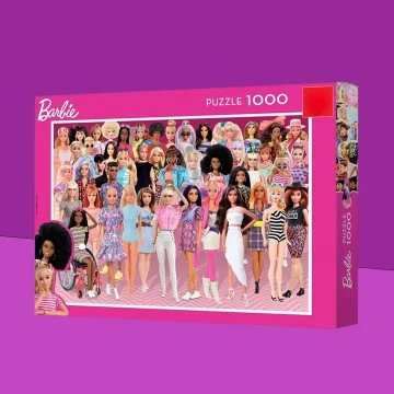
2020s: Smart, Stylish, and Sustainable
Today’s Barbie packaging is a perfect blend of functionality, design, and innovation. Boxes are crafted for collectors, kids, and eco-conscious consumers alike.
Modern packaging features include:
- Plastic-free materials and biodegradable alternatives
- Augmented Reality (AR) experiences with scannable QR codes
- Convertible packaging that transforms into playsets or storage cases
Many limited-edition dolls are now released in collector-grade packaging with magnetic flaps, velvet lining, and certificate displays. These boxes are designed to be part of the display, not discarded.
The Rise of Unboxing Culture
Social media platforms like YouTube and TikTok have birthed a powerful trend: unboxing videos. Barbie packaging today is often created with this in mind.
- Dramatic reveals and layered unboxing experiences
- Stylish, camera-friendly box designs
- Packaging becomes a content feature rather than just a container
This has transformed Barbie boxes into a powerful marketing and engagement tool, especially for younger audiences who love watching toys come to life on screen.
Conclusion: Packaging That Tells a Story
From its vintage elegance in the 1950s to today’s sustainable, interactive masterpieces, the Barbie packaging box has evolved into an essential storytelling medium. It reflects not only the growth of the brand, but also the shifting values, technologies, and expectations of each generation.
Each Barbie box is now a blend of art, innovation, and purpose—designed not just to showcase a doll, but to inspire, engage, and delight from the very first glance.