A friend of mine runs a kitchen interiors showroom near Raj Nagar Extension. Last year, he spent close to two lakhs on Google Ads, expecting a flood of inquiries. What he got instead was a flood of visitors — and almost no leads. He called me, frustrated, asking whether digital marketing was a scam.
It wasn't. His ads were working fine. The problem was what happened after the click.
His website opened to a 4-second loading spinner, a hero banner that said "Welcome to Our Website," and a contact form with eleven fields including "How did you hear about us?" By the time someone scrolled to the section that actually showed his modular kitchens, half the visitors were already gone.
This is the quiet tragedy of small and mid-sized businesses in Ghaziabad and across NCR. They invest in ads, SEO, social media, sometimes even influencers — and then send all that hard-earned attention to a website that actively repels customers. If that's happening to you, no amount of marketing budget will fix it. The leak is in the bucket, not the tap.
The Five-Second Rule Nobody Talks About
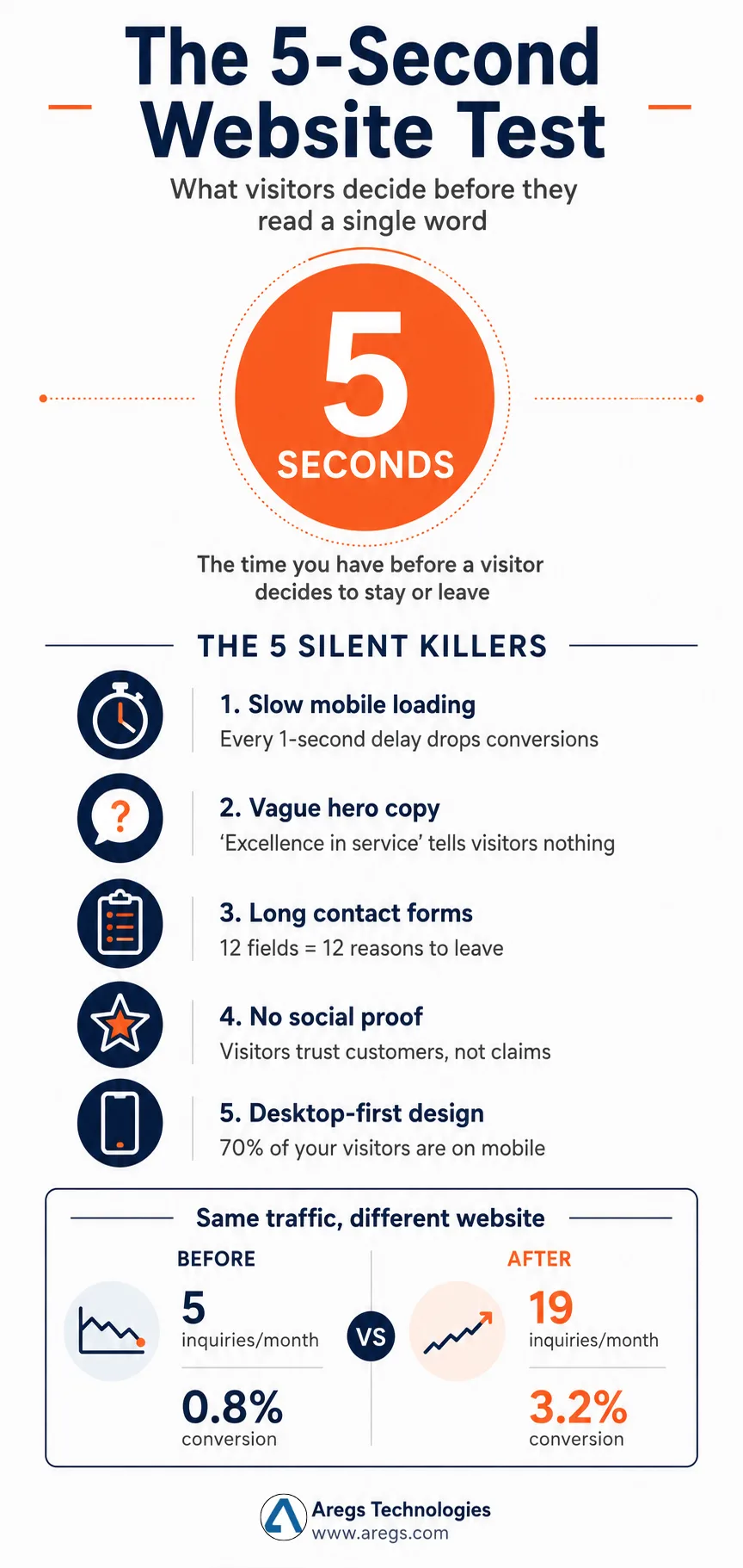
There's a useful way to test your own website. Open it on your phone, count to five, and close it. Then ask yourself: in those five seconds, did a stranger learn what you do, who you do it for, and why they should care?
For most websites in Ghaziabad — whether it's a coaching institute in Vaishali, a clinic in Kavi Nagar, or a manufacturing unit in Sahibabad — the honest answer is no. The homepage usually opens with a stock-photo carousel of handshakes, a vague tagline like "Solutions that empower," and a navigation menu with seven items that all sound the same.
A website is not a brochure. It is a conversation that has roughly five seconds to earn the next thirty. If those five seconds are wasted on a sliding banner of unrelated images, the conversation ends before it begins.
Compare this to how a good salesperson behaves at a showroom. They don't open with a slogan. They look at what you're wearing, glance at your car, ask one specific question, and tailor everything that follows. A website should do something similar — speak directly to the visitor's problem within the first scroll.
The Mistakes That Quietly Cost the Most
After auditing dozens of business websites across Ghaziabad and the wider NCR, the same handful of mistakes show up again and again. They aren't dramatic. They aren't even obvious. But they bleed leads every single day.
The first is slow loading on mobile. Most local business owners check their own website on a fast office Wi-Fi connection and assume it works for everyone. It doesn't. The visitor in Loni opening your site over a patchy 4G connection is waiting eight seconds for your homepage to render — and Google's own data is unambiguous that a one-second delay drops conversions noticeably. Compress your images. Get rid of the auto-playing video on the homepage. Pick a host that isn't overselling shared servers in some basement.
The second is vague hero copy. "Excellence in every service" tells a visitor nothing. "Modular kitchens designed and installed across Ghaziabad in 21 days, with a 5-year warranty" tells them everything. Specific beats poetic, every time.
The third is forms that interrogate. If a visitor wants a quote, you do not need their date of birth, their company size, or their annual turnover. You need a name, a number, and a one-line message. Every extra field is a closed door. I have seen businesses double their inquiry rate in a week just by cutting their form down from twelve fields to three.
The fourth is no proof. Visitors don't trust your claims about yourself; they trust your customers' claims about you. Real testimonials with real names. Real photos of real projects. Real Google reviews embedded directly on the page. A website without proof is just a stranger making promises.
The fifth — and this one hurts the most — is mobile design that's actually just desktop design squeezed. More than 70% of your visitors are on phones. If your "Get Quote" button is hidden inside a hamburger menu while a giant banner image takes up the whole screen, you are punishing the majority of your audience to please the minority.
What "Good Design" Actually Means in 2026
There's a misunderstanding I want to clear up. Good website design is not about animations, gradients, or which font is trending on Dribbble this quarter. Those things are decoration. The structure underneath them is what matters.
Good design in 2026 means a visitor lands on your site and within a single scroll understands four things: what you do, who you do it for, why you're a credible choice, and how to take the next step. That's it. Everything else — the colors, the typography, the micro-animations — is in service of those four answers being delivered fast.
This is also where AI search has changed the game. Tools like ChatGPT, Perplexity, and Gemini now recommend businesses directly to users who never even visit Google. When someone asks, "Who builds custom Shopify stores in Ghaziabad?", these tools scan websites for clear, structured, factual content — service pages with specific information, transparent process descriptions, location relevance, real client work. Vague, fluffy websites get skipped. Specific, well-structured ones get cited.
For a Ghaziabad business, this means your website is no longer competing only with the agency two streets away. It's competing with how legibly an AI can summarize what you do versus what your competitor does. The websites that win in 2026 are the ones built for both human visitors and machine readers — and partnering with a thoughtful website design company in Ghaziabad is increasingly less about getting "a nice-looking site" and more about getting an asset that performs in both worlds.
A Real Example, Numbers and All
Let me give you a concrete one. A small dental clinic in Indirapuram came to us with a website that was getting roughly 600 visits a month from local SEO. Their inquiry rate was around 0.8% — about 5 inquiries a month. Not great, but not zero.
We didn't change the traffic. We didn't change the SEO. We rebuilt the website with three changes:
- Replaced the stock-photo banner with a 4-second clip of the actual clinic and a single sentence: "Painless root canals and same-day crowns in Indirapuram, with EMI options."
- Cut the contact form down to three fields and added a WhatsApp button that opened a pre-filled message.
- Added six real Google reviews with patient first names and dates, embedded live from their Google Business profile.
That was it. Three changes. The next month their inquiries went from 5 to 19. Same traffic, same SEO, same ads. The website simply stopped pushing people away.
This is not a marketing miracle story. It is what happens when a website starts behaving like a competent salesperson instead of a digital pamphlet.
How to Audit Your Own Website This Weekend
You don't need an agency to start. Spend an hour this weekend doing the following honestly:
Open your homepage on your phone over mobile data — not Wi-Fi. Time how long it takes to become usable. If it's over three seconds, that's your first fix.
Read your hero section out loud. If it sounds like a generic press release, rewrite it as if you were describing your business to a curious customer at a chai stall.
Click your contact form. Count the fields. If there are more than four, ask yourself which ones you actually use when following up.
Check your Google reviews. If they're not visible on your homepage, you're hiding your strongest sales asset.
Open your site on a friend's phone — someone outside your industry. Ask them to describe what your business does after looking at it for ten seconds. If they hesitate, your homepage is failing the five-second test.
These five checks won't fix everything. But they'll tell you whether your website is working for you or quietly working against you.
The Takeaway
Websites in Ghaziabad — and frankly, across India — have stopped being judged by local standards. The same customer who is choosing between two interior designers in Vaishali is also browsing Pinterest, scrolling through Instagram brands from Mumbai, and reading reviews on global e-commerce sites. Their bar for what "looks professional" has been quietly raised by every premium experience they've had online.
You don't need a million-rupee budget to meet that bar. You need clarity, speed, proof, and a contact path that doesn't feel like a tax form. Whether you build it yourself, hire a freelancer, or work with a professional website design company in Ghaziabad, the principles stay the same. Get the fundamentals right, and even modest traffic will start converting.
Get them wrong, and no marketing budget in the world will save you. The leak will keep widening, and you'll keep blaming the wrong thing.
Your website is either earning its keep or quietly costing you customers. There is no third option.