Last week, a colleague sent me a link to a local restaurant's website. She wanted to check the menu before we headed there for lunch. We both opened it on our phones at the same time. The text was tiny, the images were all over the place, and you had to pinch and zoom just to read the name of a dish. We gave up after about thirty seconds and just searched for somewhere else to eat.
That restaurant lost two customers without even knowing it.
This happens more often than business owners realise. Someone finds your website, opens it on their phone, and within seconds decides to leave because it's just too hard to use. No second chances. No "let me try again on my laptop later." They're gone.
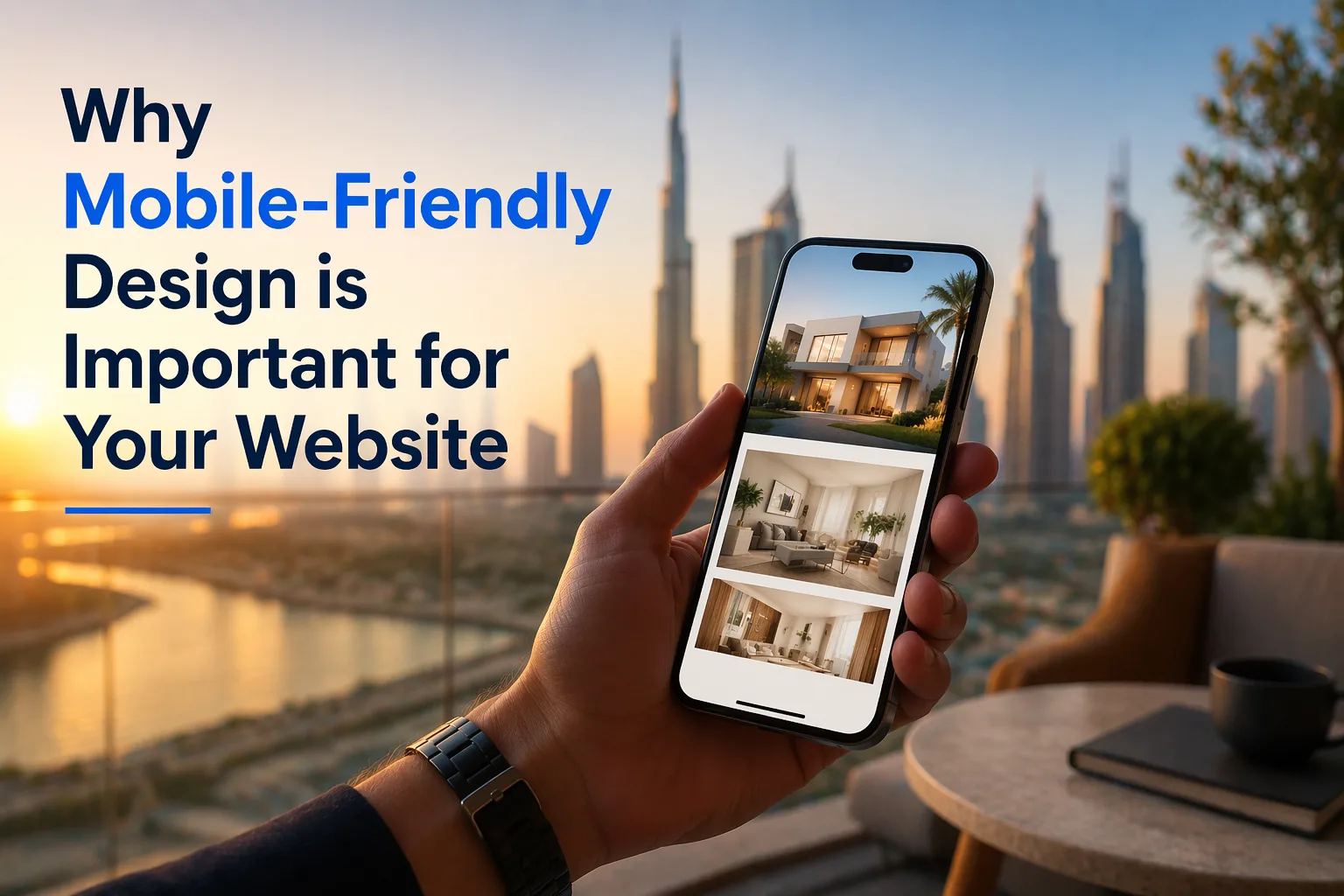
What Mobile-Friendly Actually Means
Let's clear this up first because a lot of people confuse it with just having a website that opens on a phone.
A mobile-friendly website is one that actually works well on a small screen. The text is readable without zooming. Buttons are big enough to tap with a thumb. The layout adjusts based on the screen size. Images load properly. Nothing overlaps or gets cut off. It feels like the site was made for your phone, not just squeezed onto it.
The difference between a site that opens on mobile and one that's actually designed for mobile is huge. One technically works. The other actually works.
People Are on Their Phones, Always
Here's something that shouldn't surprise anyone but still gets ignored by a lot of businesses. The majority of web traffic today comes from mobile devices. Not laptops. Not desktop computers. Phones.
When someone hears about your business, whether through a friend, a social media post, or a Google search, the first thing they do is check your website. And they do it on their phone, usually right in that moment. If what they see is a mess, that's their first impression of you. And first impressions in the digital world are almost impossible to fix.
For businesses in a competitive market like Dubai, where customers have dozens of options at their fingertips, a bad mobile experience is not just inconvenient. It's genuinely costly.
Google Cares About This Too
This is the part that often gets businesses to sit up and pay attention.
Google ranks websites based on how well they perform on mobile. It's called mobile-first indexing, and it means Google looks at the mobile version of your site first when deciding where to show you in search results. If your site looks broken or loads slowly on a phone, your ranking takes a hit. You end up lower in search results, which means fewer people find you organically.
So it's not just about user experience. It directly affects whether people can even discover your business online. A good Web Design Agency in Dubai will build your site with this in mind from the very beginning, not as an afterthought.
The Speed Factor
Mobile-friendly design and page speed go hand in hand. A site that's been properly optimised for mobile loads faster. And speed matters enormously.
Studies have shown that if a page takes more than three seconds to load, a big chunk of visitors leave. Three seconds. That's barely enough time to take a breath. On mobile connections, which aren't always as fast as home wi-fi, a heavy, poorly optimised site can take much longer than that.
Slow-loading images, clunky code, and elements that weren't built for smaller screens all slow things down. A well-designed mobile site strips away the unnecessary stuff and focuses on what the visitor actually needs.
What Happens When You Get It Right
When your website works beautifully on mobile, a few things happen that are worth thinking about.
People stay longer. They browse more pages. They're more likely to fill out a contact form, make a booking, or buy something. The whole experience feels smooth and trustworthy, and that feeling transfers to how they think about your brand.
There's also something to be said for the confidence it builds. When a potential customer lands on a clean, easy-to-use mobile site, it tells them that you take your business seriously. It says you pay attention to details. That matters, especially when someone is deciding whether to trust you with their money.
Any experienced Web Design Agency in Dubai will tell you the same thing. The businesses that invest in a proper mobile experience see better results across the board, from lower bounce rates to more inquiries coming through the site.
How to Know If Your Site Has a Problem
The easiest way is to just open your own website on your phone right now. Go through it as a new visitor would. Can you read everything easily? Are the buttons easy to tap? Does it load quickly? Does anything look broken or out of place?
If you're squinting or zooming in, your visitors are too. And most of them won't bother.
You can also use Google's free mobile-friendly test tool. Type in your URL and it'll tell you exactly how your site performs on mobile and what needs fixing.
A Small Fix With Big Returns
Getting your website properly optimised for mobile doesn't mean rebuilding everything from scratch. Sometimes it's a few targeted changes. Other times it does require a fresh approach, especially if the site is older and wasn't built with mobile in mind at all.
Either way, partnering with a reliable Web Design Agency in Dubai that understands both design and performance is the smartest move. You want someone who thinks about the person holding the phone, not just how the site looks on a big monitor.
Your website is often the first real conversation you have with a potential customer. Make sure it's a good one, wherever they're reading it from.