
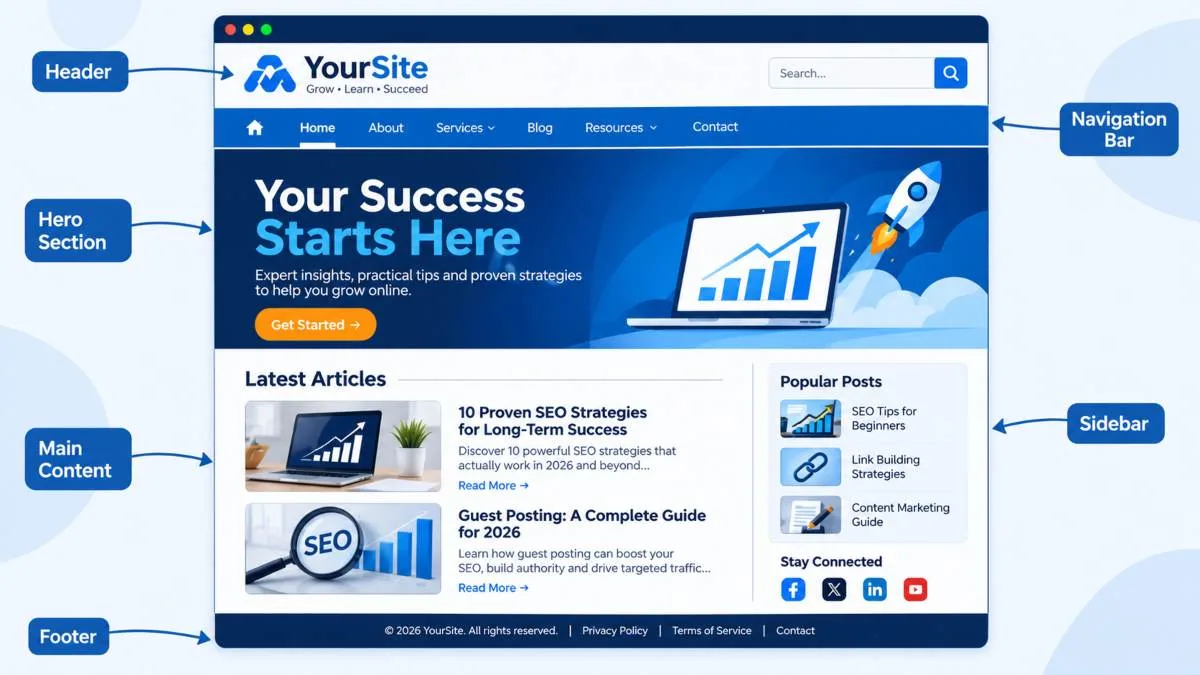
What makes a good web page layout? In short, it is a structure that helps visitors find what they need quickly, read comfortably, and take action without confusion. Visitors judge a site within seconds, and a clear web page layout design shapes that first impression before they read a single word. A well-organized page improves usability, readability, and engagement, and it keeps people on your site longer. This article explains the key principles behind effective layouts, using simple language for beginners, website owners, designers, developers, and marketers.
What Makes a Good Web Page Layout? The Basics
A good web page layout is the arrangement of text, images, navigation, buttons, and white space on a page so that users understand it at a glance. It balances how the page looks with how it works.
Three things work together here:
- Visual hierarchy: the order in which the eye moves across the page.
- Content organization: grouping related information into logical sections.
- User experience: how easy and pleasant the page is to use.
When these three align, your website layout structure feels natural. Visitors never have to wonder where to click or what to read next. If you want a deeper walkthrough, our Web Page Layout Design Guide covers the fundamentals step by step.
What makes a good web page layout – annotated wireframe showing header, content, sidebar, and footer
What Makes a Good Web Page Layout? 7 Essential Design Principles
Every strong layout follows a handful of proven principles. Apply these seven and your pages will be easier to scan, use, and trust.
1. Establish a Clear Visual Hierarchy
Visual hierarchy tells visitors what matters most. Use larger headings, bolder weights, strong contrast, and smart positioning to guide the eye from the headline to supporting content and then to the call to action. If everything looks equally important, nothing stands out. Make your key message, main image, and primary button obvious within the first screen.
2. Maintain a Simple and Consistent Page Structure
Organize content into logical sections, each with a clear purpose. Keep headers, navigation menus, and footers consistent across every page. A predictable page structure means users learn your site once and can then navigate it anywhere. Consistency also builds credibility, because a site that looks coherent feels more professional.
3. Use White Space Effectively
White space, also called negative space, is the empty area around elements. It is not wasted room. It separates sections, reduces clutter, and makes text far easier to read. Generous spacing between paragraphs, images, and blocks lets visitors focus on one idea at a time. Crowded layouts feel stressful, while airy layouts feel clear and confident.
4. Design for Readability and Accessibility
Choose readable fonts and comfortable sizes, usually at least 16px for body text. Keep strong color contrast between text and background, and use descriptive headings so readers and screen readers can understand the page. Following the Web Content Accessibility Guidelines (WCAG) helps ensure people with different abilities can use your site. Accessible design is good for everyone, not only for users with disabilities.
5. Create Responsive Web Page Layouts
People browse on phones, tablets, laptops, and large monitors, so your layout must adapt. Use flexible grids, scalable images, and CSS media queries so content reflows smoothly. Make sure menus, buttons, and text remain easy to tap and read on small screens. If you want to go further, see our earlier article on building a responsive web page layout.
6. Prioritize Navigation and User Experience
Navigation is the road map of your website. Keep menus short, labels clear, and paths intuitive. Make important pages easy to discover and place calls to action where users naturally look, such as above the fold, at the end of sections, and in the footer. A visitor should reach any key page in a few clicks.
7. Maintain Balance and Alignment
Align text, images, and buttons along consistent edges, and use a grid to keep the page balanced. Balanced layouts feel stable and organized. Remove distracting or unnecessary design elements, because every extra effect competes with your message.
What Makes a Good Web Page Layout? Common Mistakes to Avoid
Even well-meaning designs can fail. Watch for these frequent problems:
- Overcrowding: too many elements packed together overwhelm visitors.
- Inconsistent spacing and typography: mixed fonts and uneven gaps look unprofessional.
- Confusing navigation: unclear menus make users leave.
- Ignoring mobile responsiveness: a layout that breaks on phones loses a large share of visitors.
- Excessive animations and effects: they slow pages down and distract users.
- Burying important information: forcing people to scroll past filler before reaching key content hurts engagement.
Avoiding these mistakes often improves a page more than adding new features does.
What makes a good web page layout – comparison of a cluttered page and a clean, well-spaced page
What Makes a Good Web Page Layout? How to Plan One Step by Step
Good layouts are planned, not improvised. Follow this simple process.
Define Your Website’s Purpose
Decide what the page must achieve: inform, sell, generate leads, or build a brand. Your goal determines which elements get priority.
Understand Your Target Audience
Think about who visits, what devices they use, and what they want. A layout for busy shoppers differs from one for researchers reading long articles.
Organize Content and Create a Page Structure
List your content, group related items, and rank them by importance. Then arrange them into a clear page structure with logical sections and headings.
Build a Wireframe Before Designing
A wireframe is a simple blueprint showing where each element sits. It lets you test the layout without worrying about colors or images, which saves time and revisions later.
Test and Improve the Website Layout
Test with real users, check on multiple devices, and review analytics such as bounce rate and scroll depth. Small adjustments based on real behavior often deliver the biggest gains.
What makes a good web page layout – wireframe planning process on a designer's desk
What Makes a Good Web Page Layout? Examples of Effective Layouts
Different goals call for different layouts. Here are five common types:
- Single-column layout: ideal for blogs and articles because it keeps readers focused on one flow of content.
- Two-column layout: works well for content with a sidebar for navigation, related posts, or ads.
- Grid layout: perfect for portfolios and product listings where many items need equal visibility.
- Landing page layout: a focused structure built around one message and one clear call to action to boost conversions.
- Responsive layout: adjusts to any screen size, which makes it essential for mobile-friendly websites.
Choose the type that matches your content and audience, then refine it with the seven principles above.
What Makes a Good Web Page Layout for User Experience and SEO?
Layout is not only about looks. It directly affects how users behave and how search engines understand your pages.
- Readability and accessibility: clear typography and spacing keep readers engaged.
- Easier navigation: users find pages faster, which lowers bounce rates.
- Mobile usability: Google primarily uses the mobile version of a page for indexing, so a responsive layout matters. You can read more in Google’s mobile-first indexing guidance.
- Engagement and conversions: clear calls to action turn visitors into leads and customers.
- Search engine understanding: logical headings and a clean website layout structure help crawlers interpret your content.
A strong layout supports both people and search engines, which is why it deserves attention on every site. You can see practical examples on the Apso Tech home page.
What makes a good web page layout – responsive design shown on desktop, tablet, and mobile screens
What Makes a Good Web Page Layout? Conclusion
So, what makes a good web page layout? Clarity, consistency, and a focus on the user. Build a clear visual hierarchy, keep your structure simple, use white space wisely, design for accessibility, make every page responsive, simplify navigation, and keep elements balanced. Avoid clutter and distractions, plan with a wireframe, and keep testing. Take a fresh look at your existing pages today and improve one principle at a time. Small layout changes often lead to noticeably better engagement.
What Makes a Good Web Page Layout? Frequently Asked Questions
What makes a good web page layout?
A good web page layout is clear, consistent, readable, and responsive. It guides visitors with a strong visual hierarchy, uses white space well, and makes navigation and calls to action easy to find.
What are the basic principles of website layout design?
The core principles are visual hierarchy, consistent structure, white space, readability and accessibility, responsiveness, intuitive navigation, and balance with alignment.
How does website layout affect user experience?
Layout controls how easily people read, navigate, and act on your content. A confusing layout increases bounce rates, while a clear one improves engagement and conversions.
What is the best layout for a website?
There is no single best layout. Single-column suits blogs, grids suit portfolios and stores, and focused landing layouts suit campaigns. Choose based on your goal and audience.
How can I improve my website page layout?
Start by simplifying clutter, adding white space, fixing inconsistent fonts and spacing, checking mobile responsiveness, and testing navigation with real users. Use a wireframe to plan larger changes.