Introduction
In today’s digital world, users access websites from a wide range of devices: smartphones, tablets, laptops, and desktops. Among these, mobile devices dominate internet usage globally. This shift has made it essential for businesses and designers to rethink how websites are built and experienced. Responsive web design, especially the mobile-first approach, is no longer optional; it is a necessity.
Mobile-first design focuses on creating websites for smaller screens first and then scaling up for larger devices. This strategy ensures that the most important content and functionality are prioritized, leading to better user experiences and improved performance. In this article, we will explore what responsive web design is, why mobile-first matters, and how businesses can benefit from adopting this approach.
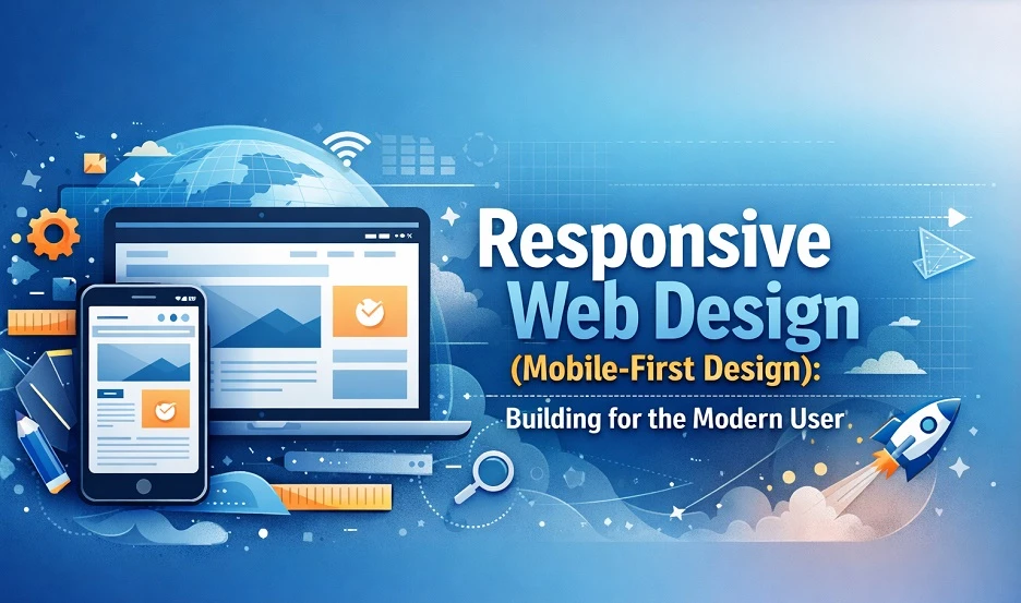
What Is Responsive Web Design?
Responsive web design is a design technique that allows a website to adapt to different screen sizes and devices. Instead of creating separate websites for mobile and desktop users, a single responsive site automatically adjusts its layout, images, and content based on the user’s screen.
Key Features of Responsive Design
- Fluid Grids: Layouts that scale proportionally instead of using fixed widths.
- Flexible Images: Images that resize within their containers.
- Media Queries: CSS techniques that apply styles based on screen size and resolution.
This approach ensures a consistent user experience across all devices without the need for multiple versions of the same website.
Understanding Mobile-First Design
Mobile-first design is a strategy where designers start by building the website for mobile devices and then expand it for larger screens. This is the opposite of the traditional approach, where desktop design comes first.
Why Mobile-First Matters
- Growing Mobile Usage: Most users now browse the internet on smartphones.
- Improved Performance: Mobile-first design focuses on speed and simplicity.
- Better SEO: Search engines prioritize mobile-friendly websites.
- Enhanced User Experience: Cleaner layouts and focused content improve usability.
By starting small, designers are forced to prioritize what truly matters, resulting in a more efficient and user-centered design.
Benefits of Responsive Mobile-First Design
1. Better User Experience
Users expect websites to load quickly and function smoothly on their devices. A mobile-first approach ensures that navigation is simple, content is easy to read, and interactions are seamless.
2. Faster Loading Times
Mobile-first design reduces unnecessary elements, which improves loading speed. Faster websites lead to lower bounce rates and higher user engagement.
3. Cost Efficiency
Instead of maintaining multiple versions of a website, businesses can manage a single responsive site. This reduces development and maintenance costs.
4. Improved Search Engine Ranking
Search engines favor mobile-friendly websites. A responsive design can help improve visibility and ranking in search results, leading to more organic traffic.
5. Future Scalability
As new devices with different screen sizes emerge, responsive design ensures that your website remains adaptable without major redesigns.
Core Principles of Mobile-First Design
Prioritize Content
Start by identifying the most important content and features. Mobile screens have limited space, so only essential elements should be displayed first.
Simplify Navigation
Use clear menus, icons, and intuitive layouts. Avoid complex navigation structures that may confuse users on smaller screens.
Optimize Images and Media
Large images can slow down mobile websites. Use optimized formats and responsive images to maintain performance without compromising quality.
Focus on Touch Interactions
Design buttons and links that are easy to tap. Ensure adequate spacing to prevent accidental clicks.
Progressive Enhancement
Begin with a basic mobile version and gradually add features for larger screens. This ensures that all users get a functional experience, regardless of their device.
Common Challenges and How to Overcome Them
Limited Screen Space
Solution: Use minimal design, collapsible menus, and clear typography to maximize usability.
Performance Issues
Solution: Optimize code, compress images, and reduce unnecessary scripts to improve loading speed.
Cross-Device Compatibility
Solution: Test the website on multiple devices and screen sizes to ensure consistent performance.
Content Overload
Solution: Break content into smaller sections and use headings to improve readability.
Practical Tips for Implementing Mobile-First Design
Start with Wireframes
Create simple wireframes for mobile layouts before moving to larger screens. This helps in organizing content effectively.
Use Modern CSS Frameworks
Frameworks like Bootstrap or Tailwind CSS can speed up development and ensure responsiveness.
Test Frequently
Regular testing during development helps identify issues early and ensures a smooth user experience.
Focus on Accessibility
Ensure that your website is usable for all users, including those with disabilities. Use readable fonts, proper contrast, and accessible navigation.
The Role of Professional Design Services
While many tools and frameworks are available, creating a truly effective responsive website requires expertise and experience. Professional design services can help businesses build websites that are not only visually appealing but also functional and optimized for performance.
For example, platforms like Fusion Finesse Design focus on delivering modern, user-centered design solutions that align with current industry standards. Their approach emphasizes usability, responsiveness, and brand consistency, which are essential for success in today’s competitive digital landscape.
Why Businesses Should Invest in Mobile-First Design
Businesses that ignore mobile users risk losing a significant portion of their audience. A poorly optimized website can lead to frustration, higher bounce rates, and lost opportunities.
On the other hand, a well-designed mobile-first website can:
- Increase user engagement
- Improve conversion rates
- Strengthen brand credibility
- Provide a competitive advantage
Investing in responsive design is not just about keeping up with trends—it’s about meeting user expectations and delivering value.
Conclusion
Responsive web design and mobile-first strategies have transformed the way websites are built and experienced. By focusing on smaller screens first, designers can create faster, cleaner, and more effective websites that cater to modern users.
As mobile usage continues to grow, adopting a mobile-first approach is essential for businesses that want to remain relevant and competitive. From improved user experience to better search engine rankings, the benefits are clear.
Whether you are building a new website or redesigning an existing one, prioritizing responsive design will ensure that your digital presence is future-ready and user-friendly.