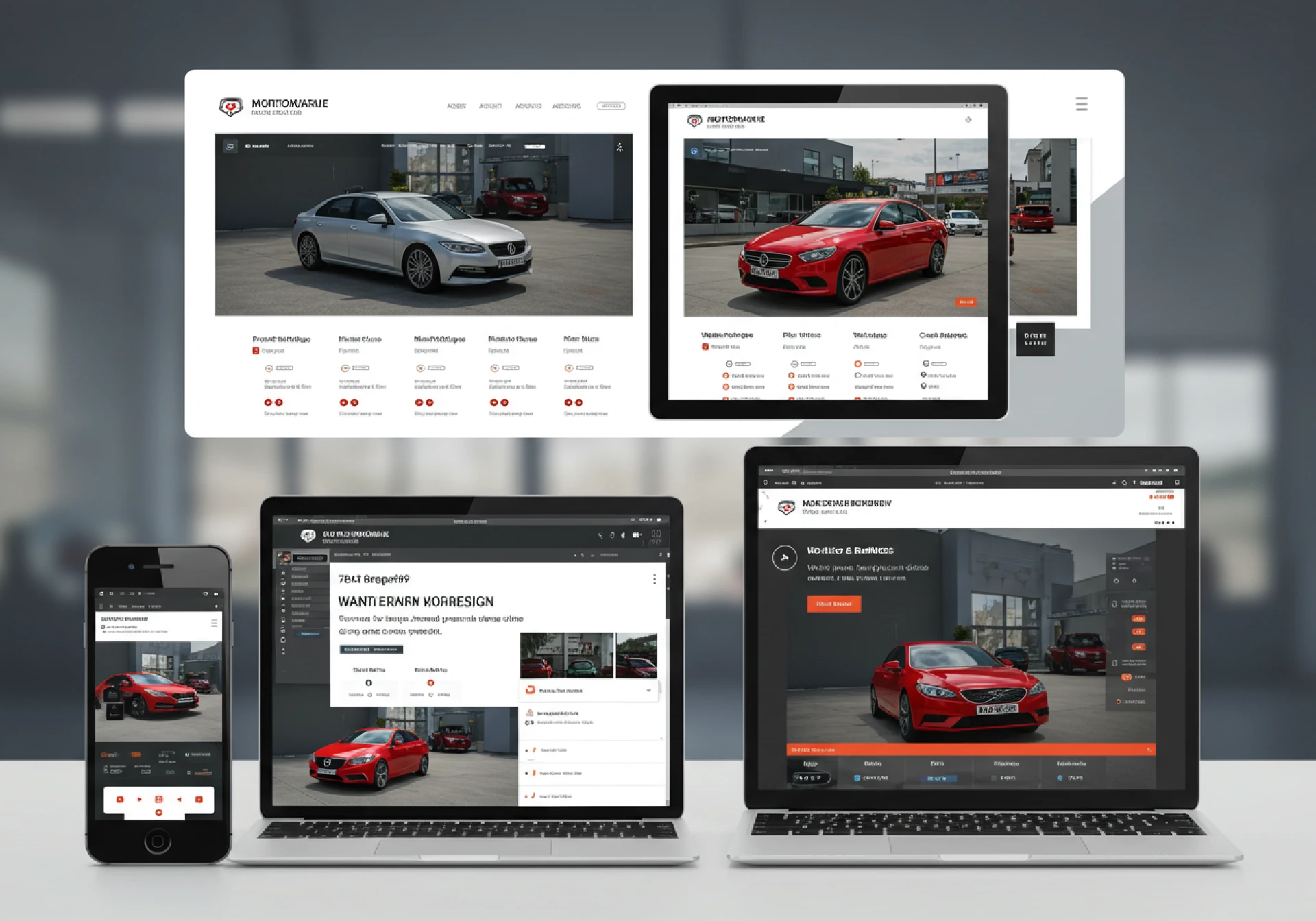
In today’s fast-moving digital world, your dealership’s website is your online showroom. More than 65% of car buyers browse vehicles on their smartphones before ever visiting a lot. This makes responsive design—a site that adapts seamlessly to different screen sizes—not just important, but essential. For auto dealers, a mobile-first approach ensures customers have a smooth, engaging experience from the very first click.
Why Responsive Design Matters for Auto Dealer Websites
1. Car Buyers Are Mobile-First
Most potential buyers start their car search on their phones. If your site loads slowly or looks clunky on mobile, they’ll bounce to a competitor.
2. Boosts Search Engine Rankings
Google prioritizes mobile-friendly websites in its search results. A responsive design not only improves user experience but also helps dealerships rank higher on Google.
3. Builds Trust and Professionalism
Your website is often the first interaction customers have with your dealership. A clean, mobile-optimized site shows that you value professionalism and customer experience.
Key Mobile-First Features for Auto Dealer Sites
Fast Loading Speeds
Car shoppers don’t wait. Optimize images, use caching, and invest in quality hosting to ensure your site loads in under 3 seconds.
Simplified Navigation
Mobile users should find vehicles, financing, and contact info with minimal clicks. Use clear menus, sticky navigation bars, and simple layouts.
Click-to-Call and Messaging
Integrating click-to-call buttons and live chat makes it easy for mobile users to contact your dealership instantly.
High-Quality Visuals Optimized for Mobile
HD photos, 360° car tours, and videos must be compressed and mobile-friendly without losing quality.
Integrated Search and Filters
Shoppers should be able to filter cars by make, model, price, and mileage directly from their phones.
Location and Map Integration
Mobile users often search “dealerships near me.” Embedding Google Maps and directions ensures easy access.
Mobile-First Design Best Practices
- Design for Small Screens First – Build layouts for smartphones before scaling up to desktops.
- Use Responsive Frameworks – Frameworks like Bootstrap or Tailwind CSS simplify creating mobile-first websites.
- Prioritize Thumb-Friendly CTAs – Place buttons like Book a Test Drive or Get Financing where they’re easy to tap.
- Leverage AMP (Accelerated Mobile Pages) – For blogs and landing pages, AMP improves loading speed and SEO.
- Test Across Devices – Always check performance on iOS, Android, and tablets to ensure consistent experience.
How Responsive Design Impacts Conversions
A mobile-first website isn’t just about design—it’s about sales conversions. When buyers can:
- Browse inventory easily
- Apply for financing online
- Contact sales instantly
They are more likely to trust your dealership and book an appointment.
Research shows that dealerships with mobile-optimized websites generate up to 50% more leads compared to those without responsive design.
Final Thoughts
Responsive design is no longer optional for auto dealer sites—it’s the standard. A mobile-first approach ensures your dealership website loads fast, looks great, and converts visitors into customers.
If you’re looking to upgrade your dealership’s website, explore Automotive Web Solutions—a platform dedicated to building responsive, mobile-first website themes for car dealerships.