
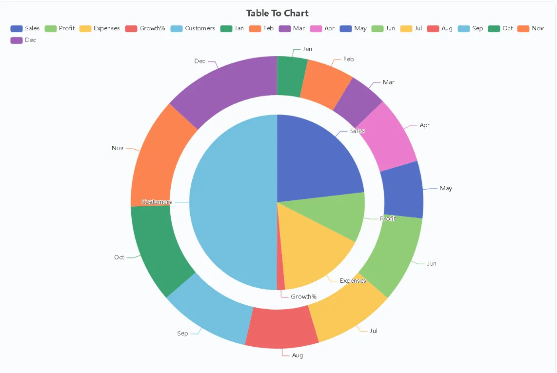
Most blog posts about traffic, conversions, or survey results still present their numbers as plain tables or quoted figures. Readers skim past them. A custom chart, on the other hand, stops the scroll: it turns a wall of numbers into a shape the eye can grasp in seconds. The problem is that many bloggers assume making charts requires design software or a paid analytics suite, so they publish text-only posts and leave engagement on the table. In practice, a lightweight workflow built around a free chart generator can take a post from a copied spreadsheet to a polished visual in under a minute.
Start From Data You Already Have
Bloggers already sit on chart-ready data: monthly traffic exports, affiliate earnings by program, email open rates by campaign, reader poll results. The fastest path is to paste data copied from Excel, Google Sheets, or any CSV source straight into an editor, or upload an existing xlsx or xls file and let the tool read the table structure automatically. There is no need to rebuild the dataset by hand or resize anything manually, because the editor expands as the data grows. Picking a chart type and rendering it is a single click, which means the step from raw numbers to a first draft visual takes less time than writing a caption. Because the whole thing runs in a web page with no sign-up wall, no email address, and no continue-with-Google gate, it fits naturally into a drafting session without breaking focus.
Match the Chart Type to the Story
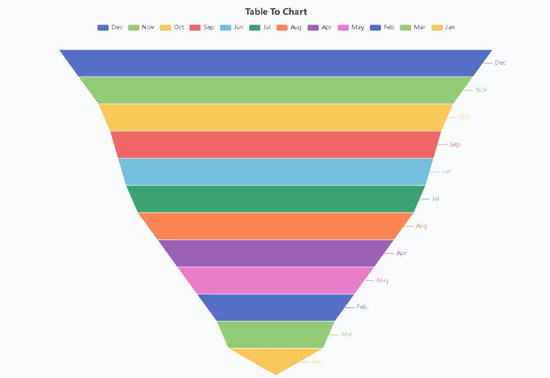
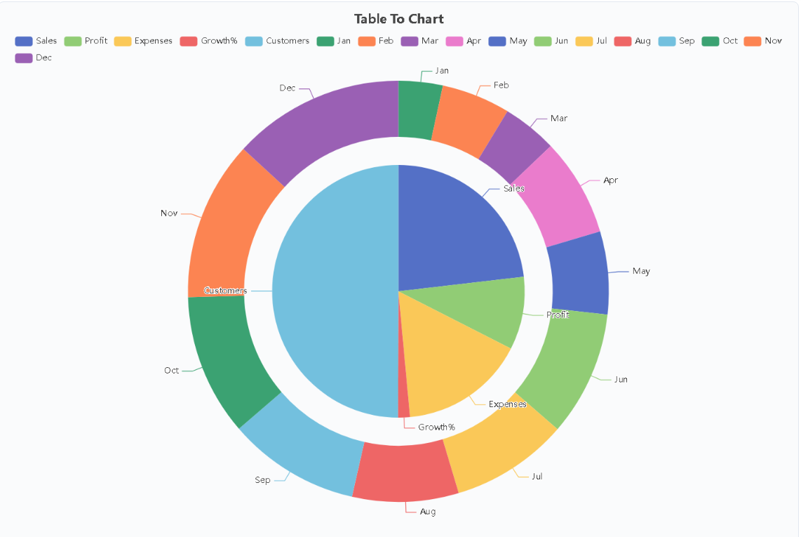
Different posts need different shapes. Trend pieces about traffic growth over a year read best as spline or line charts, while side-by-side comparisons of hosting plans or plugin benchmarks suit column and bar layouts. Share-of-traffic breakdowns across channels belong in pie or dual ring compositions, and survey answers with several dimensions can be shown with radar or heatmap views. Funnel charts work well for conversion walkthroughs, and scatter plots help when relating two variables such as word count and ranking position. Having eleven chart types available at no cost, covering trends over time, side-by-side comparison, and proportional composition, means the writer chooses the visual that fits the argument instead of squeezing every story into the one default style a spreadsheet offers. Trying two or three types for the same dataset before deciding is cheap, and it often reveals which framing readers will understand fastest.
Keep the Visual Clean and Honest
A chart earns trust only if it is readable and accurate. Keep labels short, use consistent scales, and resist the urge to decorate with 3D effects or extra colors that add noise rather than meaning. Exporting at high resolution matters here: a crisp image stays legible on retina screens and survives social media compression far better than a blurry screenshot. It also helps that the workflow described here deliberately avoids the usual strings attached to free tools, since there is no watermark stamped on the chart and no locked chart types hiding behind a pro tier. Readers see exactly what the data says, and the visual looks like a deliberate editorial choice rather than an afterthought. One practical habit worth adopting is generating the chart image with TableToChart early in the draft, then writing the surrounding paragraphs to explain what the shape shows, which keeps text and visual tightly aligned.
Publish Visuals That Keep Working
Charts keep paying off after publication. They get pinned, embedded, and shared with attribution far more often than plain paragraphs, and each reuse sends new readers back to the original post. They also lift time on page, because visitors pause to study a graphic they would have skimmed as a table. Privacy is a quiet bonus in this workflow: pasted data is never stored on any server, so traffic figures or revenue breakdowns used to build the visual do not linger anywhere after the image is downloaded. Saving the finished image and dropping it straight into slides, newsletters, or follow-up posts extends the same asset across channels with no extra work. For bloggers covering WordPress, SEO, or online business topics, turning one spreadsheet per post into one clear chart is a small habit that compounds into visibly more professional content.