
Before a customer reads a single word of your website, brochure or social post, they’ve already formed an impression from how those words look. The shape of your letters quietly signals whether your business feels modern or traditional, friendly or serious, affordable or premium. As a graphic design agency in London, we often see businesses with excellent products held back by mismatched, hard-to-read or overly decorative fonts. Typography is one of the most affordable ways to look professional, and the principles behind it are easier to apply than most people expect.
In this guide, we’ll explain what typography is, how different font styles shape perception and how to choose and use fonts that make your brand look polished and trustworthy.
What Is Typography, and Why Does It Matter?
Typography is the art of arranging text so it is readable, attractive and consistent. It covers your choice of fonts, but also size, spacing, weight, alignment and hierarchy.
It matters because:
It shapes first impressions: Fonts communicate personality before anyone reads your message.
It affects readability: Poor choices make people tired or frustrated, so they leave.
It builds recognition: Consistent type helps customers remember your brand.
It signals quality: Careful typography suggests care and attention to detail.
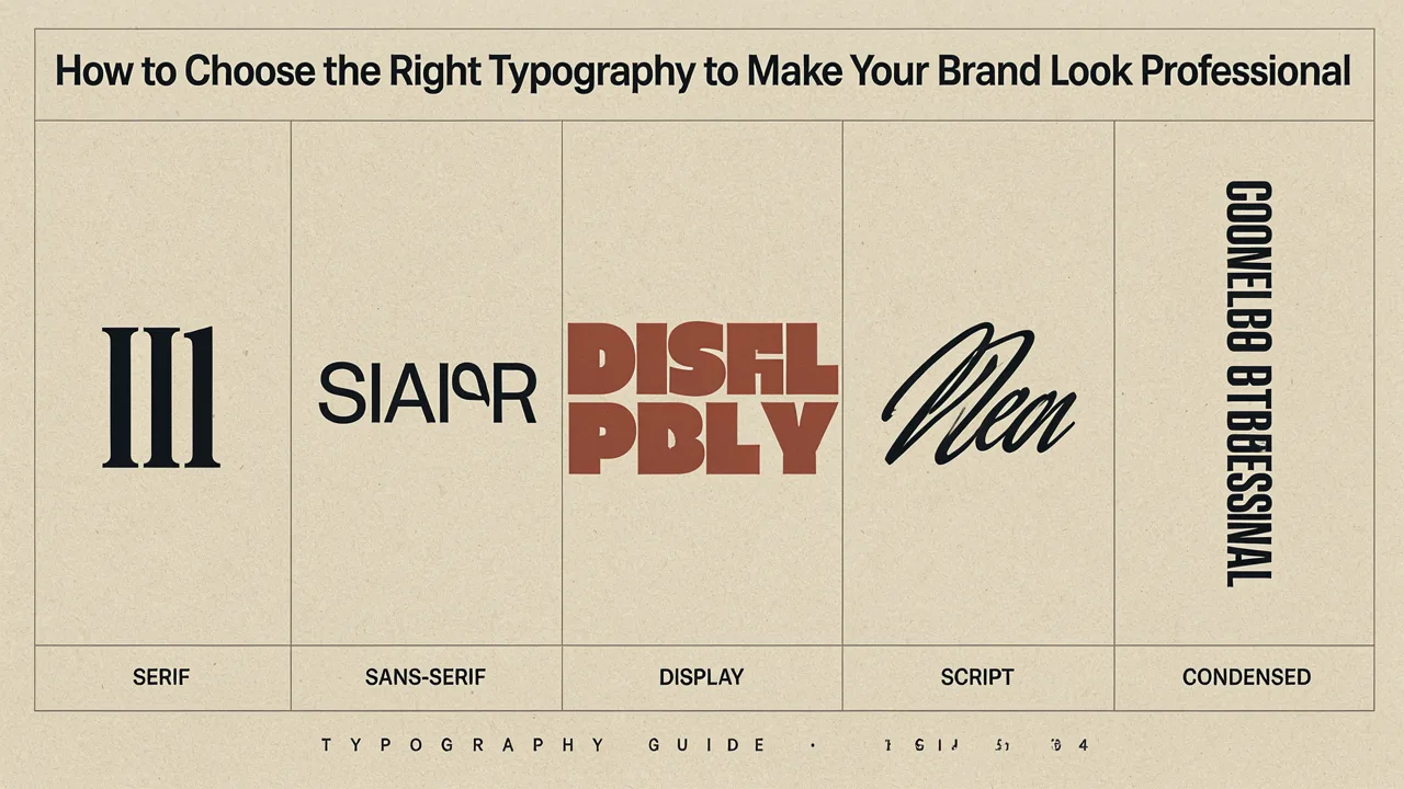
Understand the Main Font Categories
Knowing the basic families helps you choose with purpose.
Serif fonts: These have small strokes at the ends of letters, such as Georgia or Playfair Display. They often feel traditional, established and trustworthy, which suits law firms, publishers and heritage brands.
Sans serif fonts: These have clean lines without strokes, such as Helvetica, Inter or Montserrat. They feel modern, simple and approachable, and work well for technology, healthcare and startups.
Slab serif fonts: These have thick, block-like strokes and feel confident and sturdy. They can suit craft, outdoor and food brands.
Script fonts: These imitate handwriting, such as Pacifico or Lobster. They feel personal and elegant, but are harder to read, so use them sparingly.
Display fonts: Highly decorative fonts designed for large headlines. They add character but are rarely suitable for body text.
Monospace fonts: Every letter has the same width, giving a technical, coded appearance.
Match Your Fonts to Your Brand Personality
Start with your brand, not with fonts you happen to like. Describe your business in three or four words, such as “friendly, expert, reliable” or “bold, youthful, energetic”. Then choose type that reflects those traits.
Premium and elegant: Refined serifs or light, spacious sans serifs
Friendly and approachable: Rounded sans serifs with open shapes
Corporate and trustworthy: Clean sans serifs or classic serifs
Creative and playful: Distinctive display fonts for headlines, paired with simple body text
Technical and innovative: Geometric sans serifs or monospace accents
Consider your audience as well. A children’s brand, a law firm and a fitness studio will each need a different feel.
Limit Your Font Choices
One of the quickest ways to look amateur is to use too many fonts. A good rule is to use two, or at most three, in your brand.
Heading font: Used for titles and key messages. It can carry more personality.
Body font: Used for paragraphs. It should be highly readable.
Accent font (optional): Used sparingly for quotes, labels or special highlights.
You can also use a single font family with different weights, such as light, regular and bold, which creates variety while staying consistent.
Pair Fonts Carefully
Good pairings balance contrast and harmony.
Pair a serif with a sans serif: This classic combination gives clear distinction between headings and body text.
Avoid pairing similar fonts: Two fonts that are almost the same look like a mistake.
Keep one font as the star: Let one be expressive and the other be quiet.
Check the mood: Both fonts should support the same personality.
Use families designed together: Many font families include matching serif and sans versions.
Prioritise Readability
A beautiful font that people can’t read doesn’t help your brand.
Choose clear letterforms, especially for body text
Avoid thin or ultra-light fonts for small sizes
Use sufficient contrast between text and background
Keep line lengths comfortable, roughly 50 to 75 characters per line
Set generous line spacing, often around 1.4 to 1.6 times the font size
Don’t set long paragraphs in capitals, italics or script fonts
Test your type on different screens, in print and at different sizes. Small mobile screens reveal weaknesses quickly.
Build a Clear Hierarchy
Hierarchy guides the reader’s eye by showing what matters most. Create it with size, weight, colour and spacing.
Headline: Largest and boldest
Subheadings: Smaller, but clearly distinct
Body text: Comfortable and consistent
Captions and notes: Smaller and lighter
Keep the system consistent across pages. If every heading looks different, visitors lose their sense of order.
Consider Practical Details
Licensing
Many fonts require a licence for commercial use, especially in print, apps and websites. Check the terms before you commit, because using a font without the right licence can lead to fees or legal trouble. Google Fonts offers many open-source options that are free for commercial use.
Website performance
Custom fonts can slow your site if they’re heavy. Choose only the weights you need and use modern formats such as WOFF2.
Language support
If you serve customers who use accents, symbols or other alphabets, make sure your font includes the characters you need.
Fallback fonts
Specify safe alternatives for systems that can’t load your chosen font so your layout still looks acceptable.
Accessibility
Aim for strong contrast and sensible text sizes, typically at least 16 pixels for body text on websites. Clear typography helps people with visual impairments and benefits everyone.
Keep Typography Consistent Everywhere
Use your chosen fonts across all touchpoints:
Website and landing pages
Social media graphics
Business cards and stationery
Proposals, invoices and presentations
Packaging and signage
Email newsletters and signatures
Where a font isn’t available, such as in an email client, choose a close, safe alternative and document it in your brand guidelines.
A Simple Process for Choosing Your Fonts
Write down your brand personality words
Identify your audience and where the type will appear
Shortlist three to five fonts in the right category
Test them on real content, such as your logo, a headline and a paragraph
Check readability at small and large sizes
Confirm licensing and file formats
Choose a heading and body combination
Record sizes, weights and spacing in your brand guidelines
Common Typography Mistakes to Avoid
Using more than three fonts
Choosing decorative fonts for long text
Setting text too small or too light
Poor contrast between text and background
Inconsistent heading styles
Stretching or distorting letters
Following trends that don’t suit your brand
Ignoring how fonts look on mobile devices
Using unlicensed fonts
Typography doesn’t need to be complicated, but it does need to be deliberate. Choose fonts that reflect your personality, keep your selection small, prioritise readability and apply your choices consistently. Do that, and your brand will look more polished, feel more trustworthy and communicate clearly in every place customers meet it.
Frequently Asked Questions
How many fonts should a brand use?
Two is ideal, one for headings and one for body text. A third accent font can work if used sparingly. Alternatively, use one font family in several weights.
What is the best font for a professional look?
There’s no single answer. Clean sans serifs such as Inter or Helvetica suit modern brands, while classic serifs such as Georgia feel traditional. Choose what fits your personality and audience.
Can I use free fonts for my business?
Yes, many are free for commercial use, such as those on Google Fonts. Always check the licence terms to be sure they cover your intended use.
What is the difference between serif and sans serif?
Serif fonts have small strokes at the ends of letters and often feel traditional. Sans serif fonts have clean, simple ends and usually feel modern and approachable.
How do I know if a font is readable enough?
Test it with real content at actual sizes on different devices. If you or others struggle to read a paragraph comfortably, choose a clearer option.