
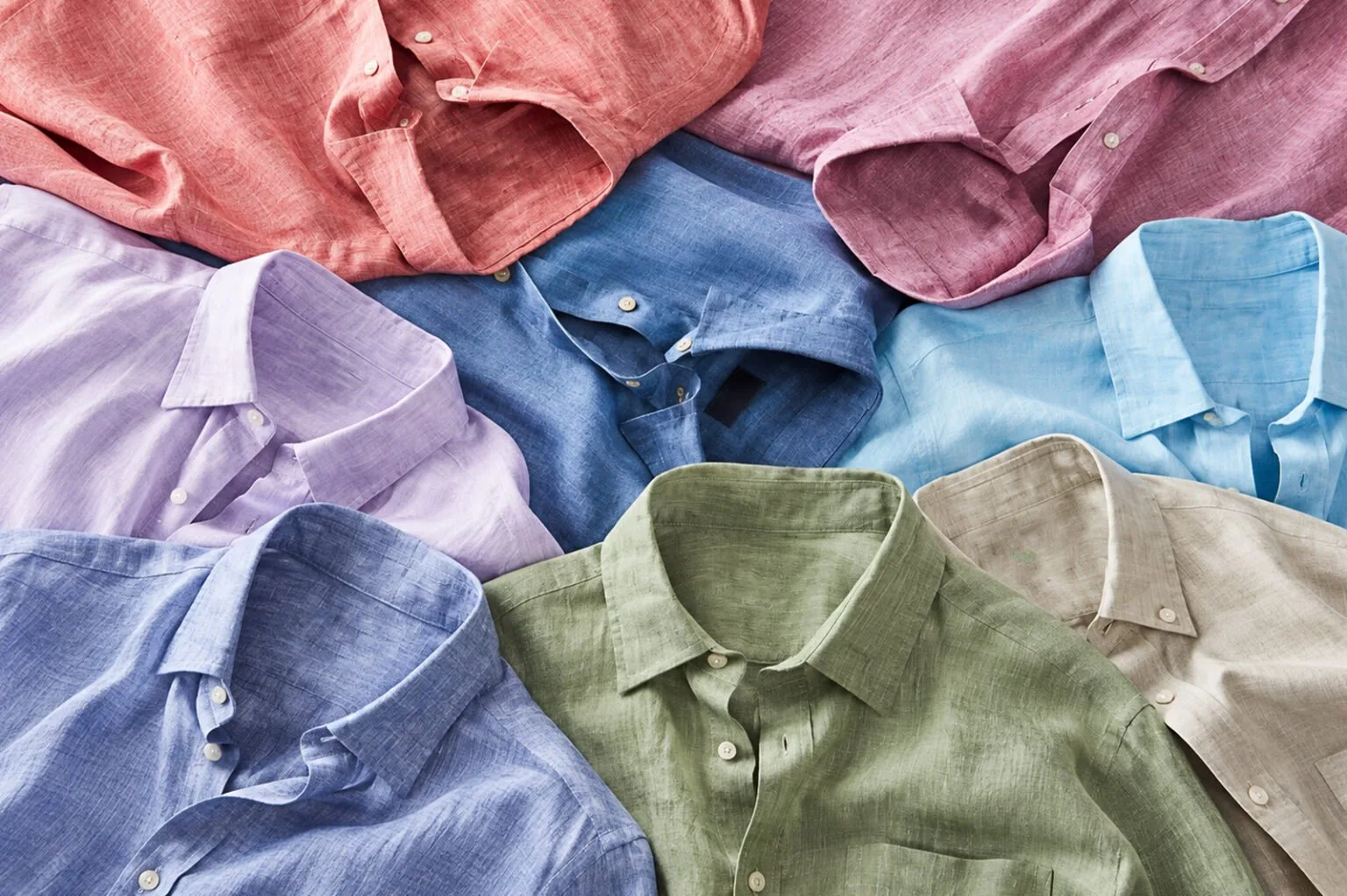
Colour plays a big role in how a shirt collection comes together. It is often one of the first things a buyer notices and it can influence which styles stand out on a retail floor or online.
For clothing manufacturers, colour selection also comes with practical questions. Which shades will have wider appeal? How many colours should a collection carry? Where can seasonal shades fit in? And how will those colours actually look once they are produced in fabric?
A commercial colour palette needs to answer these questions before production begins.
Begin With Colours That Have Consistent Demand
Most shirt collections need a dependable base. White, light blue, navy, grey and neutral shades tend to have a place in many wardrobes and can work across formal and casual shirts.
These colours can also support different fits, fabrics and price points. A manufacturer working on several styles can use a strong core palette across the collection, giving buyers familiar options while keeping production practical.
The exact colours will depend on the target market. A formal menswear brand may lean heavily towards whites and blues, while a casual collection could give more space to earthy or muted tones.
Bring in Seasonal Colour Carefully
Seasonal colours give a collection some freshness. Fashion forecasts, runway collections, retail launches and platforms such as Pantone can offer useful direction when planning upcoming ranges.
Manufacturers should look at these trends through the lens of their own customers. A colour forecast can suggest a direction, while the final selection needs to work for the market the collection serves.
Muted versions of a trending colour can sometimes have wider commercial use than its brightest form. They can sit comfortably alongside existing colours and remain useful across several styles.
Create a Palette That Works Together
Choosing ten attractive colours does not automatically create a strong collection. The shades need to relate to each other.
One useful approach is to build colour groups. A collection could have a classic blue-and-white group, an earthy group built around beige and olive or a softer group featuring powder blue, blush and lavender.
These groups give buyers a clear visual story. They also make it easier for manufacturers to develop several shirt styles within the same colour direction.
Think about the collection as a whole when reviewing the palette. If all the colours were displayed together, would they look like they belong to the same range?
Keep the Customer in the Picture
Colour preferences vary considerably between markets and customer groups.
A corporate shirting collection may require a larger selection of understated shades. A younger casualwear range may have more scope for stronger or unusual colours. A premium collection might work with deeper tones and subtle variations that give the fabric a richer appearance.
The intended customer should therefore be part of the colour discussion from the beginning. Retail positioning, climate, season and local preferences can all influence the final palette.
For manufacturers supplying different brands, this becomes especially important. The same fabric colour may suit one customer’s collection perfectly and have little relevance to another.
Look at Colour on the Actual Fabric
A colour reference can look very different once it is produced in fabric. The fibre, weave, texture and finish all affect the final appearance.
Cotton, for instance, can give a shade a different character depending on the construction and finish of the shirting fabric. The way the surface reflects light can also change how a colour appears in photographs compared with a physical sample.
This is where fabric sourcing becomes part of colour planning. Manufacturers should review colour on the actual fabric wherever possible before finalising a collection.
For garment makers looking for a broad selection of shirting fabrics, Cirocco Fabrics offers a range of cotton and linen qualities in different colours and constructions, giving manufacturers more flexibility when developing a colour-led collection.
Give Statement Colours a Clear Role
Every collection can benefit from a few colours that attract attention. These could be a deeper green, a rich burgundy, a strong blue or a seasonal shade that gives the range a more current feel.
The important question is how that colour will be used.
A statement shade may work particularly well on one or two shirt styles rather than across the entire range. It can create a point of interest while the core colours carry the broader collection.
This also helps manufacturers keep the range manageable. Strong colours can be tested in smaller quantities before becoming part of a wider collection.
Review the Palette Before Production
Once the colours have been shortlisted, look at the collection from a production and selling perspective.
Can the shades work across more than one shirt style? Do they complement the fabrics being used? Are there enough dependable colours to support the range? Does the collection have enough variation to give buyers a reason to look at the newer shades?
It is also worth checking how the colours will appear together in a catalogue, showroom or retail environment. A palette that works well on individual swatches may need adjustment when seen as a complete collection.
Make Colour Part of Collection Planning
A well-planned colour palette can give a shirt collection structure, variety and a stronger visual identity. It helps manufacturers decide where to rely on established shades, where to introduce seasonal colour and how different fabrics can bring those shades to life.
The best place to start is with the customer and the market, then build the colour range around what makes sense for both. Once the palette is clear, fabric selection, shirt styles and production decisions become much easier to align.