Practical, research-backed museum exhibit design principles that help cultural spaces hold attention and create lasting memories.
Walk into a great gallery and something shifts. You slow down. You lean in. A single object suddenly feels personal. That feeling is rarely an accident. It is the result of careful museum exhibit design, where space, story, light, and technology work together to shape how people feel and what they remember.
Museums sit at a turning point. The American Alliance of Museums counts more than 35,000 museums in the United States alone, drawing hundreds of millions of visits each year. Those visitors arrive carrying phones that serve instant, personalized content. To stay relevant, exhibits must do more than display objects.
This guide breaks down seven exhibit design rules that consistently work. Each one is simple to state and hard to master. Together, they explain why some galleries feel alive while others feel like storage with labels.
Why does museum exhibit design influence visitor engagement?
Because attention is limited, and design decides where it goes. Research compiled in Beverly Serrell's Paying Attention study, covering more than 100 exhibitions, found that most visitors spend under 20 minutes in a show and stop at only about a third of its elements. Good design accepts this truth. It earns attention rather than assuming it. You design for the glance first, then reward the curious.
The International Council of Museums describes museums as inclusive spaces for education, reflection, and shared knowledge. Strong design turns that mission into a lived experience. Immersive venues such as Paris's Atelier des Lumieres now wrap guests inside projected artwork, raising what audiences expect from every room they enter.
Seven museum exhibit design rules that earn lasting attention
These principles come from decades of practice across science centers, art galleries, and heritage sites. Together they separate forgettable rooms from exhibits people discuss for years.
1. Begin with one big idea
Every memorable exhibit starts with a single, clear message. Serrell calls this the big idea, one sentence that defines what the show is about. Objects and technology then serve that story. When the theme is muddy, visitors drift. When it is sharp, every label and screen pulls in the same direction.
2. Respect the visitor's limited attention
People scan before they read. Design for that habit. Lead with bold visuals and short headlines, then layer deeper detail for those who want it. Avoid crowding a gallery with competing elements. Editing is a design skill. What you remove often matters as much as what you keep.
3. Write labels visitors actually read
Wall text fails when it reads like a textbook. The Smithsonian's accessible design guidelines suggest keeping main labels to roughly 75 to 100 words, with about 55 characters per line and high contrast between text and background. Use plain language. Write in the present tense. Give the eye a clear place to begin.
4. Make museum exhibit design inclusive by default
Accessibility is not an add-on. It sits at the heart of good museum exhibit design. The Smithsonian advises seating in every gallery, clear sightlines for seated and standing guests, and information offered through more than one sense, including Braille and audio. Inclusive choices help everyone, from a curious child to a grandparent to a visitor reading in a second language.
5. Guide the journey with intuitive flow
A confused visitor stops learning. Strong layouts create a clear path, with well-lit routes and natural pacing. Designers balance intense moments with quiet ones to prevent fatigue. Sightlines hint at what waits ahead, drawing people gently forward without signs that bark orders.
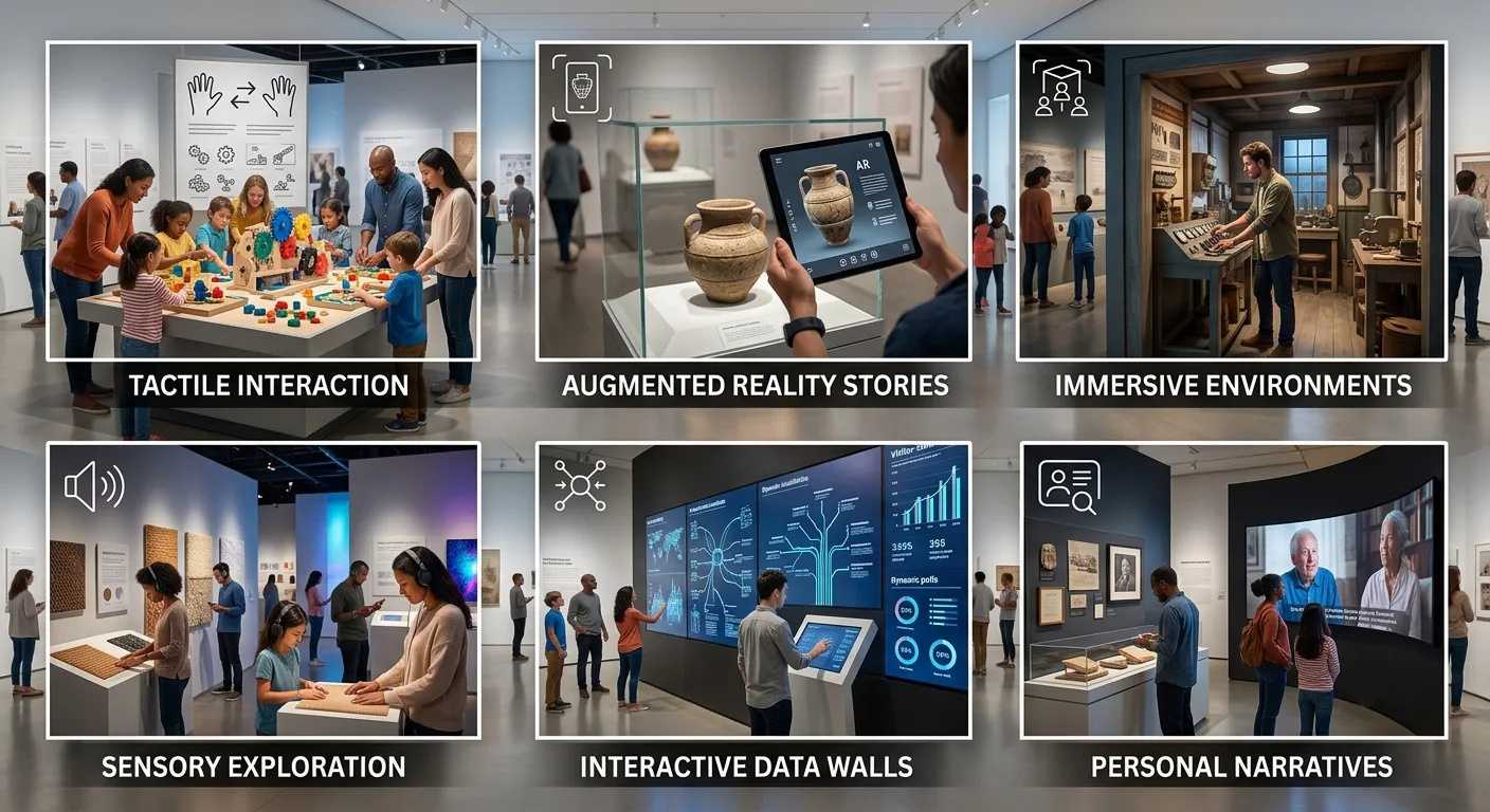
6. Turn viewers into participants
Hands-on moments build memory. When ViitorX created four interactive stations for the CSMVS "Network of the Past" exhibition in Mumbai, the team used screens to deepen the story, not distract from it. That approach to interactive museum exhibition design let visitors trace ancient trade routes on a glowing map and decode old scripts beside real artefacts.
The British Museum has tested similar ideas with design firm Ralph Appelbaum Associates, adding soundscapes and immersive layers to historic galleries. The rule holds steady: technology supports the object, never upstages it.
7. Test, measure, and refine
Great exhibits are built, then improved. Designers prototype with real visitors and watch how people behave. Serrell's tracking and timing methods reveal where attention fades. Digital feedback tools now capture honest reactions in seconds, replacing slow paper forms. The CSMVS project used this approach, giving curators real-time insight to keep the experience sharp.
How can museums create unforgettable exhibits?
By putting people first at every step. Start with a clear story. Edit hard. Make text readable and spaces welcoming. Then add interactivity and technology only where they serve meaning. The finest exhibits feel effortless because the hard choices happened long before opening day.
Final thoughts
Objects hold stories, but museum exhibit design decides whether anyone truly listens. Every rule above shares one belief: a museum is a quiet conversation between a visitor and an idea. When designers honor attention, welcome every guest, and invite people to take part, a single visit can spark curiosity that lasts for years. That lasting spark is the real measure of an exhibit done well.