Hospitals are among the most complex public buildings a person might ever enter. With multiple wings, floors, departments, corridors, and emergency exits, finding one’s way can become a daunting task—especially when someone is stressed or unwell. Signage in hospitals is not merely decorative: it is a vital information tool, a safety mechanism, and psychological support for patients, visitors, and staff alike.
In simple terms: signage is important in a hospital because it guides people accurately and quickly to their destinations, prevents confusion and delays, strengthens safety (through emergency and warning signs), supports efficient flow of foot traffic, reduces staff burden of giving directions, and contributes to a more positive patient and visitor experience.
Reasons Why Signage Matters in Medical Faculty
1. Wayfinding, Orientation, and Flow
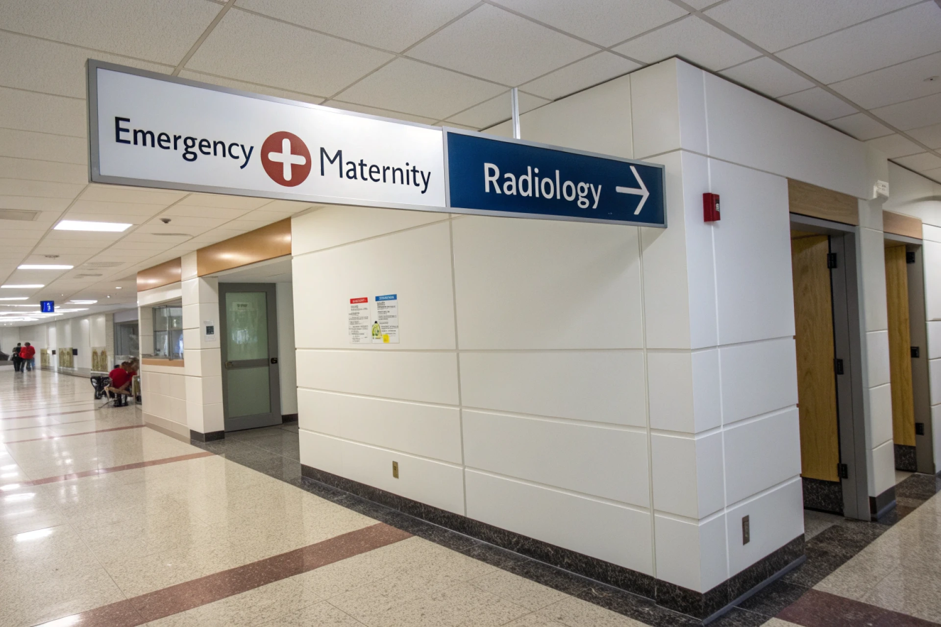
Hospital wayfinding is one of the main functional roles of signage. People entering a hospital often have no familiarity with its layout. They might need to find outpatient clinics, imaging suites, wards, restrooms, cafeterias, laboratories, or billing counters. In a poorly signed facility, many will get disoriented or take wrong turns, causing delays and frustration.
A study of public hospital signage implementation found that after introducing color-coded multilingual signage, 98% of surveyed participants were able to reach their destination—though many still double-checked with staff. PMC This shows that even well-designed signage does not eliminate all confusion—but it makes a dramatic improvement.
Effective signage reduces corridor congestion and misdirected traffic. It helps visitors and patients make decisions at the right “decision points” (junctions, intersections, elevator banks, stairwells). Good sign placement means that people see instructions exactly where they need them, not too early or too late.
2. Safety, Compliance, and Emergency Guidance
Signage isn’t just about guidance for routine movement. In emergencies (fires, evacuations, chemical spills) and critical zones (sterile areas, biohazard zones, MRI rooms) signage becomes a safety imperative. Fire exit arrows, muster point signs, “no entry,” and radiation warnings must be precise, conspicuous, and compliant with regulation.
In addition, signage guides infection control (e.g. isolation rooms), helps with patient flow separation (e.g. "clean" vs "dirty" zones), and marks staff-only areas. Without clarity, accidental access or wrong moves can compromise patient safety or breach HIPAA‐style privacy standards.
3. Reducing Staff Burden and Interruptions
In hospitals, staff are frequently interrupted to give directions. Each time a nurse, porter, or clinician stops to steer someone, that is time taken away from patient care. A well-designed signage system reduces such interruptions. The fewer “lost” visitors, the fewer staff time wasted.
4. Emotional Support and Reduced Anxiety
Walking into a hospital can be unsettling. People may already be anxious about their health or that of a loved one. The uncertainty of place compounds emotional stress. Clarity in signage provides not just orientation but psychological relief. It tells people: “you are in the right place, and help is available.” That sense of orientation can make a hospital visit feel more humane.
5. Branding, Reputation, and Patient Satisfaction
Hospitals increasingly compete—either for reputation, for referrals, or for regulatory incentive metrics. A clean, consistent signage system contributes to a positive first impression. It signals that the institution cares about details, organization, and visitor experience. That impression gets built even before clinical care starts.
Because patient satisfaction scores often tie into institutional reimbursement or rankings, every interaction—even one as “mundane” as signage—matters.
6. Accessibility and Inclusive Design
Good signage must serve a wide spectrum of people: those with low vision, mobility constraints, limited language skills, or cognitive impairments. That means signs need high contrast, large fonts, universal symbols, tactile or braille features, multiple languages, and logical consistency. Inclusive signage ensures no one is left bewildered.
In a large tertiary care hospital, precise hospital signage can make the difference between a calm, efficient visit and a chaotic one. Imagine a worried patient arriving for a critical imaging scan: if signs are confusing or poorly placed, they may wander hallways, come late, or end up distressed. But with a clear, color-coded, multilingual sign system guiding them, their path is smooth. That sense of orientation, clarity, and reassurance is what good signage must deliver consistently.
What Makes a Hospital Sign Easy to Understand — and What Can Go Wrong?
Key Design Principles
- Clarity and Legibility Use simple, sans-serif fonts, high contrast (dark text on light background or vice versa), and an adequate minimum character size for readability from distance. Avoid clutter or decorative typefaces.
- Consistency and Hierarchy Use consistent color schemes, symbols, iconography, and naming conventions throughout the hospital. Primary (major destinations), secondary (departments), and tertiary (rooms or offices) should follow an organized hierarchy.
- Strategic Placement Signs should be placed exactly at decision points—not too early and not too late. At junctions, elevator lobbies, stairwells, reception desks, and along corridors, the context determines what signs are needed.
- Progressive Disclosure Rather than dumping all information at once, reveal information step by step: first major zones, then sub-zones, then specific rooms.
- Redundancy and Multi-Modal Cues Use complementary cues — for instance, pictograms + text + arrows + color bands + floor patterns. This helps across language or literacy differences.
- Landmarks and Visual Cues Physical architecture, color zones, artwork, or thematic flooring help people “anchor” their location and orient themselves.
- Accessibility Incorporate tactile elements, braille, positioning at accessible height, and ensure signs do not obstruct mobility.
- Maintenance and Update Regular audits and updates are essential. Departments move, corridors shift; signage must keep pace or it becomes misleading.
What Can Go Wrong?
- Overcrowded signs with too much text
- Inconsistent naming (e.g. using different names for same area in different signs)
- Poor visibility — signs hidden by lighting, decorative elements, or placed behind clutter
- Sign placement too early (users can’t internalize) or too late (too late to make the decision)
- Neglecting multilingual or symbolic needs in diverse communities
- Failing to maintain or replacing faded, damaged or outdated signs
- Ignoring staff input and visitor usability testing
Conclusion
Signage in a hospital is far more than directional decoration — it is a foundational infrastructure that connects patients, visitors, and staff to places and peace of mind. When well designed, maintained, and integrated, hospital signage:
- Accelerates movement and reduces delays
- Frees staff from repetitive directions
- Enhances safety and emergency readiness
- Diminishes visitor anxiety
- Boosts institutional reputation and satisfaction metrics
- Serves all users, including those with disabilities or language barriers
In an age when every minute and every impression counts in healthcare, investing in a thoughtful signage system is not optional — it’s essential. Hospitals that treat navigation as a strategic design domain, rather than an afterthought, are the ones that deliver better experiences from the first footstep to the final discharge.