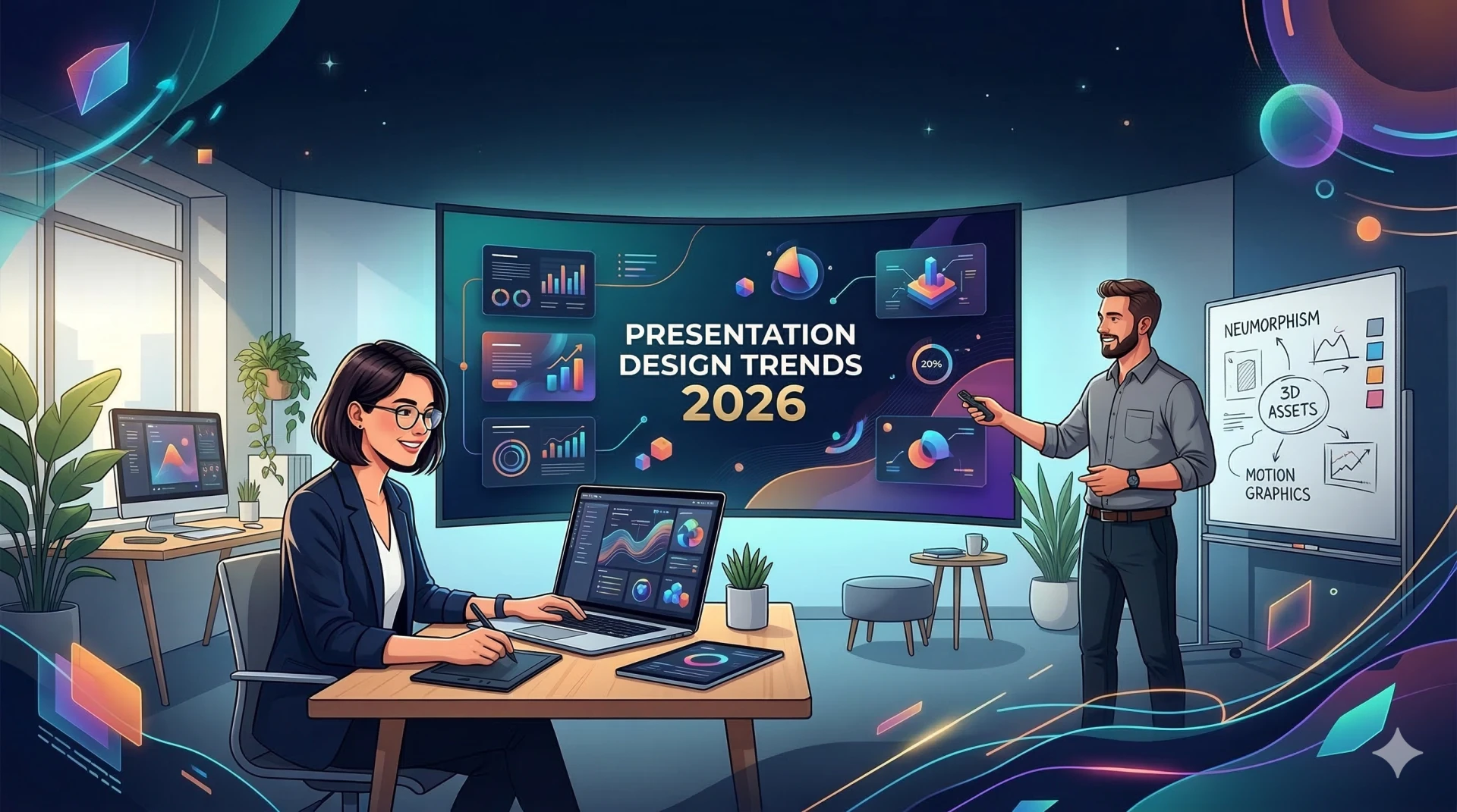
Every year brings predictions about the next big thing in presentation design. Bold colors! Minimalism! 3D animations! The problem is that most of these "trends" exist more in design blogs than in actual boardrooms. They look impressive in screenshots but fall apart the moment you try to use them for a quarterly business review or client pitch.
In 2026, the presentation design landscape is being shaped less by aesthetic preferences and more by fundamental shifts in how business presentations get created, distributed, and consumed. Presentation design in 2026 is no longer about decorating slides; it is about communicating ideas with clarity across multiple contexts. Slides are presented live, shared asynchronously, viewed on laptops, and skimmed on mobile screens.
Understanding what actually works right now, as opposed to what looks trendy in a design showcase, matters if you are building presentations that need to perform under real professional conditions.
The shift toward clarity over decoration
Slides are becoming less complicated, which is a good thing. Designers are removing unnecessary decorations and ensuring each presentation conveys a single clear message. White space, brief headlines, and planned images are doing the most work.
This is not minimalism for the sake of aesthetics. It is a direct response to how audiences actually consume business presentations in 2026. People are reading decks on phones while commuting, skimming PDFs between meetings, and reviewing slides asynchronously without a presenter to explain them. Complicated layouts that depend on verbal narration to make sense simply do not work anymore.
The practical application is straightforward. Every slide should communicate its core message without requiring explanation. If someone opens your deck on their laptop at midnight to prepare for tomorrow's meeting, they should understand what each slide is saying without you there to walk them through it. This is exactly why professionals are turning to AI PPT tools that prioritize clarity and structure over unnecessary decoration.
Typography as the primary visual driver
Text is the hero now. Headlines grow bigger and more expressive, paired with simple sans-serif companions. Variable fonts add rhythm and flexibility, letting you play with weight and width. Perfect for pitches, keynotes, and educational content where words carry weight.
This trend is showing up consistently across professional presentations because it solves a real problem. When text is the primary visual element, slides remain readable across devices and viewing contexts. A slide with large, clear typography works whether it is projected in a conference room, viewed on a laptop, or read on a phone screen.
For professionals building presentations regularly, how to write prompts for expert-level decks with AI-powered PPT tools becomes essential knowledge because the quality of AI-generated slides depends heavily on how clearly you describe what you need, including typographic hierarchy.
Design systems replacing one-off templates
In 2026, presentations are treated as brand assets, not disposable files. Design systems help teams maintain consistent style across every slide, automate design rules, and ensure visuals, fonts, and colors adhere to a cohesive look even for complex data visualization charts.
The shift from templates to systems is happening because large organizations finally recognized that brand consistency across hundreds of decks matters more than giving every team creative freedom to design their own slides. When presentations go to clients, investors, or leadership, they need to look like they came from the same company.
Slidely AI is built around exactly this principle. As an inbuilt AI presentation tool working natively inside PowerPoint, it learns your existing brand and enforces it automatically across every deck. The output does not just follow your brand guidelines; it replicates the actual visual language your team already uses.
Mobile-first slide design
Executives are reading your decks on iPhones, not projectors. The vertical slide format in 9:16 aspect ratio is the fastest-growing category in 2026. Designing for mobile means larger fonts and less text. Research shows that 47% of initial outreach decks are now viewed on mobile devices.
If your slides were designed assuming they would be projected on a screen, they are failing nearly half the time they get opened. The fix is not complicated but it does require rethinking layout conventions that have been standard for decades. Larger text, simpler layouts, and fewer elements per slide are not aesthetic choices. They are functional requirements for slides that need to work on small screens.
This is where an AI PPT tool becomes invaluable, automatically optimizing layouts for readability across different screen sizes without requiring manual adjustments for every presentation format.
Data simplification over data dumping
Copy-pasting a screenshot of an Excel sheet is now considered a presentation crime. The trend for 2026 is data simplification, using clean Donut Charts, Sankey Diagrams, and simplified Funnels to show only the data point that matters.
This connects directly to the broader clarity trend. Audiences in 2026 do not have the patience or the cognitive bandwidth to decode complex data tables during a presentation. They want to see the insight, not the raw numbers that support it. Data visualization tools are now employed by over 50% of presenters to make complex data more understandable.
The professionals who understand this are focusing their slides on the single number or trend that actually matters, then making the supporting detail available in backup slides or appendices. An inbuilt AI presentation tool can automatically transform complex datasets into clear, focused visual insights without hours of manual chart building.
Dark mode as a professional standard
Dark mode reduces eye strain and makes neon accents pop. It is the professional standard for tech pitches and presentations in dimly lit boardrooms. Dark-themed presentations are becoming more popular as screen fatigue becomes a bigger issue. The high contrast themes help reduce eye strain, making presentations well suited for projectors or huge screens.
This is another trend driven by actual usage conditions rather than aesthetics. People are spending more time looking at screens than ever before, and presentations that reduce visual fatigue are appreciated. For decks that will be presented in conference rooms with projectors, dark backgrounds with high-contrast text also simply perform better.
The human-centric design backlash
The heavy influence of AI, AR technology, and gaming in our lives may ironically be driving a bit of a backlash away from hi-tech design. Creative is starting to index more heavily on organic, analog, realistic, human-centered design. 2026 is being called the Year of Imperfect by Design, a creative rebellion where imagination rules, curiosity expands, and creators bend AI to their own style, sparking a more human era of visual expression.
This manifests in professional presentations as a move away from overly polished, obviously AI-generated slides toward designs that feel more crafted and intentional. AI-powered slide recreation addresses this directly by improving existing slides rather than generating generic new ones, preserving the human decisions and brand nuances that make presentations feel authentic.
Accessibility as a design requirement, not an afterthought
Accessibility-first presentation design ensures slides are readable, inclusive, and usable by diverse audiences. Accessible design improves clarity for everyone, not just users with disabilities.
This is no longer optional for professional presentations. Proper color contrast, readable font sizes, alt text for images, and logical content hierarchies are baseline requirements. The benefit extends beyond compliance. Slides designed with accessibility in mind are clearer, easier to follow, and more effective for every audience.
Modern AI PPT tools now include built-in accessibility checks, flagging potential issues with color contrast, font sizing, and content hierarchy before slides are finalized or shared.
What actually works for annual planning presentations
For teams managing strategic planning cycles, design trends matter less than structural clarity and reusability. Maximalist styles can leverage bold color palettes, playful typography, and layered backgrounds to give slides dimension and unique visual interest that keeps audiences engaged when presentations require sustained attention.
Best presentation templates for annual strategy and planning provides frameworks that incorporate these 2026 design principles without sacrificing the strategic depth that planning presentations require.
The bottom line for professionals
Presentation design trends in 2026 are being driven by how slides actually get used in professional contexts, not by what looks impressive in design portfolios. Clarity over decoration. Typography over complex graphics. Mobile-first layouts. Data simplification. Dark mode for projector compatibility. Human-centered design that resists generic AI aesthetics.
The professionals and teams who understand these shifts are building presentations that work across every viewing context, maintain brand consistency, and communicate clearly without requiring a presenter to explain them. The right AI PPT tool makes implementing these design principles automatic rather than manual, saving hours while ensuring every deck meets modern professional standards.
Ready to see how modern presentation design works in practice? Slidely AI is an inbuilt AI presentation tool working natively inside PowerPoint to help professionals create on-brand, accessible, mobile-ready presentations that actually work in 2026. Book a demo and experience the difference yourself.