Walk past two identical stand structures at any trade show, and you'll often notice one pulls people in while the other gets ignored entirely. The difference rarely comes down to layout or lighting alone. Sometimes it's something as simple as the surface finish. This small decision sits at the heart of good Exhibition Displays Design, yet it's one of the most overlooked details in the planning process.
Most exhibitors spend weeks debating booth size, graphics, and furniture placement. Few stop to ask whether their panels should be matte or glossy. But finish choice changes how light behaves, how colours read from a distance, and how the entire stand feels under exhibition hall lighting.
Why Finish Decisions Get Pushed to the Bottom of the List
Finish selection usually happens last, almost as an afterthought once everything else is locked in. That's a mistake. The surface treatment affects how your branding photographs, how visitors perceive your colour palette, and even how scratches or fingerprints show up over a three-day show.
A panel that looks sharp on a designer's screen can behave completely differently under harsh venue lighting. Gloss surfaces bounce light aggressively. Matte surfaces absorb it. Neither is universally better, but each suits different booth conditions, and exhibition stand designers who understand this distinction can save clients from costly reprints or last-minute panel swaps.
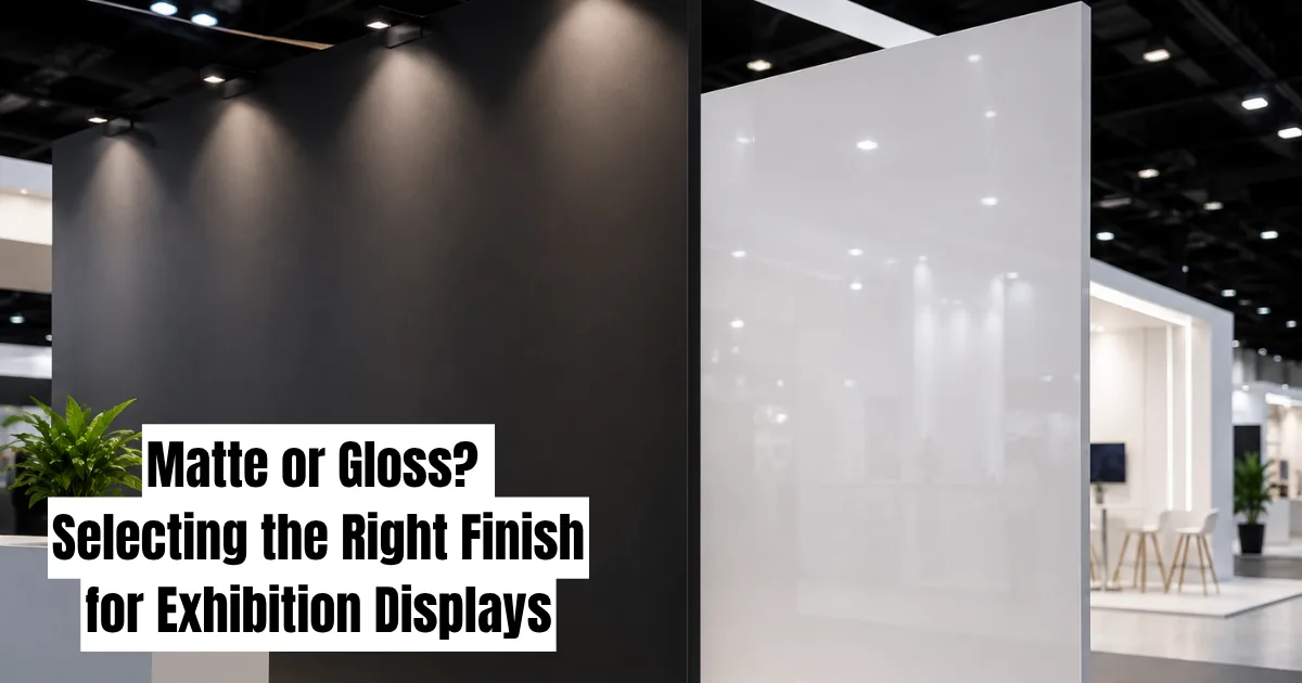
Gloss Finishes: Bold, But Demanding
Glossy surfaces have a reputation for looking premium. They make colours appear richer and graphics pop with a kind of polish that catches the eye from across the hall. For brands wanting a sleek, modern look, gloss often feels like the obvious choice.
But gloss comes with conditions. It reflects everything, including overhead spotlights, nearby screens, and even visitors walking past. On a busy show floor with mixed lighting rigs, that reflection can wash out text or create distracting glare exactly where you want attention.
Fingerprints and dust also show up faster on gloss. A stand that looked flawless during setup on day one can look smudged and tired by the final afternoon of a three-day event. This matters more than people expect, since exhibition booth design is judged constantly, not just during the opening hour.
Matte Finishes: Quiet Confidence
Matte surfaces handle light differently. Instead of bouncing it back sharply, they diffuse it, which softens reflections and reduces glare. This makes matte a practical choice for stands positioned under direct lighting rigs or near windows with natural daylight streaming in.
Matte also tends to hide minor surface imperfections better. Scuffs from transport, light scratches from handling, or dust accumulated over a long show day are far less visible on a matte panel than a glossy one. For exhibitors running multi-day shows, that durability advantage adds up.
The trade-off is that matte can sometimes read as flatter or less vibrant, particularly with bold colour blocks or photography-heavy graphics. Reds can look slightly muted, blacks can lose some depth. A skilled stand builder will often test print samples under venue-style lighting before committing, because what looks fine in a print shop doesn't always translate to a 4,000 square foot exhibition hall.
Matching Finish to Brand and Booth Position
There's no single correct answer here, which is exactly why this decision deserves real thought rather than a default setting. A few practical considerations help guide the choice:
Lighting conditions matter more than personal preference. A corner stand near large ceiling lights will behave differently than an island stand under controlled spotlighting. Visiting the venue layout or reviewing the floor plan in advance gives useful clues about what kind of light your panels will face.
Brand tone plays a role too. Tech and finance brands often lean toward matte for a more understated, professional feel. Consumer products, automotive, and lifestyle brands frequently choose gloss to create energy and visual impact. Neither rule is fixed, but it's a useful starting point during early custom exhibition stands planning.
Photography and video coverage should factor in. If your stand will be filmed or photographed for marketing afterward, gloss can create reflection problems that are hard to fix in post-production. Matte tends to photograph more reliably under mixed lighting.
Mixing Finishes for a Layered Look
Plenty of stands don't pick one or the other; they combine both. A matte backdrop with glossy accent panels around a product display, for instance, creates visual hierarchy without overwhelming the eye. The matte recedes slightly, letting the glossy element draw focus exactly where the brand wants it.
This layered approach has become more common in recent exhibition stand design work, particularly for stands featuring product launches or hero displays. It allows designers to control attention deliberately rather than relying on a single flat surface treatment across the entire structure.
That said, mixing finishes requires careful planning around material costs and production timelines. Two finish types often mean two separate print runs, which affects budget and lead time. This is where early coordination between design and production teams genuinely pays off.
Practical Testing Before Production
One habit that separates experienced exhibition stand manufacturer teams from rushed jobs is sample testing. Producing a small physical sample panel and viewing it under lighting similar to the actual venue catches problems before they become expensive mistakes.
Screen colours and printed colours rarely match perfectly, and finish amplifies that gap further. A digital mockup showing a deep navy blue might print as something closer to grey-blue once matte laminate is applied. Catching that on a sample swatch costs almost nothing. Catching it after full production is a different story entirely.
Finish Affects More Than Looks
Beyond aesthetics, finish choice has practical implications for maintenance and reuse. Stands built for multiple shows across a year need surfaces that hold up to repeated handling, transport, and storage. Matte laminates generally tolerate this better, while gloss surfaces may need more careful packing to avoid visible scratching.
For exhibition stand supplier teams managing reusable modular systems, this becomes a real cost consideration. A finish that needs replacing after two shows isn't actually saving money, even if the upfront print cost was lower.
Bringing It All Together
Matte versus gloss isn't a cosmetic afterthought tacked onto the end of a design brief. It influences how graphics read under venue lighting, how a stand holds up across a multi-day event, and how consistently a brand's colours translate from screen to show floor. Treating finish as a strategic part of exhibition stand design, rather than a last-minute checkbox, tends to produce stands that look sharper on day three exactly as they did on day one.
The next time a booth catches your eye for reasons you can't quite explain, there's a decent chance finish had something to do with it.