Introduction
Embroidery has always been more than decoration — it’s a statement of craftsmanship and brand identity. When done well, an embroidered logo on a shirt, hat, or jacket communicates quality and attention to detail. But before that design becomes a perfectly stitched masterpiece, it needs one crucial step — artwork preparation.
At TeePrints.in, we often meet clients who come with beautiful digital designs that simply don’t translate well to thread. The reason isn’t creativity — it’s preparation. Embroidery machines interpret art differently than printers do, so the artwork must be structured specifically for stitching.
Learn how to prepare artwork for embroidery: vector files, simple designs, proper fonts and colors, & fabric knowledge for perfect results.
This blog walks you through how to prepare artwork for embroidery step by step — ensuring clean lines, perfect colors, and professional results every time. Whether you’re a designer, marketer, or business owner, this checklist will help you achieve embroidery perfection.
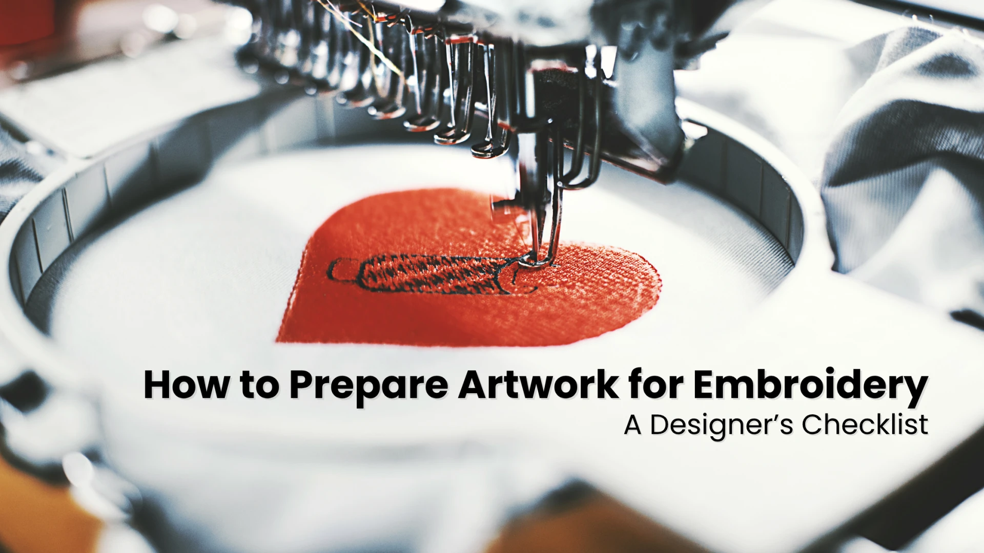
1. Start with a Clean, Vector-Based Design
Embroidery machines work best with precise, well-defined artwork. That’s why it’s important to begin with a vector file — formats like AI, EPS, or SVG — instead of a raster file like JPG or PNG.
Vector designs maintain sharp edges, scalable shapes, and clean lines regardless of size. They eliminate pixelation, which helps the embroidery digitizer convert every element into smooth, stitchable paths.
When preparing your design, simplify shapes and remove unnecessary gradients or shadows. Keep in mind that embroidery doesn’t reproduce fine fades or pixel details well. Solid, bold shapes are always more effective.
By starting with a vector file, you give the machine a clear, predictable pattern to follow — reducing errors and improving the final stitch quality.
2. Keep It Simple — Less Is Always More
When it comes to embroidery, simplicity wins every time. Unlike digital printing, embroidery has physical limitations. The thread can only handle so much detail before small elements begin to blur or distort.
Designs that look perfect on a screen can become messy when stitched on fabric. Thin lines, tiny icons, or small text often lose clarity. For example, a delicate swirl in a logo might appear as a solid blob once stitched.
The rule of thumb? Bold, clean, and minimal. Avoid thin lines under 1 mm and tiny text smaller than 5 mm in height. Focus on clear, strong elements that can withstand thread tension and needle movement.
Simple designs not only stitch better but also look more professional and stand out more from a distance — especially for uniforms, promotional wear, or caps.
3. Choose the Right Fonts and Sizes
Typography can elevate or ruin an embroidered design. Fonts that are too thin, intricate, or decorative can be difficult for machines to render. Script fonts often result in overlapping or broken stitches.
To ensure legibility, use sans-serif fonts such as Arial, Lato, or Montserrat. These offer clean lines that stitch beautifully. The smallest readable letter height in embroidery is typically around 0.25 inches (about 6mm). Anything smaller may lose clarity.
If your design includes fine or cursive text, consider enlarging that portion or converting it into a block font. When in doubt, test a single sample. Every fabric behaves differently, and a test run ensures your text remains readable and sharp.
4. Pick Colors with Purpose
Unlike printing, embroidery thread doesn’t rely on ink mixing or gradients. Each color is represented by a specific thread spool, which gives the design a rich texture and sheen.
Before finalizing your artwork, select thread colors intentionally. Fewer colors usually mean a cleaner, more cohesive result. Also, keep in mind that thread reflects light — so your chosen shade might look slightly different under natural or studio lighting.
When designing, match your brand’s Pantone colors with the nearest available thread shades. For dark garments, use contrasting thread colors so the design pops. A white thread on navy fabric, for instance, always delivers a crisp, elegant finish.
By planning your color palette early, you’ll avoid last-minute surprises and ensure brand consistency across all embroidered items.