Custom BIC Lighters have become a popular and effective tool for businesses and brands looking to make a memorable impression. They are not just functional items; they are also portable marketing tools that travel wherever your customers go. A well-designed custom lighter can capture attention, communicate your brand identity, and create a lasting connection with your audience. But to achieve this, design matters. Here’s a comprehensive guide on how to create eye-catching Custom BIC Lighters that leave a strong visual impact.
Choosing the Right Colors and Logos
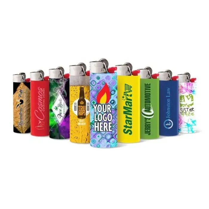
When designing Custom BIC Lighters, color selection is one of the most critical decisions. Colors convey emotion, influence perception, and can significantly impact how your brand is remembered. For example, red often communicates energy and excitement, while blue conveys trust and reliability. Choosing colors that reflect your brand identity will make your lighter instantly recognizable and aligned with your marketing message.
In addition to color, your logo is the centerpiece of your design. Ensure that your logo is clear and appropriately sized for the small surface area of a lighter. A logo that is too intricate may lose detail, while a logo that is too large may appear cramped. Simplifying your logo for the lighter’s surface while retaining brand recognition ensures that it remains visually appealing.
For businesses looking to make a bold statement, contrasting colors can enhance visibility and create a strong visual impact. Pair your primary brand colors with complementary tones to make your logo stand out and ensure readability even from a distance.
Font and Artwork Placement Tips
Text placement and font choice play a significant role in making Custom BIC Lighters visually effective. Given the compact size of a lighter, the font must be legible and simple. Avoid overly decorative fonts that may appear cluttered or unreadable. Sans-serif fonts often work best because of their clean lines and modern appeal.
When placing artwork or text, consider the lighter’s shape. Most BIC lighters have a slim rectangular surface, so vertical or horizontal alignment can change how the design is perceived. Placing your logo in the center usually ensures maximum visibility, but side placements can work well for creative or minimalist designs.
Artwork should complement the lighter’s overall aesthetic rather than overcrowd it. Small details can enhance the design, but too much detail can make the lighter look busy. Using patterns, icons, or minimalistic graphics alongside your logo can create a professional and polished look.
Trends in Custom Lighter Designs
Staying current with design trends can give your Custom BIC Lighters a modern edge and appeal to your target audience. One popular trend is the use of metallic finishes or glossy coatings, which make the lighter feel premium and catch the eye. Gradient colors and bold geometric shapes are also increasingly popular, giving lighters a contemporary and stylish look.
Another trend is personalization. Offering lighters with space for individual names, initials, or custom messages adds a personal touch, increasing engagement and brand loyalty. Similarly, limited edition designs tied to events, seasons, or collaborations can make your lighters collectible, further enhancing their value as a marketing tool.
Sustainable design is gaining attention as well. Using eco-friendly printing methods or promoting refillable lighters can appeal to environmentally conscious consumers. Brands that align with sustainability trends often enhance their reputation while demonstrating social responsibility.
Avoiding Common Design Mistakes
While creating Custom BIC Lighters, it’s easy to make mistakes that reduce the effectiveness of your design. One common error is overcrowding the lighter with too much text or graphics. Less is often more; a clean and concise design communicates your message more effectively than a cluttered one.
Another mistake is ignoring contrast. Poor contrast between text and background colors can make your logo or message hard to read. Always test your design to ensure visibility under different lighting conditions.
Choosing the wrong size for logos or text is another frequent issue. Elements that are too small may go unnoticed, while oversized designs can look cramped. Balancing proportion is key to maintaining aesthetic appeal.
Finally, neglecting alignment and symmetry can make your lighter look unprofessional. Take the time to ensure that all elements are evenly spaced and centered, providing a cohesive and polished appearance.
Conclusion: Effective Design Strategies That Make Your Custom BIC Lighters Stand Out
The ultimate goal of designing Custom BIC Lighters is to create a product that is both functional and visually appealing. Start by defining your brand identity clearly—what colors, logos, and fonts best represent your company? Use these elements consistently across all your designs.
Keep your design simple and focused. A well-placed logo, bold colors, and minimal graphics often make a stronger impression than a complex design. Pay attention to proportions, contrast, and alignment to ensure your lighter looks professional from every angle.
Consider the psychology of color and trends in modern design to stay relevant and appealing. Metallic finishes, gradients, and personalized elements can enhance your design and make your lighters collectible items.
Lastly, always test your designs before mass production. Mockups or prototypes allow you to evaluate readability, color accuracy, and overall aesthetics, ensuring that your final Custom BIC Lighters look exactly as intended.
When executed thoughtfully, your Custom BIC Lighters can become more than just a functional tool—they can be a memorable marketing asset that promotes your brand and connects with your audience. By following these design tips and strategies, you’ll create lighters that not only ignite but also inspire.