
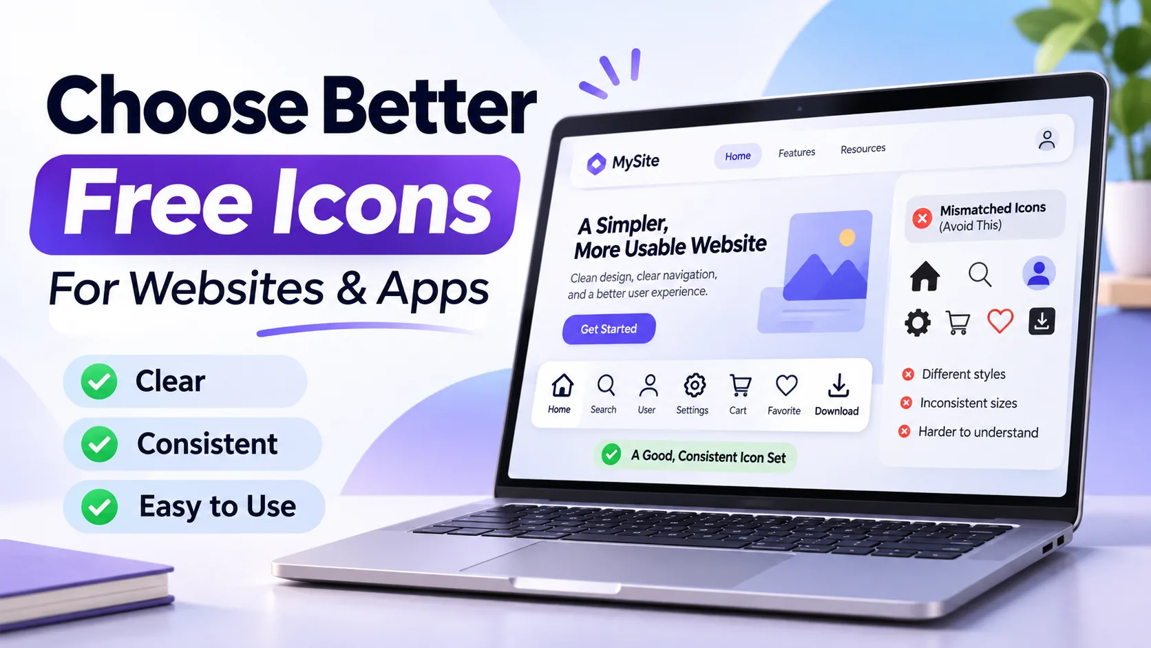
A website can look modern and still be difficult to navigate. Sometimes, the problem is surprisingly small: the icons.
A shopping cart that looks like a suitcase, a confusing menu symbol, or a collection of mismatched graphics can make visitors stop and think before clicking.
Good icon design helps people understand what an action means without needing extra instructions.
So how can you choose icons that look attractive while also making a website easier to use?
Start With Meaning, Not Appearance
When selecting an icon, the first question should be simple: will visitors understand it?
For example, a magnifying glass is commonly recognized as a search symbol. A shopping cart usually represents products selected for purchase.
These familiar symbols work because people have seen them repeatedly across different websites and applications.
Unfamiliar icons may look creative, but they can also create confusion.
Imagine replacing the usual search symbol with an abstract geometric shape. Users might need a label or explanation to understand its purpose.
Practical tip: Before choosing an icon, show it to someone unfamiliar with your project. Ask what they think it represents.
If they cannot identify it easily, consider a more recognizable symbol or add a text label.
Keep Your Icon Styles Consistent
One common design mistake is mixing different icon styles without a clear reason.
Imagine a navigation bar with a thin outline home icon, a bold filled search icon, and a colorful three-dimensional profile icon.
Each graphic might look good individually, but the collection can feel disconnected.
Instead, try using one visual style for related actions.
Outline Icons
Outline icons can work well for minimal interfaces and navigation menus. Their light visual appearance makes them useful when you want a clean layout.
Filled Icons
Filled icons appear more prominent. They can be useful for selected states or important interface elements.
Multicolor Icons
Multicolor icons can help distinguish content categories, especially in educational interfaces or visual dashboards.
The right choice depends on the purpose of your project. Consistency matters more than choosing the most decorative style.
Make Sure Icons Work at Small Sizes
An icon might look excellent when displayed at 100 pixels but become difficult to recognize at 20 pixels.
This problem is especially noticeable on mobile devices.
Icons with excessive detail, thin lines, or tightly packed shapes may become less clear when reduced.
Before publishing, test each icon at its intended size.
For a navigation icon, check whether its shape remains recognizable without zooming in.
Also consider the clickable area around the icon. A visually small symbol can still have a comfortable touch target.
These are separate design decisions: the graphic should remain clear, and the interactive control should be easy to use.
Choose the Right File Format
Another important decision is the download format.
Icons commonly come in formats such as SVG, PNG, and WebP.
SVG: Useful for scalable interface graphics because vector paths remain sharp at different sizes.
PNG: Helpful when a project requires a raster image, particularly one with transparency.
WebP: Useful for compact raster graphics on compatible websites and applications.
There is no single format that works best in every situation.
For most scalable interface icons, SVG is a practical starting point. For specific design tools or publishing systems, another format may be more suitable.
Where Can Designers Find Matching Icons?
Finding one useful icon is easy. Finding a complete collection that shares the same visual language takes more care.
When exploring an icon library, look for features that make consistency easier:
- Search by meaning or category.
- Browse icons by visual style.
- Select icons from the same pack.
- Preview graphics before downloading.
- Check available formats and licensing conditions.
For example, IamVector's free icon library organizes icons by categories, visual styles, and collections. It includes outline, filled, and multicolor options, along with icon download formats such as SVG, PNG, and WebP.
Having access to related designs in one place can reduce the time spent searching across unrelated sources.
The important part is not the size of the library alone. It is whether you can find a consistent group of icons that suits your project.
Do Not Forget Accessibility
Icons should support understanding, not become the only way people can navigate.
Some symbols are widely recognized, but others depend heavily on context.
For actions such as deleting a file, sharing content, or changing settings, consider whether a visible text label would help.
Buttons should also have accessible names so people using assistive technology can understand their purpose.
Color matters too. If you use a red icon to communicate an error, provide another indication such as an explanatory label.
A helpful icon is one that works for different people, devices, and interaction methods.
A Five-Minute Icon Review Before Publishing
Before adding a set of icons to your website, complete this simple check.
Minute 1: Check meaning. Can users recognize the purpose of each icon?
Minute 2: Compare styles. Do the graphics use consistent shapes and line thickness?
Minute 3: Test small sizes. Are important details still visible on mobile?
Minute 4: Check accessibility. Do interactive icons have meaningful labels and comfortable touch targets?
Minute 5: Review file formats and licenses. Are the files suitable for your project, and do their terms permit your intended use?
This short review can catch visual and usability issues before they reach your visitors.
Final Thoughts
Icons are small design elements, but they can have a noticeable effect on how people understand a website.
Choose familiar symbols, maintain a consistent style, test your designs on mobile, and make accessibility part of your process.
Finding free icons should be the beginning of that process, not the final step.
The real goal is to help visitors understand the interface quickly and confidently.