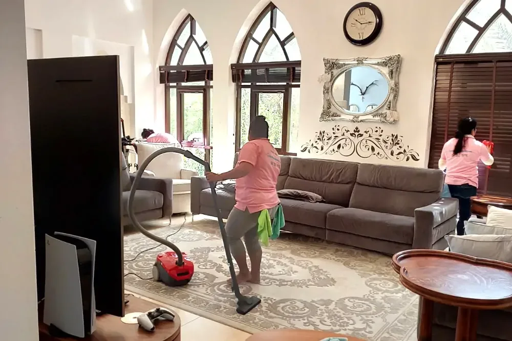
Event layouts look simple on paper. A bunch of boxes and circles, maybe a stage scribbled in the corner. But once people actually fill the space… everything changes. They bump into things, avoid some areas, cluster in others. Human behaviour has its own logic, and if your layout ignores that, the whole event feels a bit off. Not terrible, maybe, but not great either. And these small layout decisions matter even more when you’re stocking up on the right party supplies in Pittsburgh—because the space determines what you actually need, how much, and where it all belongs.
I’ve seen events with beautiful décor, expensive lighting, perfect menus—and still, guests wandered around looking confused or awkward. That’s a layout problem, not a budget problem. And it’s fixable if you understand how flow works. Let’s break it down, piece by piece, without overthinking it too much.
Why Layout Shapes How Guests Move
Every event has a natural rhythm. People arrive, pause, scan the room, and then make a decision about where to go. When the first ten seconds feel smooth, the whole night goes better. When they don’t? You can almost see people stiffen up.
A good layout creates little cues that guide folks without signs or forced direction. Things like a slightly open aisle, a clear view of the bar, or even just the way chairs sit at angles. You don’t need architectural diagrams; you need common sense with a bit of psychology sprinkled in.
The worst layouts usually share the same flaw: everything is packed tightly into one place. A DJ booth smashed into the entry point. Tables jammed into corners. Decor that’s gorgeous but physically blocks movement. You end up with traffic jams in places that should be welcoming. People avoid certain paths. Some areas stay dead all night, like they’re cursed.
Entrance Flow Sets the Mood
First impressions matter. If guests walk in and immediately stumble into a cluster of people, they feel crowded. And once they get that crowded feeling, it sticks. Fancy lighting can’t undo it.
A better move is leaving a breathing zone near the entrance. A little buffer space where guests step in, get their bearings, and don’t feel shoved. This also helps with photos. And many events underestimate how many people the entry area has to handle at once—families, groups, folks checking in, people adjusting outfits, all of that.
When the entrance is clean and open, the room feels five times more inviting. I’ve seen small rooms feel huge just because the first ten feet weren’t clogged.
The Mid-Zone: Where the Real Interaction Happens
Here’s where layouts really earn their keep—right in the middle third of the space. This section determines whether guests circulate or freeze. And this is also where décor pieces like Balloon Arches really come into play.
People naturally move through visual “gateways.” Balloon décor, arches, columns, even tall centrepieces—they signal a path without shouting directions. When placed right, they guide people deeper into the room, instead of leaving them hanging around the front.
But here’s the trick most planners miss: don’t overdo it. One strong anchor piece is enough. Two or three… maybe, depends on the room. But a maze of décor turns into an obstacle course, and nobody likes feeling like a lab rat weaving around party props.
Food stations, bars, and seating clusters should sit in this mid-zone too, but spaced enough so movement is natural. Not everything needs to be symmetrical. Real life isn’t symmetrical anyway.
If the middle of the room is too dense, guests slow down. They start bottlenecking. If it’s too empty, the event feels like a warehouse. The sweet spot is a scattered, intentional layout that looks casual but isn’t.
Conversation Zones and Collision Points
Some areas should attract people on purpose. Others should spread them out. This is where you create “interaction pockets.” A conversation pocket doesn’t need walls. A few angled chairs, a small cocktail table, maybe a soft divider like a floral piece. These pockets let people pause without blocking traffic.
Then you’ve got collision points. These are the spots where guests naturally cross paths—the bar, the dessert station, somewhere near the dance floor. You want these areas lively but not messy. A good rule: if two people stop to talk, they shouldn’t block the next ten behind them. Keep those paths a bit wider than you think.
Humans hate being bumped from behind, even lightly. Too many bumps, and people retreat to the edges. The energy drops. And yes, you can lose the atmosphere of an event simply because aisles were 10% too tight.
Seating Layout: The Silent Conversation Killer (or Saver)
Seating is always trickier than planners admit. Too much seating, the room feels dead. Too little, and people stand awkwardly or hover next to tables like vultures waiting for a spot.
Round tables encourage easy conversation but take up more space. Long banquet-style seating keeps people in linear conversations but reduces mingling. Lounge setups feel casual but can clog up corners if you don’t leave breathing room around them.
Angles help. Not everything should be straight. A slightly crooked layout, just a hair off from perfect, looks more natural and encourages movement. Think of it like a living room that’s been lived in—not showroom furniture lined up like a catalogue.
The Dance Floor and Entertainment Zone
This part depends heavily on your crowd. But in most events, the dance floor shouldn’t sit right at the entrance. It also shouldn’t be hidden in the back like a secret room. Somewhere central—but not central enough to block everything else.
Entertainment draws people, then disperses them. When you place the DJ or band near the room’s natural pivot point, guests flow around it like water. Too far left or right, and the whole room tilts. You’ll see people cluster on one side while the other half feels abandoned.
Conclusion
A great event layout isn’t about fancy diagrams or overthinking every inch of space. It’s about understanding how people move, how they gather, and honestly, how easily they get annoyed when they can’t. Your décor, your seating, your entry, all of it play into how guests interact. And yes, even the smallest decision—like where you put your décor, how you use party supplies in Pittsburgh, or whether you drop in one bold Balloon Arch—can shift the vibe of the entire night
.
Good layout just feels right. Not perfect, not overly polished. Just natural. When guests feel comfortable moving, they talk more, laugh more, and stay longer. And that’s what makes an event feel alive.