
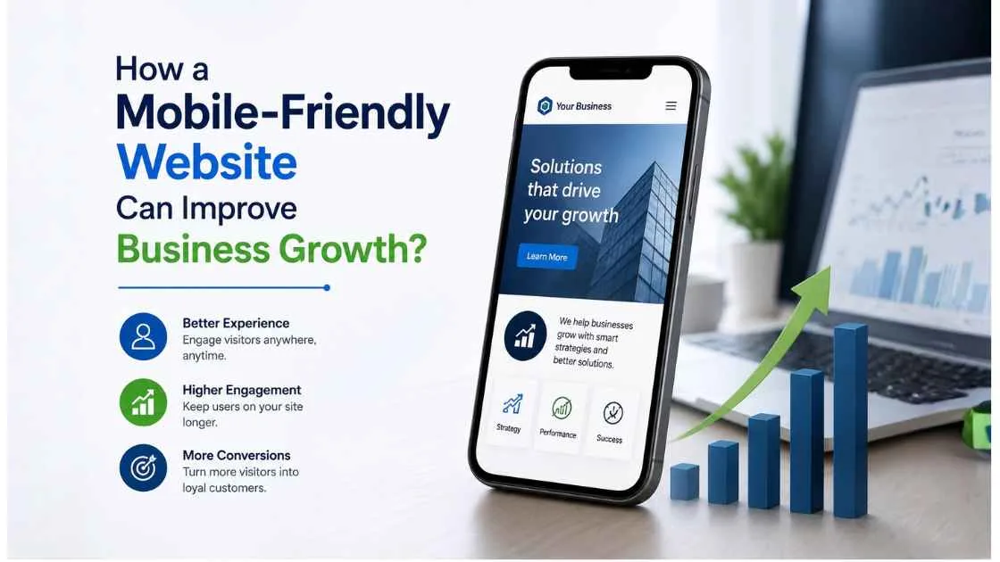
Summary - A mobile-friendly website can support business growth by making it easier for smartphone users to find information, trust a business, contact the company, and complete actions such as enquiries, bookings, purchases, or calls. Responsive design, fast loading speed, simple navigation, readable content, clear calls to action, and mobile SEO can improve the customer journey. For local businesses in PCMC, mobile optimization is especially valuable because customers often search for nearby products and services using smartphones.
A potential customer may discover a business while travelling through Wakad, searching from Pimpri, comparing service providers in Chinchwad, or looking for a nearby company in Bhosari. In each situation, the first interaction may happen on a smartphone.
If the website is difficult to use on that small screen, the business can lose the opportunity before the customer even makes an enquiry.
That is why mobile-friendly website design is no longer just a technical preference. It is an important part of customer experience, online visibility, lead generation, and business growth.
What Is a Mobile-Friendly Website?
A mobile-friendly website is designed to work properly across smartphones, tablets, laptops, and desktops.
A responsive website automatically adjusts its layout according to the user's screen size. Text remains readable, images fit the available space, navigation is usable, and important buttons can be tapped without difficulty.
A mobile-friendly website should generally provide:
- Responsive layouts
- Readable typography
- Touch-friendly buttons
- Simple navigation
- Fast loading
- Properly optimized images
- Accessible forms
- Clear calls to action
- No unnecessary horizontal scrolling
The objective is straightforward: customers should be able to use the website comfortably regardless of the device they choose.
Why Is a Mobile-Friendly Website Important for Business Growth?
A website can receive visitors without producing meaningful business results. Growth happens when those visitors can easily understand an offer and take the next step.
A mobile-friendly experience reduces friction between discovery and conversion.
The process can look like this:
Mobile Search → Website → Information → Trust → Action → Lead/Customer
For example, someone searching for a local service may visit a website expecting to find pricing information, service details, reviews, and a phone number. If those details are difficult to access on mobile, the visitor may return to Google and choose another business.
A better mobile experience keeps the customer moving forward.
How Does Mobile-Friendly Design Improve Customer Experience?
Good mobile UX makes a website feel effortless.
Visitors should not have to pinch and zoom to read a paragraph or repeatedly open menus to find a contact page.
Important improvements include:
- Short and clear navigation menus
- Readable font sizes
- Proper spacing between buttons
- Easy-to-scan headings
- Short forms
- Visible contact information
- Fast access to important pages
- Clear next steps
A practical test is to open your website on your own phone and try to complete the action you want customers to take.
Can you find a service in a few seconds?
Can you call the business without copying a number?
Can you submit an enquiry without struggling with the form?
These simple tests often reveal usability problems that desktop testing misses.
Can a Mobile-Friendly Website Generate More Leads?
Yes, when mobile design is combined with a clear conversion strategy.
A mobile website should make high-value actions easy.
Depending on the business, these might include:
- Call the business
- Send a WhatsApp enquiry
- Request a quotation
- Book an appointment
- Submit a contact form
- Request a product demonstration
- Make a purchase
- Get directions
For example, an industrial business in Bhosari may need a simple Request a Quote form, while a healthcare provider in Pimpri may need an appointment button.
The best CTA depends on the customer's intent.
Instead of placing five competing buttons on one screen, give visitors one obvious next step.
Does Mobile-Friendly Design Improve SEO?
Mobile optimization is an important part of a search-friendly website, particularly because Google uses mobile-first indexing.
However, making a website responsive does not automatically guarantee high rankings.
SEO also depends on factors such as:
- Content relevance
- Website structure
- Search intent
- Technical SEO
- Internal linking
- Page speed
- Authority
- Helpful content
- Structured data
- Overall user experience
A mobile-friendly website helps ensure that the content users and search engines need to access is presented effectively on smaller screens.
This is particularly important for businesses competing in local search results.
How Does Website Speed Affect Mobile Visitors?
Mobile users may leave a page when it takes too long to load.
Common causes of poor performance include:
- Large uncompressed images
- Excessive JavaScript
- Too many third-party scripts
- Poor hosting
- Unoptimized CSS
- Inefficient plugins
- Lack of caching
Businesses should regularly review page performance and Core Web Vitals.
Image compression, efficient code, browser caching, reliable hosting, and careful use of third-party tools can all contribute to a faster experience.
Speed should be viewed from the customer's perspective, too.
If a person clicks a service page from a search result and has to wait several seconds before seeing useful information, the opportunity for conversion may already be disappearing.
How Can Mobile Optimization Help Local Businesses in PCMC?
Mobile optimization is particularly relevant to local businesses because customers frequently perform location-based searches from smartphones.
Consider a customer searching for a service in Wakad, Nigdi, Ravet, Punawale, Tathawade, Akurdi, or Chinchwad.
After seeing a business in search results, the customer may immediately visit its website.
The website should make local information easy to access, including:
- Address
- Service areas
- Phone number
- Directions
- Business hours
- Available services
- Local testimonials
- Enquiry options
Click-to-call and map functionality can be especially useful for businesses where customers prefer immediate contact.
Local SEO and mobile optimization therefore work well together: local search helps customers discover the business, while a good mobile website helps convert that discovery into action.
Why Does Mobile Design Matter for Voice Search?
Voice search is closely connected with mobile behavior.
People often use conversational phrases when speaking to search assistants.
Examples include:
- “Where can I find a web development company near me?”
- “Which restaurant is open near Pimpri?”
- “What digital marketing services are available in PCMC?”
Businesses can make their content more answer-friendly by addressing real customer questions directly.
Useful approaches include:
- Question-based headings
- Concise answers
- FAQ sections
- Natural conversational language
- Clear service and location information
- Descriptive page titles
- Structured data where appropriate
This structure can also make content easier for AI-powered search systems and answer engines to interpret.
How Does Mobile Design Support Google Ads and Social Media?
Paid advertising can drive visitors to a website, but the landing-page experience still determines what happens after the click.
Consider:
Advertisement → Mobile Landing Page → Offer → Trust Signal → CTA
If an advertisement promotes a particular service but sends mobile users to a generic homepage, the visitor has to work harder to find what they were promised.
A better approach is to create mobile-optimized landing pages that closely match the advertisement or social media content.
For example, a campaign promoting a specific service should ideally lead to a page explaining that service, demonstrating credibility, and providing a clear enquiry option.
How Does Mobile-Friendly Design Build Customer Trust?
Trust can be lost quickly when a website appears broken on a smartphone.
Customers may question the professionalism of a business if:
- Text overlaps
- Images are distorted
- Buttons do not work
- Pages load slowly
- Contact information is difficult to find
- The website looks outdated
A professional mobile experience should be supported by genuine trust signals such as:
- Customer reviews
- Testimonials
- Case studies
- Certifications
- Portfolio examples
- Business information
- Secure browsing
The design creates the environment in which these trust signals can actually be seen and understood.
How Does Mobile Website Design Differ Across Industries?
Different businesses have different mobile priorities.
B2B and Manufacturing
Industrial companies may need product specifications, technical documents, catalogues, certifications, and enquiry forms.
Healthcare
Healthcare websites should make services, practitioner information, appointment options, FAQs, and location details easy to access.
Retail and E-commerce
Customers need smooth product browsing, filters, product information, cart functionality, and checkout.
Restaurants
Mobile visitors often want a menu, location, opening hours, reviews, and reservation options.
Professional Services
Consultants and service businesses can use mobile-friendly service pages, case studies, testimonials, and consultation forms to generate enquiries.
This is why responsive design should be combined with industry-specific customer journey planning.
What Are Common Mobile Website Mistakes?
Businesses should watch for:
- Tiny text
- Complicated menus
- Slow pages
- Large images
- Difficult forms
- Buttons that are hard to tap
- Intrusive pop-ups
- Horizontal scrolling
- Missing contact options
- Poorly designed landing pages
- Desktop-only functionality
- Weak calls to action
Fixing these issues can improve the experience without necessarily requiring a complete website rebuild.
How Can a Business Make Its Website More Mobile-Friendly?
Use this practical checklist:
1. Test the website on multiple smartphones.
2. Simplify navigation so important pages are easy to reach.
3. Compress and optimize images without sacrificing useful visual quality.
4. Improve page speed by reducing unnecessary scripts and technical overhead.
5. Make CTAs obvious and easy to tap.
6. Shorten enquiry forms to request only essential information.
7. Improve content readability with short paragraphs and descriptive headings.
8. Add convenient contact options such as calls, WhatsApp, bookings, or quotations where relevant.
9. Check Core Web Vitals and technical SEO.
10. Track conversions to determine whether website improvements are producing business results.
Businesses that need professional implementation can evaluate a website development company in PCMC based on responsive development, technical SEO knowledge, performance optimization, UX expertise, security, scalability, and ongoing support—not simply the appearance of its portfolio.
Turn Mobile Traffic Into Business Opportunities
A mobile-friendly website should not be treated as a box to tick during development. It should be viewed as part of the customer's path from search to trust to enquiry.
For businesses serving PCMC, the opportunity is especially practical: customers may discover a company through local search and decide within minutes whether to call, enquire, visit, or move to a competitor.
If your website is difficult to use on a smartphone, start with the pages that matter most. Test your service pages, improve speed, simplify navigation, strengthen CTAs, and make contact options effortless.
Don't wait for customers to tell you your website is difficult to use. Test it yourself, identify the friction points, and turn your mobile website into a stronger source of enquiries and business growth.
Frequently Asked Questions
Why is a mobile-friendly website important for small businesses?
It helps smartphone users access information easily, improves usability, supports search visibility, and provides convenient ways to contact the business.
Does a mobile-friendly website increase leads?
It can increase conversion opportunities by reducing friction and making actions such as calls, enquiries, bookings, and purchases easier to complete.
Does mobile optimization help local SEO?
Yes. A strong mobile experience supports users performing location-based searches, while local SEO elements help search engines understand the business and its service areas.
How do I know if my website is mobile-friendly?
Test the website on different smartphones and review mobile usability, page speed, layout, navigation, and conversion actions. Performance tools can also help identify technical issues.
Should every business have a responsive website?
For most businesses, yes. Customers use a wide range of devices, so responsive design provides a more consistent and accessible experience.