Horror has always been one of the most visually powerful genres in cinema. Before audiences ever step into a theatre or hit play on a streaming app, they often experience fear through a single image—the poster. Horror movie film posters have a unique responsibility: they must terrify, intrigue, and immerse the viewer within seconds. Unlike other genres, horror posters thrive on psychological tension, symbolic imagery, and subtle visual storytelling. But what exactly makes these posters so unforgettable? Why do certain images stay etched in our minds long after the movie is over?
In this article, we explore the deep, fascinating design secrets behind the scariest horror movie film posters ever created. From colour psychology to typography tricks, from minimalist horrors to monster-driven intensity, these elements collectively form the blueprint for designing visuals that make hearts race. For collectors, designers, filmmakers, and fans alike, understanding these techniques reveals why horror poster art remains one of the most revered fields of graphic design.
1. The Power of Minimalism: When Less Creates More Fear
Some of the most chilling horror movie film posters are surprisingly simple. Minimalist posters tap into humanity’s oldest fear—the unknown. The less a poster reveals, the more the imagination fills in the gaps.
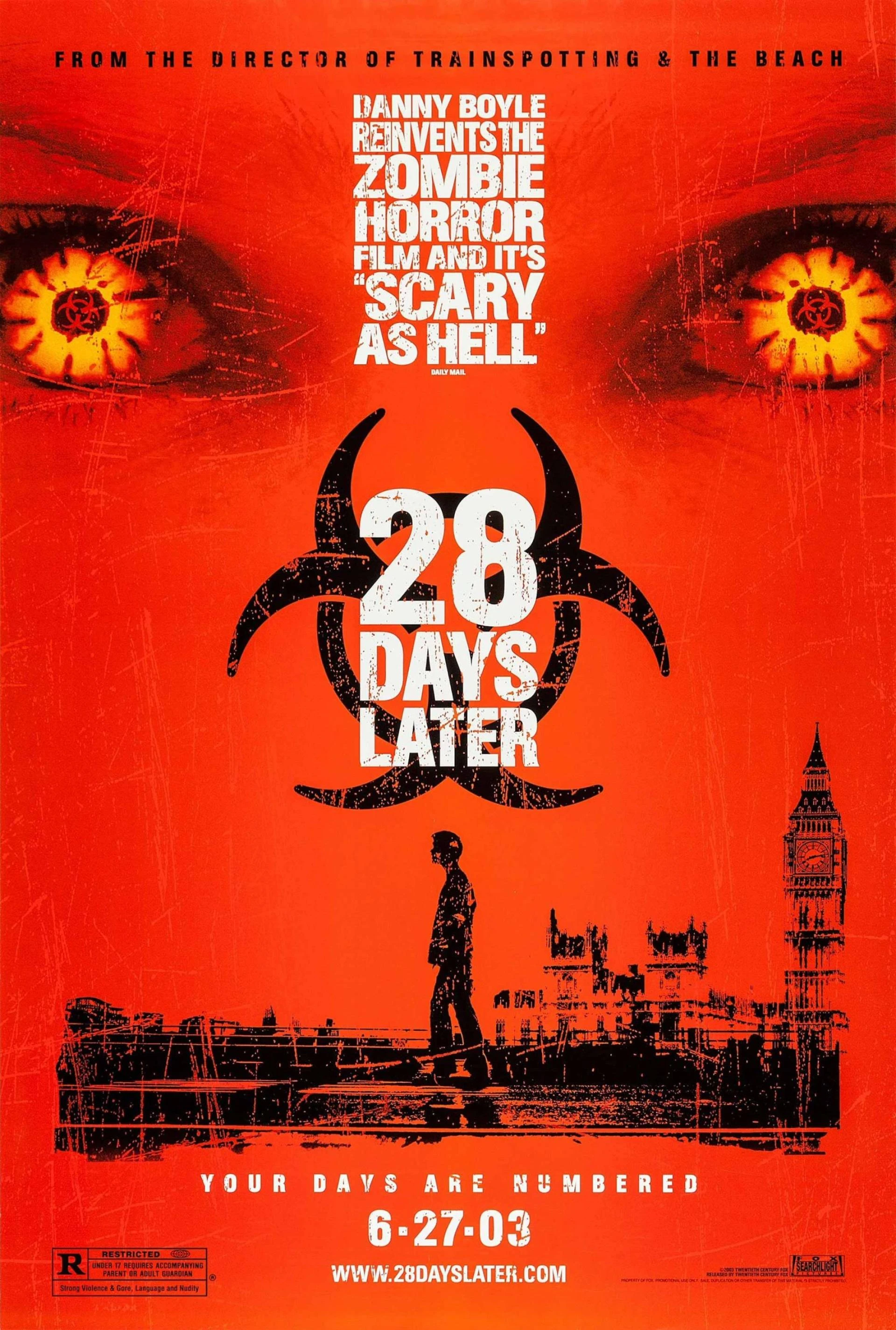
Think of The Exorcist poster featuring a silhouette under a streetlight or The Blair Witch Project with just a mysterious stick figure symbol. These posters rely on the audience’s internal fear mechanisms. Minimalism creates unease because viewers feel something terrible is hidden.
Designers use negative space, silhouettes, or stark contrasts to evoke dread. This technique is highly effective because horror thrives on anticipation. Instead of showing a monster, the poster hints at its presence. A shadow, a claw mark, an empty doorway—these small elements transform simple artwork into psychological terror.
Minimalism also helps these horror movie film posters remain timeless. Their clean but haunting imagery allows viewers from any era to connect with the fear.
2. Colour Psychology: Red, Black, and the Palette of Fear
Colour is one of the strongest tools in horror poster design. Humans are wired to respond emotionally to certain shades, and great horror movie film posters exploit this instinct.
Black – The Unknown and the Void
Black is the dominant colour in most horror posters. It symbolises darkness, death, fear, and the unseen. Designers use black backgrounds to create isolation and amplify tension. Black also helps highlight contrasting imagery, like white eyes or blood-red symbols.
Red – Danger, Violence, and Urgency
Red has long been associated with blood, danger, and warning signs. In horror poster design, it signals immediate threat. It’s used in typography, splashes, or glowing effects to intensify a viewer’s response.
Green & Sickly Neutrals – Poisonous Tones of Decay
Movies involving zombies, possession, or supernatural rot often use murky greens, mustard yellows, or greys. These create a feeling of sickness or contamination, making the viewer subconsciously uncomfortable.
The best horror movie film posters use colour with purpose. Designers don’t just pick shades randomly; they use emotion-driven palettes to prime the audience for the film.
3. Typography That Terrifies: Fonts With a Personality
Typography in horror posters is often underestimated, but it plays a crucial role in shaping tone. The font is like the voice of the poster—whispering, screaming, or warning depending on its style.
Sharp, Jagged Fonts
Used in slasher and monster films, these fonts resemble scratches, broken glass, or wounds. They indicate violence and chaos.
Distorted or Erased Fonts
Ghosts, supernatural films, and paranormal themes often use typography that appears faded, smudged, or cracked. This suggests something is interfering with the material world.
Vintage Serif Fonts
Many psychological or gothic horror films use traditional serif fonts, evoking old manuscripts or cursed books.
Typography in many horror movie film posters isn't just written—it’s designed to feel alive, unstable, or threatening. The letters become part of the horror narrative.
4. The Eyes Have It: Using Faces and Expressions to Intensify Fear
Human faces trigger emotional responses, making them a common anchor in the most terrifying horror movie film posters. But not just any face—the scariest posters feature distorted, fearful, or unnatural expressions that signal danger.
Some posters focus on wide, terrified eyes. Others depict emotionless faces, which can be even more unsettling. Posters like The Ring, Sinister, or Hereditary use facial expressions or deliberately blank stares that hint at something wrong beneath the surface.
Close-up shots are powerful because they eliminate distractions. The viewer must confront the emotion head-on.
5. Symbolism: Hidden Meanings Within the Artwork
Symbolism is a cornerstone of great poster design. Instead of showing the entire story, designers plant visual clues.
Common symbolic elements in horror movie film posters include:
- Doors, windows, or hallways – representing transitions into danger
- Masks – indicating hidden identities or psychological depth
- Creepy children’s toys – innocence corrupted
- Shadows – symbolising lurking threats
- Crows, insects, or decayed objects – signalling death or doom
Symbolism adds layers to a poster, rewarding viewers who look deeper. It creates a mental puzzle that viewers feel compelled to solve.
6. The Fear of Being Watched: Composition Techniques That Create Tension
One of the most effective psychological tools in horror posters is the sense of being observed. Humans instinctively react to the idea of eyes following them.
Poster designers often use:
- Eyes hidden in shadows
- Creatures peeking from behind objects
- Figures standing too far away or too close
- Imbalanced compositions where threats loom over smaller figures
These techniques make viewers feel unsafe—exactly what great horror movie film posters are supposed to do.
7. Texture and Grunge: Giving Posters a Disturbing Physical Sensation
Textures play a huge role in horror aesthetics. Designers incorporate:
- Scratches
- Smudges
- Grainy film effects
- Blood spatter patterns
- Mould- or decay-inspired textures
These elements make posters feel dirty, dangerous, and unsettling. When viewers almost “feel” the surface, the poster becomes immersive.
8. Monsters, Silhouettes, and the Art of Suggestion
While some posters showcase the monster directly, many prefer suggestion over revelation. Shadows, partially visible figures, or silhouettes create fear because they leave room for imagination.
Great horror movie film posters understand this balance. They might show:
- A distorted outline
- A claw or hand
- A shadow on the wall
- A silhouette against a foggy background
This technique increases suspense and curiosity—making viewers wonder what horrifying thing awaits in the movie.
9. Nostalgia and Retro Horror Aesthetics
Retro horror posters, especially those from the 70s and 80s, have made a major comeback. Their hand-painted look, exaggerated expressions, and bold colouring have become iconic.
Modern designers often emulate this style to create posters that feel nostalgic yet fresh. These posters tap into childhood memories, adding emotional layers to the fear.
Collectors especially love retro-inspired horror movie film posters, making them great decorative pieces for home theatres or personal collections.
10. Why These Design Secrets Still Matter Today
Even with modern Photoshop tools and 3D effects, the core design principles of horror movie film posters remain rooted in psychology. Fear is timeless. Whether a poster uses minimalist shadows or hyper-detailed monster art, the goal is the same: to evoke emotion.
The reason these design secrets endure is simple—they work. They manipulate perception, play with instinctual fears, and create visual storytelling that haunts the mind.
Bringing Horror Art into Your Home with Movie Poster Prints
For collectors, movie lovers, and fans of the horror genre, owning high-quality horror movie film posters is a powerful way to celebrate this art form. That’s where Movie Poster Prints truly stands out.
Movie Poster Prints specialises in creating premium, high-resolution reproductions of classic and modern horror posters. Whether you love minimalist ghost imagery, vintage slasher art, or psychological horror designs, they offer an impressive range of stunning prints crafted with exceptional attention to detail.
Their posters are available in multiple sizes, framing options, and finishes, making them perfect for home décor, media rooms, offices, or collector displays. For anyone passionate about the artistry behind horror movie film posters, Movie Poster Prints delivers unmatched quality, durability, and design authenticity.
Conclusion
The scariest horror movie film posters in history aren’t just advertisements—they’re psychological works of art. They manipulate colour, composition, texture, and symbolism to evoke deep emotional reactions. These posters continue to captivate audiences because they tap into universal fears and primal instincts.
Whether you're a designer seeking inspiration, a movie lover fascinated by visual storytelling, or a collector building your personal gallery, understanding these design secrets adds a new dimension to the appreciation of horror art.
If you want to bring this haunting beauty into your own space, explore the exceptional collection offered by Movie Poster Prints, where every horror poster is crafted with artistic integrity and premium quality—giving fans the perfect way to celebrate the genre they love.