


Imagine stepping into a bustling airport, the hum of anticipation in the air. Your eyes instinctively search for your flight status amid a sea of information. There, a color-coded dashboard visualization helps you get clarity: green for on-time flights inviting you to relax, yellow gently warning of brief delays, red signaling cancellations and a need to pivot, and the calming blue asking you to board. This isn\'t just a dashboard—it\'s your personal guide through the maze of air travel, transforming chaos into order with the simple power of color.

Welcome to the cutting edge of data clarity, where color-coded dashboards transform the way we interpret essential information, making every insight and decision sharper and more intuitive.
This blog delves into the art and science of using color effectively in a data visualization dashboard to enhance data comprehension and decision-making.
The Science Behind Color Coding in Data Visualization
Color plays an essential role in how we process information. In the context of a data visualization dashboard, it\'s not just about aesthetics; it\'s about communication. Various hues can signify urgency, trends, or categorization, making it easier to digest complex data. For instance, red often indicates critical issues in business intelligence data visualization, demanding immediate attention.
Principles of Color Theory in Dashboard Design
Let\'s see how color theory principles are applied in the context of dashboard design for dashboard visualization. This includes understanding the psychological impact of colors, ensuring readability and clarity, and enhancing the overall user experience. Here\'s a detailed breakdown:
Color Psychology
Emotional Response: Different colors can elicit varied emotional responses. For example, blue is often perceived as professional and calming, while red can indicate urgency or importance. Banks often use blue in their business intelligence data visualization dashboards, as it evokes trust, stability, and professionalism.
Cultural Context: Color perceptions can vary based on cultural contexts, thus, understanding the audience is key in choosing appropriate colors. Green, known for its calming effect, is frequently used in a healthcare data visualization dashboard to create a sense of well-being.
Color Harmony
Complementary Colors: Using colors that are opposite each other on the color wheel can create a vibrant look, but should be used sparingly to avoid visual strain.
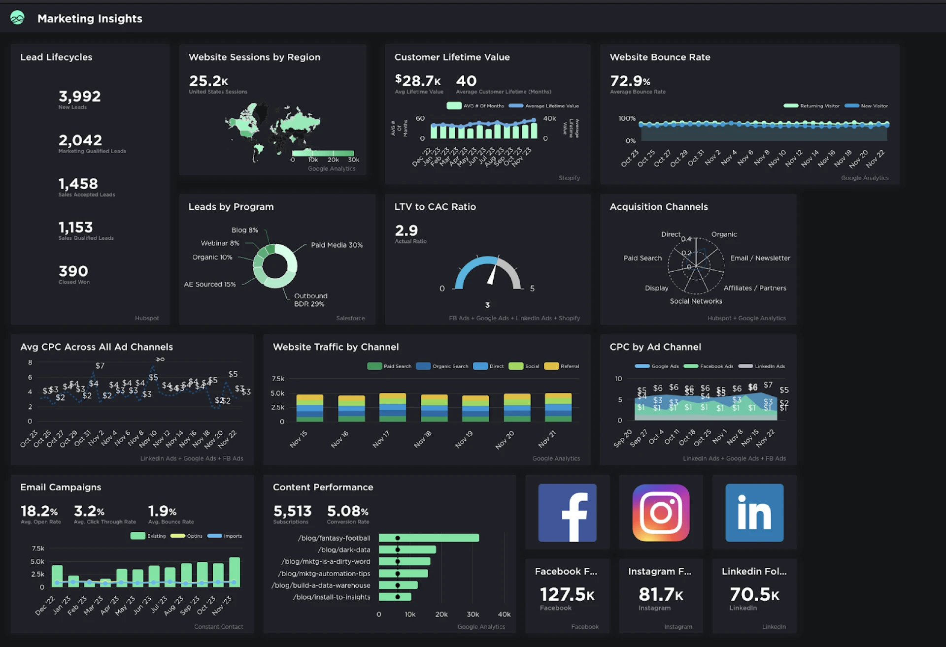
The provided marketing dashboard by Grow utilizes a cohesive color scheme that primarily revolves around shades of blue and green. These colors are adjacent to each other on the color wheel, characterizing an analogous color scheme. This choice of color scheme creates a visually harmonious and pleasing aesthetic, which is effective for marketing purposes as it reflects consistency and can be easier on the eyes compared to a complementary color scheme that uses opposite colors on the wheel. The dashboard avoids visual strain by not employing vibrant, contrasting colors that would be typical in a complementary scheme. Instead, the consistent use of cooler colors (blues and greens) contributes to a professional and calm appearance, which can enhance brand consistency and aid in data readability.
Analogous Colors: Colors that are next to each other on the color wheel offer a more harmonious and visually cohesive look, suitable for grouping related data points. Complementary colors (like red and green) are used in retail dashboards during holiday seasons to invoke festivity and prompt action.
Contrast and Legibility
High Contrast for Readability: Ensuring high contrast, especially between text and background colors, enhances readability. This is crucial in data visualization dashboard design, where quick data interpretation is needed.
Balancing Contrast: Too much contrast can be jarring, so it\'s important to find a balance that makes the dashboard comfortable to look at for extended periods.
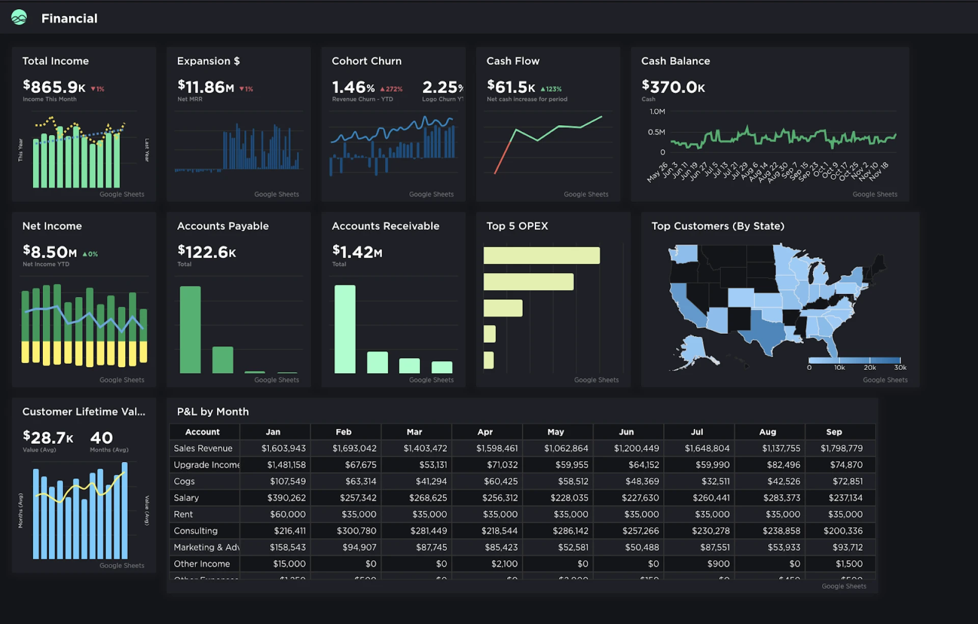
Grow’s financie dashboard utilizes high contrast effectively, with light-colored text on dark backgrounds to ensure that key metrics stand out for immediate readability. At the same time, it avoids overly stark contrasts, creating a visual experience that\'s informative yet comfortable for the eyes over time.
Consistency and Standards
Standardized Color Usage: Consistent use of colors for similar data types or categories across different dashboards helps in creating a standard that users can quickly understand.
Avoiding Misinterpretation: Inconsistent use of colors can lead to misinterpretation of data. For example, using the same color for different metrics can confuse users.
Color Saturation and Brightness
Attention with Saturation: More saturated colors draw more attention. They can be used to highlight key information or data that requires immediate action.
Utilizing Brightness: Variations in brightness can be used to represent different levels or hierarchies of data.
Color for Data Categorization
Categorical Colors: Assigning different colors to different categories can make complex data sets more understandable at a glance.
Sequential Color Schemes: For data that has a natural order, using a gradient of colors can effectively communicate the sequence.
Accessibility and Inclusivity
Designing for Color Blindness: Avoiding color combinations that are commonly problematic for color-blind users (like red-green) is essential.
Offering Alternatives: Providing options for users to change color settings or using patterns and icons in addition to colors can make dashboards more accessible.
Contextual Use of Color
Purpose-Driven Color Choice: The choice of color should align with the purpose of the dashboard. For instance, Grow\'s Company Health dashboard employs color strategically to signify different business metrics and initiatives, aligning with the principle of contextual use of color.
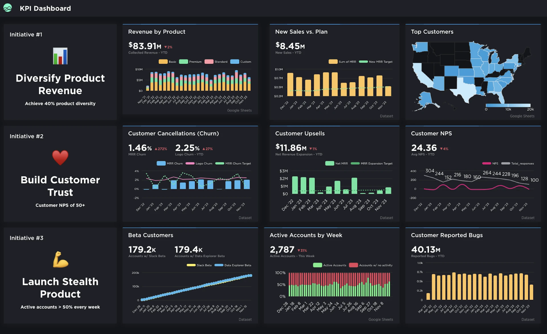
The use of red for customer-related metrics like churn and NPS (Net Promoter Score) effectively draws attention to customer satisfaction and loyalty, which are typically high-priority areas. Dark and light blues differentiate between types of customers and revenue sources, allowing for quick segmentation. Also, distinct colors are used for the initiative icons, making each goal visually distinct and immediately recognizable, which aids in quick navigation and contextual understanding for users reviewing the business intelligence data visualization.
Testing and Iteration
User Feedback: Regularly collecting user feedback on color schemes can provide insights into their effectiveness and areas for improvement.
Iterative Design Process: Continuously refining the color palette based on usage data and user feedback ensures the dashboard remains effective and user-friendly.
Conclusion
Elevate your data narrative with Grow’s dashboard visualization—where data-driven storytelling meets simplicity. Grow\'s
no-code data visualization platform streamlines the process of transforming complex data sets into engaging and understandable visual stories. The ease of use comes from its intuitive drag-and-drop interface, which allows users from any background to create detailed dashboards without needing to write a single line of code. This accessibility dramatically reduces the time and technical barriers typically associated with data analysis. The benefits are vast, including the ability to quickly generate insights, make data-driven decisions more efficiently, and communicate findings in a visually compelling way that can be easily understood by stakeholders across all levels of the organization. With Grow BI dashboard software, users can harness the full potential of their data, turning it into a strategic asset that drives action and growth
Embrace the power of no-code data visualization and transform your data into dynamic business intelligence data visualization that informs and inspires action.
Visit Grow with Grow.com TrustRadius and don’t just analyze—visualize and use your data to its fullest with us.