How To Choose Best Acp Sheet Color For Space?
Architecture and cladding materials have modernized over the past few decades. When innovation is at its peak in all sectors of the industry, architecture is experiencing some phenomenal changes. Whether it is about green architecture or using durable cladding materials, the entire focus of architecture has now shifted to sustainability for thoughtful living and a better future.
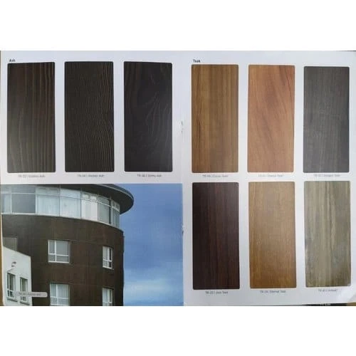
When talking about eco-friendly materials in sustainable architecture, ACP or aluminium composite panels have made some phenomenal contributions in combining utility with decor. When looking for premium building materials, the price has mostly been a constraint. However, with composite panels, and the wide variety of acp sheet colour, it is becoming one of the coveted architectural materials of all time.
Why Choose ACP?
In comparison to traditional building materials, ACP is much more dynamic. Its basic component, aluminium, is a lightweight yet sturdy and bendable metal. Along with the structural finesse, there is a wide range of acp sheet colour combination, texture, finish, and design available giving creative liberty to architects and designers.
What Are Different Colours and Their Methodology?
To choose the right acp colour sheet, understanding colour methodology is important. Let’s take a look at how different colours for ACP sheet design work in a given space.
Red
The most dynamic and vibrant colour in the colour scheme, red is often easily identified by the human eye even from a distance. It is mostly associated with energy, power, fearlessness, strength, and excitement. This is why red is used in consumer-oriented products.
Orange
Orange is a bright colour and it is generally associated with positivity. It grabs the attention of the viewer and is often used by brands in their marketing strategies. Industries related to food and beverages mostly use this colour as they signify health as well.
Yellow
It is a mellow colour that is often associated with sunshine and happiness. In terms of branding, yellow also gives a sense of clarity. That is why, many brands use yellow to showcase the vibrancy of the product and are mostly used in consumer goods.
Blue
It is a sensitive colour and exudes a sense of calmness, serenity, and cleanliness. Blue in a certain space reflects the same characteristics. That is why blue can be mostly seen in pharmaceutical brands.
Green
The colour of relaxation, generosity, and health, green often feels calm on the eye. If you want to invoke a restful ambiance, green is a suitable colour for you. As it signifies, natural or organic, many food brands use it.
White
Often associated with clean and freshness, white evokes a sense of youth and modernity. White makes for an ideal background against any colour making it stand out or catch attention. The use of white can be seen across brands starting from apparel to vehicles.
Brown
Brown is a neutral or natural colour and it is an excellent colour choice if you are looking to portray a natural or organic feeling or bring in a wholesome ambiance in general. Food and services brands generally go for the colour brown.
How to Choose the Right ACP Sheet Colour?
Choosing acp sheet colour design and finish depends on several factors, personal preference is one of them. Let’s take a look at the determining factors for choosing acp sheet colour combinations for interiors.
Purpose Of The Space:
The primary determining factor for choosing acp sheet colour is understanding the function of the space. This will help you create a better ambiance by choosing the right colour combination. For example, the ACP colour scheme in a retail store will be different from that of an office.
Existing Lighting Conditions:
Different lighting conditions have a significant influence on space design. If the space is filled with natural light, a lighter acp sheet colour will add charm. On the contrary, a space with dim lights will mostly go with deeper shades. Analyze the lighting situation before installing.
Understanding Colour Psychology:
Different colours evoke different emotions and you should consider the mood you want to create with the specific set of colours. Brighter colors like red, yellow, or orange are warm colours that impart a feeling of energy and vibrancy. However, cool tones like blue and white have a sense of calm and serenity. You can choose the Aludecor acp sheet colours according to it.
Use a Colour Scheme:
If there are colours already present in the space, create a colour scheme and use some acp sheet colour along with the existing colours to get a feel. However, a new space gives you the liberty to choose from various acp colour sheets and create a brand-new look. Whether you choose the monochromatic or complementary colour scheme, make sure that the acp sheet colour design and finish complement the space and the colour scheme of your choice.
Sample & Visualize:
Bring in some samples of ACP colour sheets of your choice and place them against the backdrop. This will help you get an idea of how your chosen colours of ACP sheets are interacting with the lighting conditions and existing elements of the space.
Ask a Professional:
Choosing the right colour scheme for a space can be an overwhelming task and it is obvious to get confused. In that scenario, you can always ask for professional advice. Seek the guidance of an architect or an interior designer who has a vivid knowledge of colour schemes and how a space will look with a particular colour.
Conclusion
It is important to remember that preferences are as varied as the wide range of acp sheet colour available. Invest some time in analysing your choices and preference and most importantly, the purpose of the space to choose the right ACP colour and texture for your space.