


When students search and find a university’s website, they surely look for the course details, but with that, they also try to imagine their future in that university. Can this place shape their career? Will they feel like they belong here? A website becomes that very first doorway to trust, curiosity and possibility.
But here’s the challenge for institutions: higher education web design often tilts too far in one direction. Some websites feel like information dumps, packed with endless information that no one likes to read. Others go heavy on visuals, but leave students searching endlessly for basic details like admissions or fees. Both approaches miss the point.
The effect truly comes only when there's a balance. A good website expresses information with clarity on one hand and inspires with great design and storytelling on the other. It gives students everything they need to decide while sparking the excitement to take the next step.
This blog explores what makes education web design effective, how it impacts student decisions and why institutions today need to go further than just looking good online and focus on creating better experiences that truly connect.
The Website as the First Campus Tour
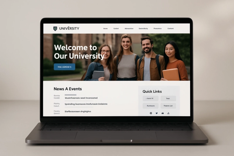
For most of the students, the first interaction they have with a university is not by walking through its campus, but by scrolling through its website. Before they step into a classroom or meet a professor face to face, they have clicked through a thousand pages trying to understand what life at that institution could be like.
This is why a website acts like a first campus tour. It shows whether the institution is trustworthy, whether the culture feels welcoming and whether there are real opportunities waiting for them.
Good design goes beyond looks. It’s just like storytelling. When students see the lush life at the campus, read inspiring stories of successful alumni or watch short videos of faculty showing the kind of nature they will experience, they are not just consuming information but also starting to imagine themselves there. That is the real power of education web design.
Too Much or Too Little: The Common Mistakes in Education Web Design
Many universities make the mistake of doing too much and too far in one direction.
Information overload
Some websites bury students under endless menus, outdated PDFs and abstruse text. Instead of guiding them, the site leaves them confused and frustrated.
Over-designed websites
Others focus only on design like flashy visuals, animations or big banners, while leaving out critical details like admission dates, fees or course requirements.
Both approaches mostly fail students. Let's understand this by picturing a scenario. A student is eager to check deadlines, but he has to scroll through multiple menus just to find some basic information. Or another who is liking the beautiful visuals but leaves after not finding any information about the application process. These are real experiences students face every day when searching online.
What Students Actually Look For on a University Website
Students usually search for-
- Admission requirements and deadlines
- Courses and specialisations
- Faculty details
- Campus life and facilities
- Fees and scholarships
- Placements and alumni outcomes
The placement of this information is just as important as the content itself. If details are buried, students may give up and move to another institution’s website.
When a design flows naturally, like in the form, admissions leading to courses, then to student life and career opportunities, it makes students feel like they belong even before they apply.
Features That Define Great Higher Education Web Design
Great education web design is not only about looks, but also about experience. Here are some features that stand out-
Mobile friendly and faster loading
Most students browse on phones, so the site must adapt smoothly.
Accessibility
Everyone, including students with disabilities, should navigate easily.
Clear CTAs
Buttons like Apply Now, Enquire or Book a Virtual Tour guide students towards action.
Personalisation
Tools like chatbots, interactive campus maps or virtual tours create tailored experiences.
Storytelling content
Student testimonials, alumni journeys and real classroom stories show authenticity.
These features are important for your institution to improve the design of the website and also build trust and confidence.
To Conclude
In the end, a university website must do more than just provide information. It must spark inspiration.
Institutions can design websites by blending clarity and creativity that not only inform but also motivate students to take action, whether that is applying for a course, enquiring about institution or imagining their life on campus.
A strong higher education web design builds trust, tells a story and invites students to belong. That is how institutions can move beyond basic design and create digital experiences that truly matter.