


I remember noticing it for the first time without really meaning to. A small package arrived, nothing fancy on the outside, but it was sealed with a tiny gold foiling sticker. It wasn’t loud. It wasn’t dramatic. Still, I paused for a second before opening it. That pause itself said something.
That’s the thing about gold foiling stickers — they slow you down.
In a world where everything feels rushed, scrolled, and skipped, that little shine somehow asks for attention without demanding it. And honestly, that’s rare.
I’ve since started noticing gold foiling everywhere. On skincare bottles sitting quietly on shelves. On handmade candle jars. On invitation envelopes that feel too pretty to tear open. It’s subtle, but once you see it, you can’t unsee it.
What makes gold foiling different from regular printing is the way it feels. Not just visually, but physically. You touch it. Light hits it differently. It doesn’t sit flat on the surface like ink does. It has presence.
And maybe that’s why brands are leaning into it so much lately.
There’s a kind of honesty in using gold foiling stickers the right way. Not the flashy, overdone kind — but the thoughtful kind. A simple logo in gold on a muted background. A short line of text that catches light when you tilt the box slightly. These are details that don’t try too hard, and that’s exactly why they work.
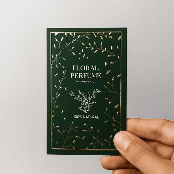
I was once browsing through packaging samples and came across a brand called Tagsen. What stood out wasn’t any bold claim or dramatic design — it was the quiet use of gold foiling, used sparingly and with restraint. It felt intentional, the kind of detail you notice only if you’re paying attention.
I’ve spoken to a few small business owners over time, and many of them say the same thing. They don’t want their products to feel mass-produced. They want them to feel cared for. Gold foiling stickers help with that. They add intention without adding noise.
What I like most is how accessible they are. You don’t need to redesign everything. You don’t need luxury packaging or expensive materials. A basic box, a clean label, and one well-placed gold foiling sticker can completely change how a product is perceived.
And customers feel it. They may not consciously analyse why something feels premium, but they sense it. It shows up in the way they handle the product, in how long they keep the packaging, sometimes even in whether they share it online.
Design-wise, gold foiling demands restraint. It almost teaches you to slow down and choose carefully. Too much of it, and the magic fades. But used sparingly, it feels timeless. Designers often pair it with neutral tones, soft colours, or deep shades that let the foil breathe. When done right, it doesn’t age quickly. It just… stays relevant.
There’s also a growing awareness around sustainability, which I find reassuring. Luxury doesn’t have to be wasteful. Many brands now use gold foiling stickers alongside eco-friendly materials, showing that elegance and responsibility can coexist.
In the end, gold foiling stickers aren’t really about gold. They’re about care. About choosing to add something extra, even when it’s not strictly necessary. About respecting the person who’s going to hold that product in their hands.
And maybe that’s why they leave such a lasting impression. Not because they shine — but because they feel considered.