As we have seen Google always recommends or suggests to its users that the users must use responsive web design (RWD) and specifically after rolling out on a huge update. If you are here in this blog to know about which website is better and which the users must use and which website the user must select in between responsive and adaptive websites.
So, here in this article, we are going to tell you about the difference between both and also adaptive vs responsive web design examples by which you can understand more clearly and more accurately about the difference between the two.
Responsive website
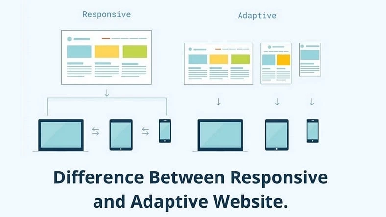
If we are talking about the responsive website then let us tell you that a responsive website is one that is fluid and adapts the size of the screen whatever the size of the screen not even the target of the device matters. It users CSS media queries which are used to change the style depending on the target device like display type, width, height, and other things too as only one of these is required for different screens.
The users can also go with the responsive website and they can refer to a website Development company that can help you. The majority of the users often use responsive websites which is comparatively easier and is very much apt for less experienced designers as well as developers. And this is thankful because of the availability of themes which is accessible through the CMS systems which are like word press, Joomla as well as Drupal. If we take an example then let us see that in an image where fluid floats then the designer is accessing percentage widths so that the users can adjust the width according to their means.
Adaptive websites
If you are thinking about what is an adaptive website then here is the answer for the same. An adaptive website usually uses static layouts which are mostly based on the breakpoints which usually do not respond once they are loaded initially. It works in an order that the size of the screen is detected and it loads in an appropriate manner for the layout, generally, you would see an adaptive website with screen widths of 320, 480, 760, 960, 1200, and 1600; these are common screen widths of an adaptive website.
If the users want to go with an adaptive website and with adaptive website examples then your choice is not too bad as it is very much useful in retrofitting a site that already exists so that the particular website could be made more mobile-friendly. This will allow you to take over complete control over the design and also to develop specific and various multiple viewports. Generally, the users will begin the design work by going with a low-resolution viewport and then you can work with your design which is not constrained by the content of the website.
Now that you know all about both types of websites now you can easily decide on your own which type of website you are willing to use and you want to use.


