


You're sitting on a goldmine of data. You have spreadsheets filled with hiring stats, performance reviews, exit interview notes, and engagement survey results. You know this information is valuable. You know it holds the key to reducing turnover, hiring smarter, and building a better company culture. But when your CEO asks, "How is our people strategy impacting the bottom line?" you're stuck spending hours, or even days, manually piecing together a static report.
This is the conversation happening in the minds of thousands of HR leaders. You feel the pressure to be more strategic and data-driven, but the tools and processes you have are holding you back. You've heard about the power of an HR dashboard, but the thought of building one seems overwhelming. "I'm not a data analyst." "Our IT team is swamped." "Where would I even begin?"
If this sounds familiar, you're in the right place. This guide is designed to be the only resource you'll need. We will demystify the HR dashboard, provide five powerful HR dashboard examples you can use today, and show you a new, faster way to build them that doesn't require any design or data science skills .
What Is an HR Dashboard?
Let's start with the basics. An HR dashboard is a visual interface that consolidates and displays your most important human resources data in one place. It transforms complex spreadsheets into intuitive charts, graphs, and scores.
But here’s the crucial difference you need to understand: what is the difference between an HR dashboard and an HR report? A report is a static snapshot of the past, like a monthly PDF. A dashboard is a living, breathing tool. It's interactive, updated in real-time, and allows you to explore your data, ask questions, and uncover the "why" behind the numbers. It’s the difference between looking at a photograph of a car and sitting in the driver's seat.
Why Use Human Resources Dashboards in Your Organization?
According to a 2023 Deloitte report, companies that effectively use HR analytics are twice as likely to improve recruitment outcomes and see a significant lift in leadership development. A human resources dashboard is your single most powerful tool for elevating HR from an administrative function to a strategic powerhouse. How do HR dashboards improve decision-making? They provide objective, undeniable data that allows you to:
- Answer Executive Questions Instantly: When your CFO asks about the cost per hire, you can pull it up in seconds, not days.
- Predict Problems Before They Happen: Spot a rising turnover rate in a specific department or a dip in employee engagement and intervene proactively.
- Optimize Your HR Spending: See exactly which recruitment sources deliver the best candidates and allocate your budget with confidence.
- Prove Your Value: Clearly demonstrate how HR initiatives—like a new wellness program or management training—are directly impacting key business metrics like productivity and retention.
The Core Dilemma: The Old Way vs. The Smart Way to Build a Dashboard
So, you're sold on the "why." But the "how" is where most HR professionals get stuck. This is the core dilemma you're facing.
The Old Way (The Path of Frustration): You either try to build something in Excel, which is manual, clunky, and can't handle real-time data. Or, you go to your IT or BI team and ask them to build a dashboard in a complex tool like Power BI or Tableau. The problem? They're overwhelmed with requests, they don't understand the nuances of HR metrics, and the process can take months of back-and-forth, only to result in a dashboard that doesn't quite meet your needs.
The Smart Way (The "Design First" Approach): Strategic teams have discovered a better way. They don't start with data or complex software. They start with a plan. They build a visual blueprint—a wireframe—of their ideal dashboard first This allows them to get buy-in from stakeholders, perfect the layout, and define every metric before any technical work begins. This "Design First" approach is the secret to building effective dashboards quickly, and it's where a specialized tool becomes your superpower.
How to Build an Effective HR Dashboard Template with a Specialist Tool
How do you create a custom HR dashboard template without being a designer? You use a tool built for you. While BI tools are for developing with data, a wireframing tool is for designing with ideas .
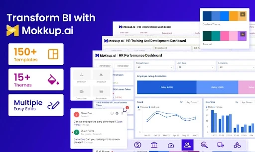
This is where Mokkup.ai changes the entire equation. It was created specifically to solve this problem, empowering HR professionals to design stunning, professional dashboard wireframes without needing any data, design skills, or domain expertise .
Here’s how it gives you an unfair advantage:
- AI-Powered Generation: This is the game-changer. You can simply type a prompt like, "Create an HR dashboard for employee turnover showing monthly trends, reasons for leaving, and turnover by department," and Mokkup's GenAI will instantly generate a complete, professional wireframe for you . The initial design work is done in seconds.
- Specialized HR Components: Unlike generic design tools where you have to draw charts from scratch, Mokkup.ai has a library of pre-built, professionally designed charts and KPIs . You're not drawing rectangles; you're dragging and dropping a "Performance Bell Curve" or a "Headcount Trend" chart.
- HR-Specific Templates: Mokkup.ai offers a rich library of HR dashboard examples and templates, giving you a 90% complete starting point Whether you need a recruitment dashboard or a performance management view, the template is ready to go.
By using a tool like Mokkup.ai, you shift from being a requester, waiting on IT, to being the architect of your own data strategy.
5 Powerful HR Dashboard Examples for Better People Analytics
Effective people analytics tells a story. Each of these HR dashboard examples is designed to tell a specific story to a specific audience. You can design a wireframe for each of these in minutes using Mokkup.ai.
1. The Executive HR Dashboard
- Audience: C-Suite, VPs, Board Members.
- The Story It Tells: "Our people strategy is healthy and aligned with the company's financial goals."
- Essential HR Metrics:
- Total Headcount vs. Budget
- Employee Turnover Rate (vs. Previous Year)
- Total Labor Cost as a % of Revenue
- Diversity in Leadership
- Employee Engagement Score
- Story in Action: A fast-growing tech firm used its Executive HR Dashboard to correlate a new wellness program with a 15% decrease in sick days and a 5-point jump in engagement scores. When budget season arrived, the CHRO didn't have to defend the program's cost; they showed clear data on how it was improving productivity and morale, securing an increased investment.
Wireframe Example: Executive HR Dashboard
- Row 1 (KPI Cards):
- Total Headcount: 1,500 / 1,480 (Budget)
- Employee Turnover (YTD): 8.5% (vs. 10.2% LY)
- Labor Cost % of Revenue: 32%
- Employee Engagement: 82 (+5 pts)
- Row 2 (Charts):
- Chart 1 (Left): Line chart showing "Headcount vs. Budget" over the last 12 months.
- Chart 2 (Right): Bar chart showing "Turnover Rate by Department" for the current quarter.
- Row 3 (Table):
- Diversity in Leadership: A table showing the percentage breakdown of leadership roles by gender and ethnicity compared to the previous year.
2. The Recruitment Dashboard
- Audience: Talent Acquisition Team, Hiring Managers.
- The Story It Tells: "We are efficiently finding and hiring high-quality talent to meet business demand."
- Essential HR Metrics:
- Time to Fill
- Cost Per Hire
- Source of Hire
- Offer Acceptance Rate
- Hiring Funnel Conversion Rates
- Story in Action: A marketing agency's Recruitment Dashboard revealed that while they spent 40% of their recruitment budget on a popular job board, it only accounted for 5% of their actual hires, who also had lower performance ratings in their first year. They reallocated that budget to their employee referral program, which the dashboard showed had the highest offer acceptance rate and top-performing hires. They cut their average Time to Fill by 12 days. You can start designing your own with this HR Recruitment Dashboard template.
3. The Employee Performance Dashboard
- Audience: Department Managers, HR Business Partners.
- The Story It Tells: "Our teams are productive, our managers are effective, and we are developing our talent."
- Essential Employee Performance Dashboard Metrics:
- Performance Rating Distribution
- Goal Completion Rate
- High-Potentials vs. Low-Performers
- Training Completion & Effectiveness
- Promotion Rate
- Story in Action: An HR Business Partner noticed on the Performance Dashboard that one department had an unusually high number of low-performers and missed goals. Instead of assuming it was a hiring issue, they drilled down and saw the team also had low training completion rates. This led to a data-driven conversation with the department manager about coaching and development, resulting in a 20% improvement in team goal completion the next quarter. Plan your ideal view with this HR Performance Management Dashboard wireframe.
4. The Turnover & Retention HR Analytics Dashboard
- Audience: HR Leadership, Executive Team.
- The Story It Tells: "We understand exactly why people are leaving and are taking targeted actions to keep our best talent."
- Essential HR Metrics:
- Monthly Turnover Rate (Voluntary vs. Involuntary)
- Turnover by Department/Manager
- New Hire Turnover (First 90 Days)
- Exit Interview Analysis
- Retention Rate of High-Performers
- Story in Action: A national retail company used its Turnover Dashboard to discover that 35% of their new hires were leaving within the first 90 days. By cross-referencing this with exit interview data on the same dashboard, they identified "inadequate onboarding" as the top reason. They launched a revamped, structured onboarding program and reduced new hire attrition by over 50% in six months, saving an estimated $1.2M annually in recruitment costs.
5. The Workplace Demographics & DEI Dashboard
- Audience: DEI Council, HR Leadership, Executive Team.
- The Story It Tells: "We are building a diverse, equitable, and inclusive workplace, and we are holding ourselves accountable."
- Essential HR Metrics:
- Diversity Breakdown (Race, Gender, Age)
- Gender Pay Gap
- Promotion Rate by Demographic Group
- Inclusion Score (from surveys)
- Story in Action: A financial services firm's DEI Dashboard surfaced an uncomfortable truth: a 12% pay gap between men and women in the same senior-level roles. Armed with this undeniable data, the DEI Council got executive buy-in for a full pay equity audit. This led to a new, transparent compensation framework that closed the gap to under 2% and became a major selling point in attracting top female talent.
Dashboard Best Practices for HR Reporting
Following a few simple dashboard best practices will ensure your dashboard is a powerful tool, not just a data dump.
- Start with Questions: Before you add any chart, ask, "What question does this answer?"
- Tell a Story: Organize your dashboard logically. Start with high-level summaries at the top and allow users to drill down into details below.
- Keep it Simple: Less is more. Avoid clutter and use plenty of white space. Focus on the most critical KPIs.
- Choose the Right Visuals: Use line charts for trends, bar charts for comparisons, and big, bold KPI cards for your most important numbers.
Choosing the Right HR Dashboard Software
Once you have a clear, stakeholder-approved wireframe of your HR dashboard from a tool like Mokkup.ai, choosing your HR dashboard software becomes incredibly simple. Your wireframe is now a blueprint that you can use to evaluate BI tools like Power BI or Tableau.
Even better, Mokkup.ai bridges the gap between design and development with one-click export to Power BI and Tableau . This means your beautiful, approved wireframe can be instantly converted into a functional dashboard file, saving your technical team dozens of hours of manual recreation.
For larger companies, security is paramount. Mokkup.ai is built for the enterprise, with SOC 2 and ISO 27001 alignment and availability on the AWS Marketplace, which simplifies procurement and ensures the tool has been vetted by AWS's stringent security standards .
Conclusion: From Data Overload to Data-Driven Leader
You have the data. You have the expertise. What you need is a way to bring it all together to tell a compelling story. An HR dashboard is that tool. It's the key to unlocking the strategic potential of your HR department and proving your value in a language the rest of the business understands.
Don't let the thought of building one hold you back. The old way of wrestling with spreadsheets or waiting on IT is over. The smart way is to start with a clear plan. Use the HR dashboard examples in this guide as your inspiration. Leverage a purpose-built tool like Mokkup.ai to design your perfect dashboard in minutes, get buy-in from your team, and take the first, most important step toward becoming a truly data-driven HR leader.
Frequently Asked Questions About HR Dashboards
1. What are the most important HR metrics to track?
Start with the fundamentals: Headcount, Turnover Rate, Time to Fill, and Cost Per Hire. Then, add metrics that align with your company's specific strategic goals, such as Employee Engagement or Diversity metrics.
2. How do HR dashboards improve decision-making?
They provide a single source of truth with real-time, objective data. This allows leaders to spot trends, diagnose problems, and make informed decisions based on facts, not gut feelings.
3. Which HR dashboard software is best for small businesses?
For small businesses, the most important factor is speed and ease of use. The best "software" to start with is a wireframing tool like Mokkup.ai because it allows you to design your perfect dashboard without any cost or technical overhead. Once you have a design, you can choose a BI tool that fits your budget.
4. How do you create a custom HR dashboard template?
The fastest and most effective way is to use a tool with a GenAI feature. In Mokkup.ai, you can simply type what you need (e.g., "a dashboard for tracking employee training"), and the AI will generate a professional template for you in seconds, which you can then customize .
5. How do I get my IT team to approve a new tool?
Choose a tool that prioritizes security. A tool like Mokkup.ai, which is SOC 2 aligned and available on the AWS Marketplace, makes the approval process much smoother because it has already been vetted by industry-leading security standards .